12 Dummy Variables Part 1
This chapter serves as a bridge between working with continuous explanatory variables and binary explanatory variables, often called indicator variables or dummy variables. A dummy variable is a variable that can have only two values, 0 and 1. A value of 1 indicates that the condition is true, while a value of 0 indicates that the condition is false. The “condition” indicated by the variable can be based on qualitative information (e.g., being a particular race, ethnicity, gender, or nationality), quantitative information (e.g., being over the age of 65, living in a house with more than 5 people), or some mix of the two (e.g., having a particular degree instead of years of education). As an example, if we have data on individuals from different US States, we might have a dummy variable WI, where WI=1 indicates the person is from Wisconsin and WI=0 indicates they are NOT from Wisconsin. It is always important to understand the data to understand what the “NOT” condition means. For example, if the data includes people from Illinois and Wisconsin, WI=0 indicates the person is from Illinois. If the data contains people from all 50 states, than WI=0 indicates they are from any state other than Wisconsin.
This chapter uses the data in HousePriceDummies.csv with price of the house in dollars (price), size of the house in square feet (size), number of bathrooms (baths), and number of bedrooms (beds). This chapter serves as a bridge between working with continuous explanatory variables and dummy variables because you will construct a dummy variable from a variable you have previously used as a continuous variable (the number of bathrooms).
From this chapter you will learn about intercept dummies that allow the average \(y\) value to differ by group by the same amount for all values of the other explanatory variables (this should sound familiar from week 1 with houses that have a garage). Intercept dummies are the most common use of dummy variables. You’ll create an intercept dummy from a numerical variable (baths) that only has two possible values, so while you’re working with a dummy variable, you’re actually just working with regression models you should already understand. This hopefully helps you better understand how to work with all dummy variables, including those based on qualitative information, not just quantitative information like the number of bathrooms. You will also learn about slope dummies that allow the slope to vary by group (slope dummies are actually just a dummy variable multiplied by a continuous variable).
Wherever you see qCnt() in the RMD file you’ll see a number in the HTML output. qCnt() is a counter (defined in the code chunk above) that is putting what are essentially question numbers in the HTML output. This makes it easier to discuss with others because we can refer to the different questions by number.
As you go through the file, you need to do something (add code, short answers) for each question everywhere it says YOUR ANSWER HERE. This is what I will be checking for when I check off your work. We will likely work on this some together in class, although you may need to finish on your own (and should get started on your own).
Note that each place you type an answer, there is HTML code to make it appear red. HTML code is surrounded by “<>”, and the closing part starts with a “/”. Specifically, you will see “div class” with the class name “textSoln”. The opening “div” is paired with a closing “/div”. You must keep both of these, or the HTML will not work correctly.
While you work on this chapter, I suggest you put rmd_files: ["12-DummyVariables1.Rmd""] in your _bookdown.yml file and build the book often as you work. This will help you catch if you have made a mistake, including with the “textSoln” html tag/formatting. If your solutions aren’t in red, I’ll make you re-do it, so monitor this as you go.
Let’s jump in…
12.1 Data
## Load Data
mydata <- read.csv("https://raw.githubusercontent.com/LhostEcon/380data/main/HousePriceDummies.csv")
Summary statistics
stargazer(mydata, type = "html",summary.stat = c("mean","sd", "min", "p25", "median", "p75", "max"))| Statistic | Mean | St. Dev. | Min | Pctl(25) | Median | Pctl(75) | Max |
| price | 348,436.100 | 94,150.230 | 109,904 | 285,144 | 347,862 | 408,484.2 | 611,257 |
| size | 1,938.569 | 493.908 | 877 | 1,536.8 | 1,910.5 | 2,323.8 | 2,965 |
| beds | 2.630 | 0.999 | 1 | 2 | 3 | 3 | 4 |
| baths | 1.528 | 0.500 | 1 | 1 | 2 | 2 | 2 |
12.2 Size only
1) In this first code chunk, first estimate the simple linear regression model of price on size and store it in modelS (that’s “model” and a capital letter “S” for “Size”). Then display modelS using pander. Next, add a variable yHatS to the mydatadata frame with the predicted price from modelS. Yes, R has a fitted() function to do this for you, but I want you to calculate it manually using:
\[ \hat{y} = \hat{\beta}_0 + \hat{\beta}_1 size \]
Finally, create a scatter plot of the data using the number of bathrooms (baths) as a factor for the color (we need factor() so it treats baths as distinct integers, 1 and 2, instead of a continuous variable that could have values like 1.234). We also include yHatS as a scatterplot and as a line (also using yHatS). Make sure you understand why all of the yHatS points are on the yHatS line. Throughout this chapter we’ll use an “x” symbol (ggplot’s shape=4) to display the data and dots (i.e., filled-in circles, ggplot’s shape=19, which is also it’s default) to display predicted prices (i.e., yHatS).
I filled this first one in for you (feel free to copy/paste and use this as a basis for what you do).
| Estimate | Std. Error | t value | Pr(>|t|) | |
|---|---|---|---|---|
| (Intercept) | 49174 | 15291 | 3.216 | 0.001502 |
| size | 154.4 | 7.645 | 20.19 | 1.826e-51 |
| Observations | Residual Std. Error | \(R^2\) | Adjusted \(R^2\) |
|---|---|---|---|
| 216 | 55363 | 0.6558 | 0.6542 |
mydata$yHatS <- coef(modelS)["(Intercept)"] + coef(modelS)["size"] * mydata$size
ggplot(mydata) +
  geom_point(aes(y=price,x=size,col=factor(baths)),shape=4) +
  geom_point(aes(y=yHatS,x=size,col=factor(baths))) +
  geom_line(aes(y=yHatS,x=size),col="black")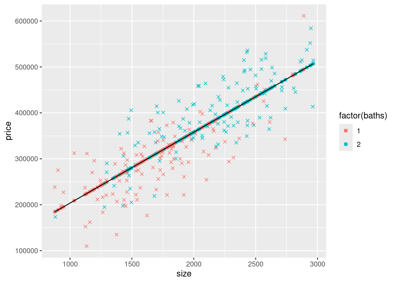
Note how we used coef(modelS)["(Intercept)"] to get the value of the intercept and coef(modelS)["size"] to get the value of the coefficient on size. We do NOT look at the output and type the value. Hard-coding the value (i.e., typing it) leads to errors, both from typos and from not updating values if the data or model change (thus changing the coefficients). Make sure to do this throughout anywhere you need to use the values of regression coefficients.
2) A big part of our focus in this chapter is the regression lines, so let’s be more explicit about plotting the line. The line we plotted above used geom_line(aes(y=yHatS,x=size)). We could plot this same line using geom_smooth, but later we’re going to plot lines that don’t work easily with geom_smooth. Instead, we’re going to use use geom_abline() to plot a line using its intercept and slope (pronounced “A B line”, as in creating a line between two points, A and B).
Recall that yHatS is:
\[
\hat{y} = \hat{\beta}_0 + \hat{\beta}_1 size
\]
so we need to use \(\hat{\beta}_0=\) 49173.68 for geom_abline’s intercept argument and \(\hat{\beta}_1=\) 154.37 for geom_abline’s slope argument. Note that when you use coef(modelS)["(Intercept)"] and coef(modelS)["size"] for the intercept and slope arguments of geom_abline, you don’t include the format() function, or it’s arguments (digits=2,nsmall=2), which were just used to display the values in this paragraph in a nicely-formatted way.
We’ll also expand the axes limits so we can see the y intercepts; to do this, we’ll include (i.e., add these two lines to your ggplot command):
scale_x_continuous(expand = c(0, 0),limits = c(0, max(mydata$size)*1.02),breaks = seq(0,max(mydata$size)*1.02,500))
and
scale_y_continuous(expand = c(0, 0),limits = c(0, max(mydata$price)*1.02), breaks = seq(0,max(mydata$price)*1.02,50000))
mydata$yHatS <- coef(modelS)["(Intercept)"] + coef(modelS)["size"] * mydata$size
ggplot(mydata) +
  geom_point(aes(y=price,x=size,col=factor(baths)),shape=4) +
  geom_point(aes(y=yHatS,x=size,col=factor(baths))) +
  geom_abline(intercept = coef(modelS)["(Intercept)"], slope = coef(modelS)["size"]) +
  scale_x_continuous(expand = c(0, 0),limits = c(0, max(mydata$size)*1.02),breaks = seq(0,max(mydata$size)*1.02,500)) +
  scale_y_continuous(expand = c(0, 0),limits = c(0, max(mydata$price)*1.02), breaks = seq(0,max(mydata$price)*1.02,50000))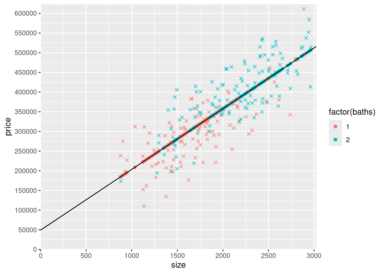
3) The slope of yHatS is the effect of size (of an additional \(ft^2\)) on the predicted price from the model that only controls for size. What do you think will happen to the effect of size on the predicted price when we also control for baths?
I expect that the effect of size will decrease once we add baths to the model. Since, larger homes also has tend to have more bathrooms the two variables are likely correlated.
12.3 Number of bathrooms and size
4) Now add the number of bathrooms (baths) as a variable to the regression (in addition to size) and store the model as modelSB (“model” with “S” for size and “B” for baths). Display the output using pander. Add a variable yHatSB to mydata with the predicted prices from this model. Remember that for this model (the “SB” model that includes both size and baths), predicted prices are given by:
\[
\hat{y} = \hat{\beta}_0 + \hat{\beta}_1 size + \hat{\beta}_2 baths
\]
Hint: Start by copy/pasting the code above where you estimated modelS and added yHatS to mydata. However, make sure to change the R object references when you use them, e.g., change modelS to modelSB. If you don’t, you’ll either have the wrong values (e.g., use the coefficient on size from the wrong model), or get an error (e.g., try to use the coefficient on baths from modelS that doesn’t include baths). Also make sure to change variable names in the expression calculating yHat (e.g., make sure the size coefficient is multiplied by the size variable, and the baths coefficient is multiplied by the baths variable…otherwise you might not notice here, but later your graph might not work).
| Estimate | Std. Error | t value | Pr(>|t|) | |
|---|---|---|---|---|
| (Intercept) | 20004 | 15384 | 1.3 | 0.1949 |
| size | 136.3 | 7.944 | 17.16 | 5.014e-42 |
| baths | 42005 | 7841 | 5.357 | 0.0000002187 |
5) Now let’s add yHatSB to the graph as a scatterplot. Copy the last graph you made above, remove the geom_point() of yHatS, and add a geom_point() of yHatSB. Make the color “orange” for all the yHatSB points (i.e., the new geom_point() should be this: geom_point(data=mydata,aes(y=yHatSB,x=size),col="orange")). By “copy the last graph you made”, I do mean that you should leave the geom_abline that plots the modelS regression line from the previous graph (don’t change it to modelSB), and leave the axes starting at (0,0).
mydata$yHatSB <- coef(modelSB)["(Intercept)"] + coef(modelSB)["size"] * mydata$size + coef(modelSB)["baths"]*mydata$bathsggplot(mydata) +
geom_point(aes(y=price,x=size,col=factor(baths)),shape=4) +
geom_abline(intercept = coef(modelS)["(Intercept)"], slope = coef(modelS)["size"]) +
scale_x_continuous(expand = c(0, 0),limits = c(0, max(mydata$size)*1.02),breaks = seq(0,max(mydata$size)*1.02,500)) +
scale_y_continuous(expand = c(0, 0),limits = c(0, max(mydata$price)*1.02), breaks = seq(0,max(mydata$price)*1.02,50000)) +
geom_point(data=mydata,aes(y=yHatSB,x=size),col="orange")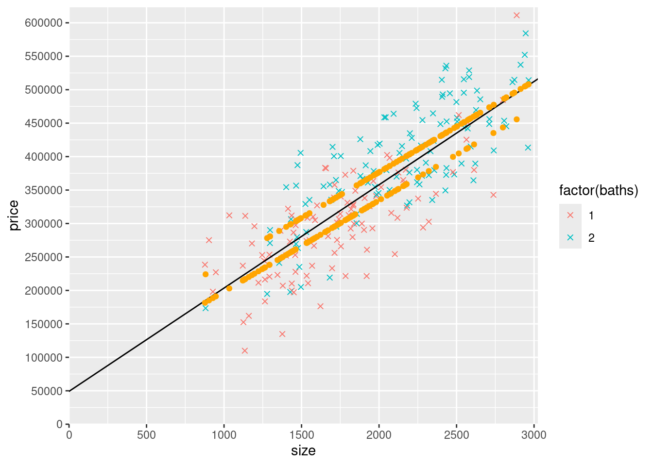
6) It looks like there are two upward-sloping parallel rows of yHatSB predicted prices. What accounts for the general upward slope of the yHatSB predicted prices? Why are there two rows (try looking at a count() of baths to help you answer this part of the question)?
The upward slope is caused by the size coefficient. There are only 2 rows because all of the houses either have 1 or 2 baths.
##   baths   n
## 1     1 102
## 2     2 114
7) Look at the graph you just made. Notice that the yHatS line doesn’t go straight through the middle of the two rows of yHatSB predicted prices. What is the slope of the yHatS line (the answer is one of the coefficients estimated above)? What is the slope of the two rows of yHatSB predicted prices (the answer is a coefficient estimated above)? Which slope is steeper? What accounts for the difference between these different slopes?
The slope of the yhatS line is 154.37,. The slope of the yhatSB line is 136.32. The slope is steeper on the yhatS line because of the correlation between size and baths.
8) How far apart vertically in the y direction (the price direction) are the two rows of yHatSB predicted prices? Why?
They are separated by 42004.73 since that is the distance added if there is an additional bathroom (1 vs 2).
9) Now you’re going to create a new version of the graph above, except all the points on the lower row of orange dots are going to be red (and connected by a red line) and all the points on the upper row of orange dots are going to be blue (and connected by a blue line). Copy the code from the previous graph as the basis for making the graph. But before creating the new graph, you’ll need to create a few new variables that you can use to replace parts of the original graph. Here’s what you need to do:
Using only the coefficients from modelSB and the size variable (and simple arithmetic), generate a variable name yHatSB1 that when you plot it, replaces the lower row of yHatSB predicted price points. Make sure that these points are only created for observations with 1 bathroom and are NA for other observation (I’d use ifelse() for baths==1). In other words, do something like this:
mydata$yHatSB1 <- ifelse(mydata$baths == 1, coef(modelSB)["(Intercept)"] + coef(modelSB)["baths"]*1 + coef(modelSB)["size"]*mydata$size, NA)
Add these yHatSB1 points to the graph as geom_point() and make them dots red. Also add a geom_abline() that goes through this row of dots and make it a red line. To do this, think about what part(s) of the yHatSB1 line are the intercept and what part(s) are the slope on a graph that has size on the x axis.
Do the same thing for the upper row. In other words, also using only the coefficients from modelSB and the size variable (and simple arithmetic), generate a variable name yHatSB2 that when you plot it, replaces the upper row of yHatSB predicted price points. Make sure that these points are only created for observations with 2 bathrooms and are NA for other observation (use a similar ifelse() but for baths==2 and calculating the correct yHat values for 2 bathrooms). Add these to the graph as geom_point() and make these dots blue. Also add a geom_abline() that goes through this row of dots and make this line blue.
In addition, remove the orange yHatSB points you added before (because you’ve replaced them with red points and blue points).
In mine, I also labeled the y-intercepts of the three lines (the black line that connects the yHatS points, the red line that connects the yHatSB1 points, and the blue line that connects the yHatSB2 points). To do this, you modify the breaks argument of scale_y_continuous(). Try it if you have time, but don’t waste much time trying to figure this out. Either way, you should understand how the intercepts correspond with coefficients from the models.
mydata$yHatSB1 <- ifelse(mydata$baths == 1, coef(modelSB)["(Intercept)"] + coef(modelSB)["baths"]*1 + coef(modelSB)["size"]*mydata$size, NA)
mydata$yHatSB2 <- ifelse(mydata$baths == 2, coef(modelSB)["(Intercept)"] + coef(modelSB)["baths"]*2 + coef(modelSB)["size"]*mydata$size, NA)

ggplot(mydata) +
  geom_point(aes(y=price,x=size,col=factor(baths)),shape=4) +
  geom_abline(intercept = coef(modelS)["(Intercept)"], slope = coef(modelS)["size"]) +
  scale_x_continuous(expand = c(0, 0),limits = c(0, max(mydata$size)*1.02),breaks = seq(0,max(mydata$size)*1.02,500)) +
  scale_y_continuous(expand = c(0, 0),limits = c(0, max(mydata$price)*1.02), breaks = seq(0,max(mydata$price)*1.02,50000)) +
  geom_point(data=mydata,aes(y=yHatSB1,x=size),col="red") +
  geom_point(data=mydata,aes(y=yHatSB2,x=size),col="blue") +
  geom_abline(intercept = (coef(modelSB)["(Intercept)"] + coef(modelSB)["baths"]), slope = coef(modelSB)["size"], color = "red") +
  geom_abline(intercept = (coef(modelSB)["(Intercept)"] + 2*coef(modelSB)["baths"]), slope = coef(modelSB)["size"], color = "blue")
## Warning: Removed 114 rows containing missing values or values outside the scale range
## (`geom_point()`).## Warning: Removed 102 rows containing missing values or values outside the scale range
## (`geom_point()`).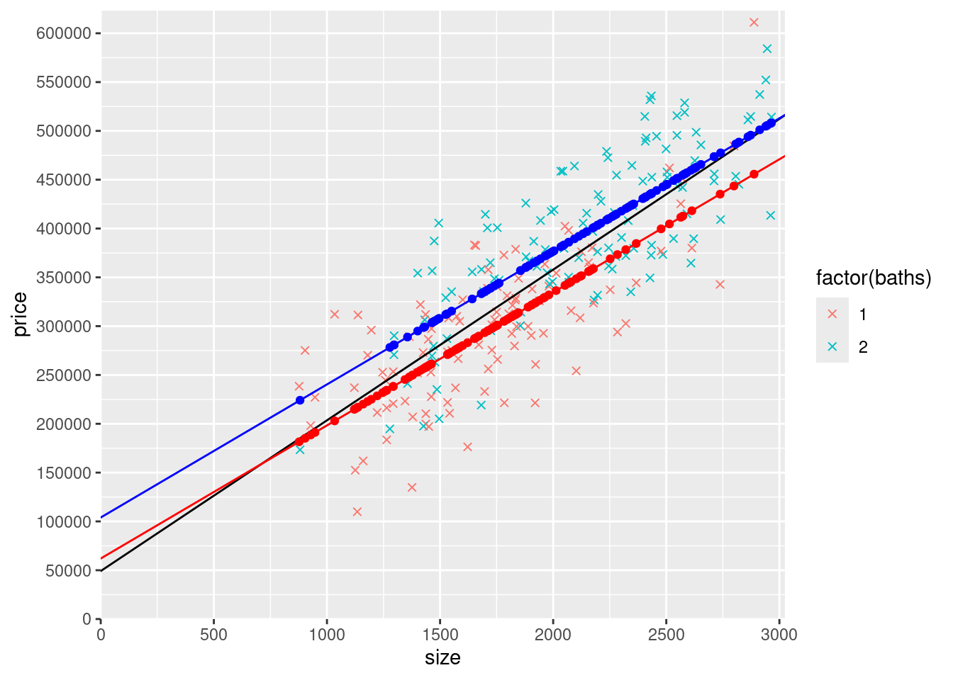
10) Using ifelse(), create two dummy variables, baths1 and baths2, and add them to mydata. The variable baths1 equals 1 for houses with 1 bathroom and equals 0 otherwise. The variable baths2 equals 1 for houses with 2 bathroom and equals 0 otherwise. Make sure to look at the data after creating the variables to make sure you did it correctly (e.g., use head())! Calculate the mean of baths1 and baths2. What does the mean of baths1 tell us? What about the mean of baths2?
mydata <- mydata %>%
  mutate(baths1 = ifelse(baths == 1,1, 0),
  baths2 = ifelse(baths == 2, 1, 0))

mydata %>%
  summarize(mean(baths1))
## mean(baths1)
## 1 0.4722222Since the sum of the means of baths1 and baths2 must equal 1, the mean of baths 2 is 0.53
11) Try estimating a regression (with price as the y variable) that includes size, baths1, and baths2. Call it model12. Display the output using pander, but also display coef(model12). Why is part of coef(model12) NA? Why? Hint: which of the 4 MLR assumptions is violated?
| Estimate | Std. Error | t value | Pr(>|t|) | |
|---|---|---|---|---|
| (Intercept) | 104013 | 17658 | 5.89 | 0.00000001487 |
| size | 136.3 | 7.944 | 17.16 | 5.014e-42 |
| baths1 | -42005 | 7841 | -5.357 | 0.0000002187 |
## (Intercept)        size      baths1      baths2
## 104013.3696    136.3161 -42004.7326          NA
It returns an NA because this violates assumption MLR.3 No Perfect Collinearity because of baths1 and baths2.
12) Since we cannot include both baths1 and baths2 in the regression, lets try again without baths1. Estimate a model (name it modelInterceptDummy) that includes size and baths2, but leave out baths1. Display the results in a stargazer table next to the results of modelSB. What is the interpretation of \(\hat{\beta}_0\), \(\hat{\beta}_1\), and \(\hat{\beta}_2\) in modelInterceptDummy)?
How do these coefficients compare/correspond with coefficients from modelSB? Specifically, how does the effect of size compare? What coefficient(s) from each model give you the intercepts for one and two bathroom houses (i.e., the average price when size is 0 for houses with 1 bathroom and for houses with 2 bathrooms)?
modelInterceptDummy <- lm(price~ size + baths2, data = mydata)
stargazer(modelSB, modelInterceptDummy,
type = "html",
report = ('vc*p'),
keep.stat = c("n","rsq","adj.rsq"),
notes = "<em>*p<0.1;**p<0.05;***p<0.01</em>",
notes.append = FALSE,
column.labels = c("modelSB","modelInterceptDummy"))| Dependent variable: | ||
| price | ||
| modelSB | modelInterceptDummy | |
| (1) | (2) | |
| size | 136.316*** | 136.316*** |
| p = 0.000 | p = 0.000 | |
| baths | 42,004.730*** | |
| p = 0.00000 | ||
| baths2 | 42,004.730*** | |
| p = 0.00000 | ||
| Constant | 20,003.900 | 62,008.640*** |
| p = 0.195 | p = 0.00004 | |
| Observations | 216 | 216 |
| R2 | 0.697 | 0.697 |
| Adjusted R2 | 0.694 | 0.694 |
| Note: | *p<0.1;**p<0.05;***p<0.01 | |
\(\hat{\beta}_0=\) 62008.64 represents the predicted price of a 0 square ft house that has one bathroom.
\(\hat{\beta}_1=\) 136.32 represents the predicted increase in price for one additional square foot, on average. Holding baths2 constant.
\(\hat{\beta}_2=\) 42004.73 represents how much we expect a 2 bathroom house to cost compared to a one bedroom house on average, assuming size is the same.
The coefficients for size are exactly the same in the two models. For a one bedroom house the intercept is \(\hat{\beta}_0=\), and for two bedroom houses the intercept is \(\hat{\beta}_0+\hat{\beta}_2\).
13) Create the same graph you created above with the red and blue lines, except modify the geom_abline() layers that use coefficients from modelSB so that they use modelInterceptDummy instead. Leave everything else as it is in the previous graph (e.g., leave the black line geom_abline() that uses modelS, leave the geom_point() using yHatSB1 and yHatSB2). The graph itself should look identical (the two models are identical because the only possible values of baths are 1 and 2). Make sure that your red line (using geom_abline() based on modelInterceptDummy coefficients) actually goes through the red points (the geom_point() based on yHatSB1) and make sure that your blue line (using geom_abline() based on modelInterceptDummy coefficients) actually goes through the blue points (the geom_point() based on yHatSB2).
ggplot(mydata) +
  geom_point(aes(y=price,x=size,col=factor(baths)),shape=4) +
  geom_abline(intercept = coef(modelS)["(Intercept)"], slope = coef(modelS)["size"]) +
  scale_x_continuous(expand = c(0, 0),limits = c(0, max(mydata$size)*1.02),breaks = seq(0,max(mydata$size)*1.02,500)) +
  scale_y_continuous(expand = c(0, 0),limits = c(0, max(mydata$price)*1.02), breaks = seq(0,max(mydata$price)*1.02,50000)) +
  geom_point(data=mydata,aes(y=yHatSB1,x=size),col="red") +
  geom_point(data=mydata,aes(y=yHatSB2,x=size),col="blue") +
  geom_abline(intercept = (coef(modelInterceptDummy)["(Intercept)"]), slope = coef(modelInterceptDummy)["size"], color = "red") +
  geom_abline(intercept = (coef(modelInterceptDummy)["(Intercept)"] + coef(modelInterceptDummy)["baths2"]), slope = coef(modelSB)["size"], color = "blue")
## Warning: Removed 114 rows containing missing values or values outside the scale range
## (`geom_point()`).## Warning: Removed 102 rows containing missing values or values outside the scale range
## (`geom_point()`).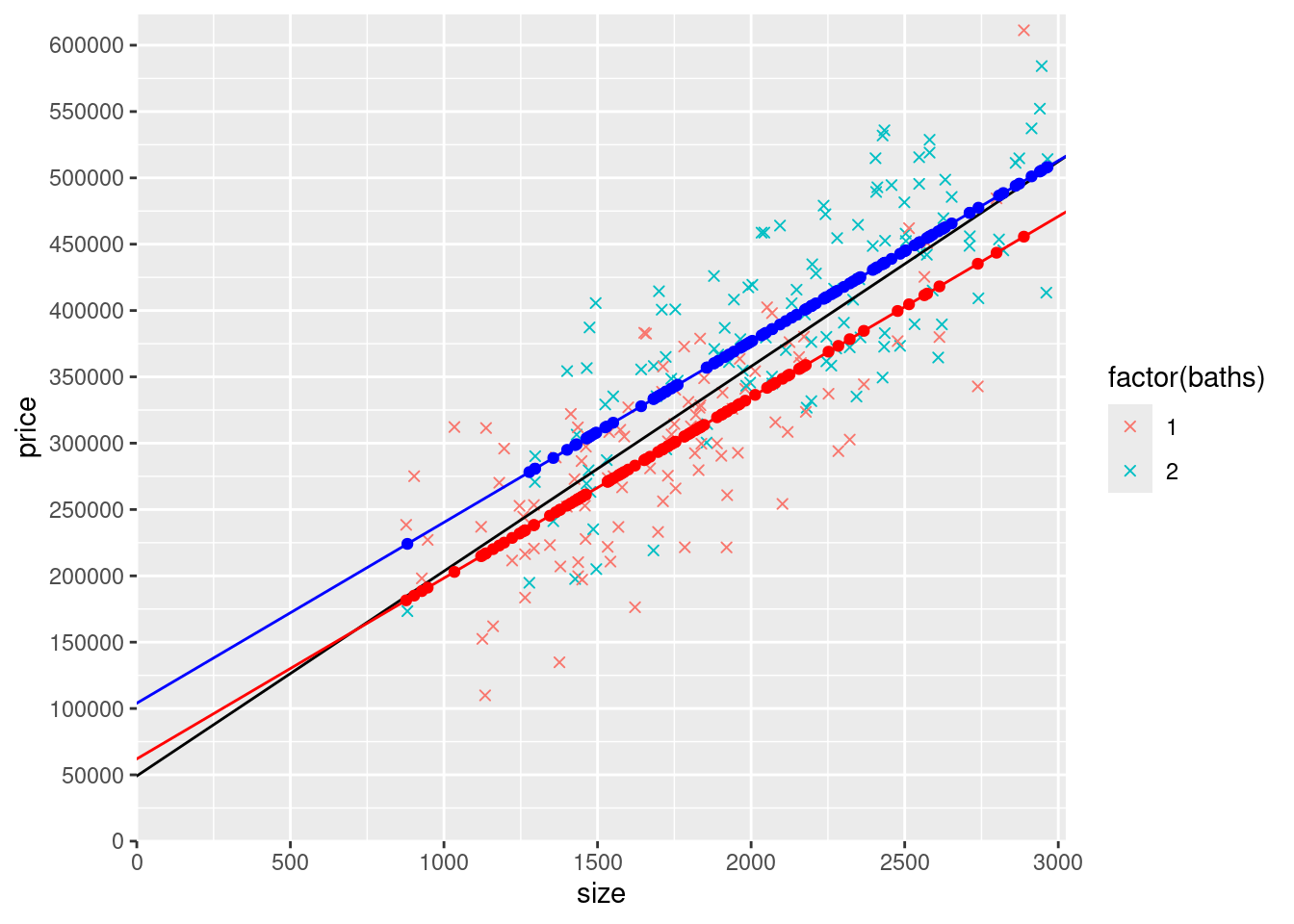
12.4 Slope dummy
14) Think about what model would allow for the slope (with respect to size) to be different for 1 and 2 bathroom houses (but for the intercept to be the same). Write out the equation for this model the way equations were written out using latex code above (e.g., using \(\beta_1\) etc).
\[ \hat{y} = \hat{\beta}_0 + \hat{\beta}_1 size + \hat{\beta}_2 size*baths2 \]
Create any new variables you need to create, and then estimate the model and call it modelSlopeDummy.
| Estimate | Std. Error | t value | Pr(>|t|) | |
|---|---|---|---|---|
| (Intercept) | 82311 | 15618 | 5.27 | 0.0000003332 |
| size | 124.7 | 9.032 | 13.81 | 2.094e-31 |
| size:baths2 | 21.57 | 3.984 | 5.415 | 0.0000001647 |
Display the results of modelS, modelInterceptDummy, and modelSlopeDummy side-by-side using stargazer.
stargazer(modelSB, modelInterceptDummy, modelSlopeDummy,
type = "html",
report = ('vc*p'),
keep.stat = c("n","rsq","adj.rsq"),
notes = "<em>*p<0.1;**p<0.05;***p<0.01</em>",
notes.append = FALSE,
column.labels = c("modelSB","modelInterceptDummy", "modelSlopeDummy"))| Dependent variable: | |||
| price | |||
| modelSB | modelInterceptDummy | modelSlopeDummy | |
| (1) | (2) | (3) | |
| size | 136.316*** | 136.316*** | 124.733*** |
| p = 0.000 | p = 0.000 | p = 0.000 | |
| baths | 42,004.730*** | ||
| p = 0.00000 | |||
| baths2 | 42,004.730*** | ||
| p = 0.00000 | |||
| size:baths2 | 21.572*** | ||
| p = 0.00000 | |||
| Constant | 20,003.900 | 62,008.640*** | 82,310.930*** |
| p = 0.195 | p = 0.00004 | p = 0.00000 | |
| Observations | 216 | 216 | 216 |
| R2 | 0.697 | 0.697 | 0.697 |
| Adjusted R2 | 0.694 | 0.694 | 0.695 |
| Note: | *p<0.1;**p<0.05;***p<0.01 | ||
Create a graph similar to what you did above, except using this new model. Start with the previous graph and make the following changes:
Remove the black line based on
modelS.Remove the red
geom_point()based onyHatSB1and replace it with redgeom_point()based onmodelSlopeDummy(I suggest creating ayHatSlopeDummy1similar to how you createdyHatSB1).Remove the blue
geom_point()based onyHatSB2and replace it with bluegeom_point()based onmodelSlopeDummy(I suggest creating ayHatSlopeDummy2similar to how you createdyHatSB2).Remove the red
geom_abline()based onmodelInterceptDummyand replace it with a redgeom_abline()based on the coefficients frommodelSlopeDummy.Remove the blue
geom_abline()based onmodelInterceptDummyand replace it with a redgeom_abline()based on the coefficients frommodelSlopeDummy.
NOTE: you rarely want to estimate a model with a slope dummy unless you also have the corresponding intercept dummy (see the next question for that model), but I’m having you do so now because it’s your first one and you need to learn how to do so.
mydata$yHatSlopeDummy1 <- ifelse(mydata$baths == 1, coef(modelSlopeDummy)["(Intercept)"] + coef(modelSlopeDummy)["size"]*mydata$size, NA)
mydata$yHatSlopeDummy2 <- ifelse(mydata$baths == 2, coef(modelSlopeDummy)["(Intercept)"] + coef(modelSlopeDummy)["size"]*mydata$size + coef(modelSlopeDummy)["size:baths2"] *mydata$size*mydata$baths2, NA)ggplot(mydata) +
geom_point(aes(y=price,x=size,col=factor(baths)),shape=4) +
scale_x_continuous(expand = c(0, 0),limits = c(0, max(mydata$size)*1.02),breaks = seq(0,max(mydata$size)*1.02,500)) +
scale_y_continuous(expand = c(0, 0),limits = c(0, max(mydata$price)*1.02), breaks = seq(0,max(mydata$price)*1.02,50000)) +
geom_point(data=mydata,aes(y=yHatSlopeDummy1,x=size),col="red") +
geom_point(data=mydata,aes(y=yHatSlopeDummy2,x=size),col="blue") +
geom_abline(intercept = (coef(modelSlopeDummy)["(Intercept)"]), slope = coef(modelSlopeDummy)["size"], color = "red") +
geom_abline(intercept = (coef(modelSlopeDummy)["(Intercept)"]), slope = coef(modelSlopeDummy)["size"] + coef(modelSlopeDummy)["size:baths2"], color = "blue")## Warning: Removed 114 rows containing missing values or values outside the scale range
## (`geom_point()`).## Warning: Removed 102 rows containing missing values or values outside the scale range
## (`geom_point()`).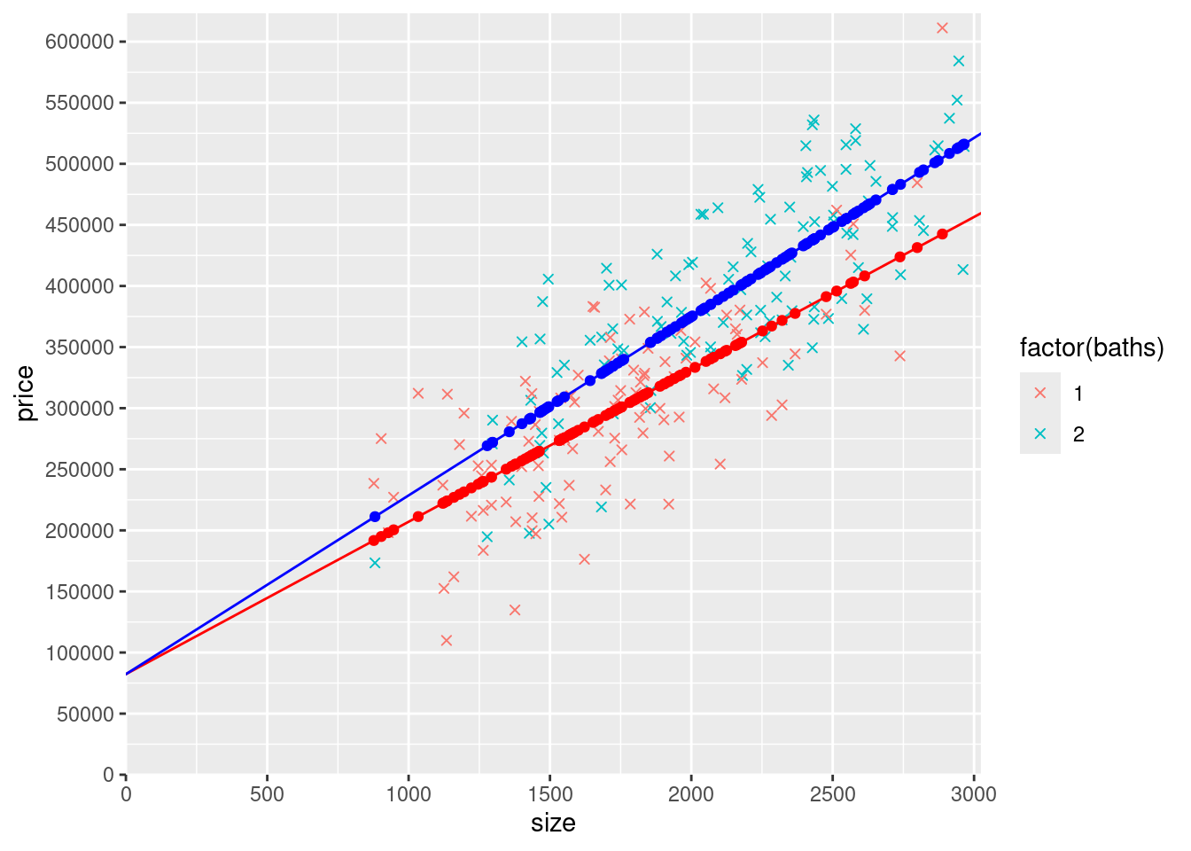
12.5 Intercept and slope dummies
15) Estimate a model that allows for both the intercept and the slope (with respect to size) to be different for 1 and 2 bathroom houses.
Write out the equation for this model the way equations were written out using latex code above (e.g., using \(\beta_1\), etc).
\[ \hat{y} = \hat{\beta}_0 + \hat{\beta}_1 size + \hat{\beta}_2 baths2 + \hat{\beta}_3 size*baths2 \]
Create any new variables you need to create, if you need to create any, and then estimate the model and call it modelSlopeAndInterceptDummies.
Display the results of the four models (modelS, modelInterceptDummy, modelSlopeDummy, and modelSlopeAndInterceptDummies) side-by-side using stargazer. For this part though, do it below the graph instead of here.
Create a graph of this model by following the same steps you followed above to create the graph of the slope dummy model.
mydata$yHatSlopeAndInterceptDummy1 <- ifelse(mydata$baths == 1, coef(modelSlopeAndInterceptDummies)["(Intercept)"] + coef(modelSlopeAndInterceptDummies)["size"]*mydata$size, NA)
mydata$yHatSlopeAndInterceptDummy2 <- ifelse(mydata$baths == 2, coef(modelSlopeAndInterceptDummies)["(Intercept)"] + coef(modelSlopeAndInterceptDummies)["size"]*mydata$size + coef(modelSlopeAndInterceptDummies)["baths2"]+ coef(modelSlopeAndInterceptDummies)["size:baths2"] *mydata$size*mydata$baths2, NA)ggplot(mydata) +
geom_point(aes(y=price,x=size,col=factor(baths)),shape=4) +
scale_x_continuous(expand = c(0, 0),limits = c(0, max(mydata$size)*1.02),breaks = seq(0,max(mydata$size)*1.02,500)) +
scale_y_continuous(expand = c(0, 0),limits = c(0, max(mydata$price)*1.02), breaks = seq(0,max(mydata$price)*1.02,50000)) +
geom_point(data=mydata,aes(y=yHatSlopeAndInterceptDummy1,x=size),col="red") +
geom_point(data=mydata,aes(y=yHatSlopeAndInterceptDummy2,x=size),col="blue") +
geom_abline(intercept = (coef(modelSlopeAndInterceptDummies)["(Intercept)"]), slope = coef(modelSlopeAndInterceptDummies)["size"], color = "red") +
geom_abline(intercept = (coef(modelSlopeAndInterceptDummies)["(Intercept)"] + coef(modelSlopeAndInterceptDummies)["baths2"]) , slope = coef(modelSlopeAndInterceptDummies)["size"] + coef(modelSlopeAndInterceptDummies)["size:baths2"], color = "blue")## Warning: Removed 114 rows containing missing values or values outside the scale range
## (`geom_point()`).## Warning: Removed 102 rows containing missing values or values outside the scale range
## (`geom_point()`).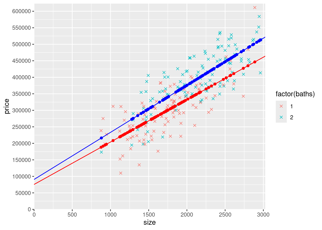
16) Display the stargazer table comparing the four models (modelS, modelInterceptDummy, modelSlopeDummy, and modelSlopeAndInterceptDummies).
stargazer(modelSB, modelInterceptDummy, modelSlopeDummy,modelSlopeAndInterceptDummies,
type = "html",
report = ('vc*p'),
keep.stat = c("n","rsq","adj.rsq"),
notes = "<em>*p<0.1;**p<0.05;***p<0.01</em>",
notes.append = FALSE,
column.labels = c("modelSB","modelInterceptDummy", "modelSlopeDummy", "modelSlopeAndInterceptDummies"))| Dependent variable: | ||||
| price | ||||
| modelSB | modelInterceptDummy | modelSlopeDummy | modelSlopeAndInterceptDummies | |
| (1) | (2) | (3) | (4) | |
| size | 136.316*** | 136.316*** | 124.733*** | 128.467*** |
| p = 0.000 | p = 0.000 | p = 0.000 | p = 0.000 | |
| baths | 42,004.730*** | |||
| p = 0.00000 | ||||
| baths2 | 42,004.730*** | 15,120.010 | ||
| p = 0.00000 | p = 0.632 | |||
| size:baths2 | 21.572*** | 14.123 | ||
| p = 0.00000 | p = 0.379 | |||
| Constant | 20,003.900 | 62,008.640*** | 82,310.930*** | 75,489.050*** |
| p = 0.195 | p = 0.00004 | p = 0.00000 | p = 0.0005 | |
| Observations | 216 | 216 | 216 | 216 |
| R2 | 0.697 | 0.697 | 0.697 | 0.698 |
| Adjusted R2 | 0.694 | 0.694 | 0.695 | 0.694 |
| Note: | *p<0.1;**p<0.05;***p<0.01 | |||
Using the estimated coefficients from the four models, write out the equation for the predicted prices for each of the four models, followed by the conditional expectations for each of the four models for one bathroom houses, followed by the conditional expectations for each of the four models for one bathroom houses. I filled in each of these for the first model (the one with size only) for you so you can see what I’m asking you to do. You can copy/paste what I did and then modify it for the subsequent models (modelInterceptDummy, modelSlopeDummy, and modelSlopeAndInterceptDummies). Round all coefficients to 0 decimal places they way I did for modelS.
Predicted prices from the four models: \[ \begin{aligned} \widehat{price} &= 49174 + 154 \cdot size \\ \widehat{price} &= 62009 + 136 \cdot size + 42005 \cdot baths2 \\ \widehat{price} &= 82311 + 125 \cdot size + 22 \cdot size \cdot baths2 \\ \widehat{price} &= 75489 + 128 \cdot size + 15120 \cdot baths2 +14 \cdot size \cdot baths2 \end{aligned} \]
Expected prices for 1 bathroom (not-two bathroom) houses \[ \begin{aligned} E(price|size,baths2=0) &= 49174 + 154 \cdot size \\ E(price|size,baths2=0) &= 62009 + 136 \cdot size \\ E(price|size,baths2=0) &= 82311 + 125 \cdot size \\ E(price|size,baths2=0) &= 75489 + 128 \cdot size \end{aligned} \]
Expected prices for two bathroom houses \[ \begin{aligned} E(price|size,baths2=1) &= 49174 + 154 \cdot size \\ E(price|size,baths2=1) &= 104013 + 136 \cdot size \\ E(price|size,baths2=1) &= 82311 + 146 \cdot size \\ E(price|size,baths2=1) &= 90609 + 143 \cdot size \end{aligned} \]
17) What do you notice about the intercepts and the slopes? Think about what variation each model allows and what restrictions it imposes. Why are the intercepts furthest out for the model with the intercept dummy (modelInterceptDummy), at one point in the middle for the model with the slope dummy, and in between for the model with both the intercept and slope dummies? How does that relate to the estimated slopes? How does that relate to the model that only includes size? I’d start by comparing the graphs of the models.
The model is furthest out for modelInterceptDummy because slope is not allowed to be the same for one bathroom and two bathroom houses. For modelSlopeDummy the slope is the steepest of the three models (not including modelS) because the intercept has to be the same for one bathroom and two bathroom houses, as a result it is using the slope to estimate all differences in price between the two. Thirdly, modelSlopeAndInterceptDummies falls in between the two models on slope and intercept because it is able to use both to best predict the value of a one or two bathroom house.
Comparing all of these models to modelS we see that the slope is flatter and the intercept is larger when we can differentitate between one and two bathroom houses.
12.6 Models with the number of bedrooms
18) To help you gain additional intuition for what’s going on in linear regressions, try estimating a model that includes size and the number of bedrooms (beds). Make a plot that includes yHat predicted values. Color the yHat points based on the number of bedrooms (use 1 bedroom = red, 2 bedroom = orange, 3 bedroom = green, 4 bedroom = blue….why? because people are used to seeing rainbow order, but yellow is hard to see so we skipped it…you can do this by adding scale_color_manual(values=c("red", "orange", "green","blue")). Why are the yHat points arranged in rows? How many rows are there? Why? Add geom_abline()s that connect the rows of dots (using the same colors as the yHat points).
Note that this is 4 separate geom_abline()s. It makes for a lot of lines of code. However, remember that once you do one of them, the other three are easily obtained by copy/pasting the first and changing the number of bedrooms and the corresponding color.
##   beds  n
## 1    1 32
## 2    2 66
## 3    3 68
## 4 4 50mydata$yHat <- coef(modelBeds)["(Intercept)"] + coef(modelBeds)["size"] * mydata$size + coef(modelBeds)["beds"] * mydata$beds
ggplot(mydata) +
scale_x_continuous(expand = c(0, 0),limits = c(0, max(mydata$size)*1.02),breaks = seq(0,max(mydata$size)*1.02,500)) +
scale_y_continuous(expand = c(0, 0),limits = c(0, max(mydata$price)*1.02), breaks = seq(0,max(mydata$price)*1.02,50000)) +
geom_point(data=mydata,aes(y=yHat,x=size, color = factor(beds))) +
scale_color_manual(values=c("red", "orange", "green","blue")) +
geom_abline(intercept = (coef(modelBeds)["(Intercept)"] + coef(modelBeds)["beds"]* 1) , slope = coef(modelBeds)["size"], color = "red") +
geom_abline(intercept = (coef(modelBeds)["(Intercept)"] + coef(modelBeds)["beds"]* 2) , slope = coef(modelBeds)["size"], color = "orange") +
geom_abline(intercept = (coef(modelBeds)["(Intercept)"] + coef(modelBeds)["beds"]* 3) , slope = coef(modelBeds)["size"], color = "green")+
geom_abline(intercept = (coef(modelBeds)["(Intercept)"] + coef(modelBeds)["beds"]* 4) , slope = coef(modelBeds)["size"], color = "blue")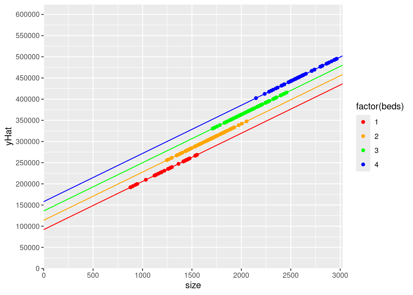
The yHatpoints are arranged in 4 rows, once for each number of bedrooms available in houses in the dataset.
19) Now try changing the previous model to include factor(beds) instead of beds (alternatively, create a dummy variable for 2 bedroom houses, 3 bedroom houses, and 4 bedroom houses, and include these three dummy variables in the model). Make a plot that includes yHat predicted values. Color the yHat points based on the number of bedrooms (using the same colors as above). Why are the yHat points arranged in rows? How many rows are there? Why? Can you add geom_abline()s that connect the rows of dots? How do the rows of dots (and the geom_abline()s that connect them) compare with the previous model? Is the effect of going from 1 bedroom to 2, or 2 to 3, or 3 to 4 different in this model than in the first?
| Estimate | Std. Error | t value | Pr(>|t|) | |
|---|---|---|---|---|
| (Intercept) | 69942 | 17390 | 4.022 | 0.00008013 |
| size | 113.8 | 18.4 | 6.184 | 0.000000003146 |
| beds | 22009 | 9103 | 2.418 | 0.01645 |
| Estimate | Std. Error | t value | Pr(>|t|) | |
|---|---|---|---|---|
| (Intercept) | 98518 | 25537 | 3.858 | 0.000152 |
| size | 111.7 | 18.75 | 5.956 | 0.00000001066 |
| factor(beds)2 | 17174 | 13691 | 1.254 | 0.2111 |
| factor(beds)3 | 39851 | 19369 | 2.057 | 0.04087 |
| factor(beds)4 | 67649 | 27898 | 2.425 | 0.01616 |
mydata$yHatB1 <- ifelse(mydata$beds == 1, coef(modelB)["(Intercept)"] + coef(modelB)["size"]*mydata$size, NA)
mydata$yHatB2 <- ifelse(mydata$beds == 2, coef(modelB)["(Intercept)"] + coef(modelB)["size"]*mydata$size + coef(modelB)["factor(beds)2"] , NA)
mydata$yHatB3 <- ifelse(mydata$beds == 3, coef(modelB)["(Intercept)"] + coef(modelB)["size"]*mydata$size + coef(modelB)["factor(beds)3"], NA)
mydata$yHatB4 <- ifelse(mydata$beds == 4, coef(modelB)["(Intercept)"] + coef(modelB)["size"]*mydata$size + coef(modelB)["factor(beds)4"], NA)


ggplot(mydata) +
  scale_x_continuous(expand = c(0, 0),limits = c(0, max(mydata$size)*1.02),breaks = seq(0,max(mydata$size)*1.02,500)) +
  scale_y_continuous(expand = c(0, 0),limits = c(0, max(mydata$price)*1.02), breaks = seq(0,max(mydata$price)*1.02,50000)) +
  geom_point(data=mydata,aes(y=yHatB1,x=size, color = factor(beds))) +
  geom_point(data=mydata,aes(y=yHatB2,x=size, color = factor(beds))) +
  geom_point(data=mydata,aes(y=yHatB3,x=size, color = factor(beds))) +
  geom_point(data=mydata,aes(y=yHatB4,x=size, color = factor(beds))) +
  scale_color_manual(values=c("red", "orange", "green","blue")) +
  geom_abline(intercept = (coef(modelB)["(Intercept)"]) , slope = coef(modelB)["size"] , color = "red") +
  geom_abline(intercept = (coef(modelB)["(Intercept)"] + coef(modelB)["factor(beds)2"]) , slope = coef(modelB)["size"], color = "orange") +
  geom_abline(intercept = (coef(modelB)["(Intercept)"] + coef(modelB)["factor(beds)3"]) , slope = coef(modelB)["size"], color = "green")+
  geom_abline(intercept = (coef(modelB)["(Intercept)"] + coef(modelB)["factor(beds)4"]) , slope = coef(modelB)["size"], color = "blue")
## Warning: Removed 184 rows containing missing values or values outside the scale range
## (`geom_point()`).## Warning: Removed 150 rows containing missing values or values outside the scale range
## (`geom_point()`).## Warning: Removed 148 rows containing missing values or values outside the scale range
## (`geom_point()`).## Warning: Removed 166 rows containing missing values or values outside the scale range
## (`geom_point()`).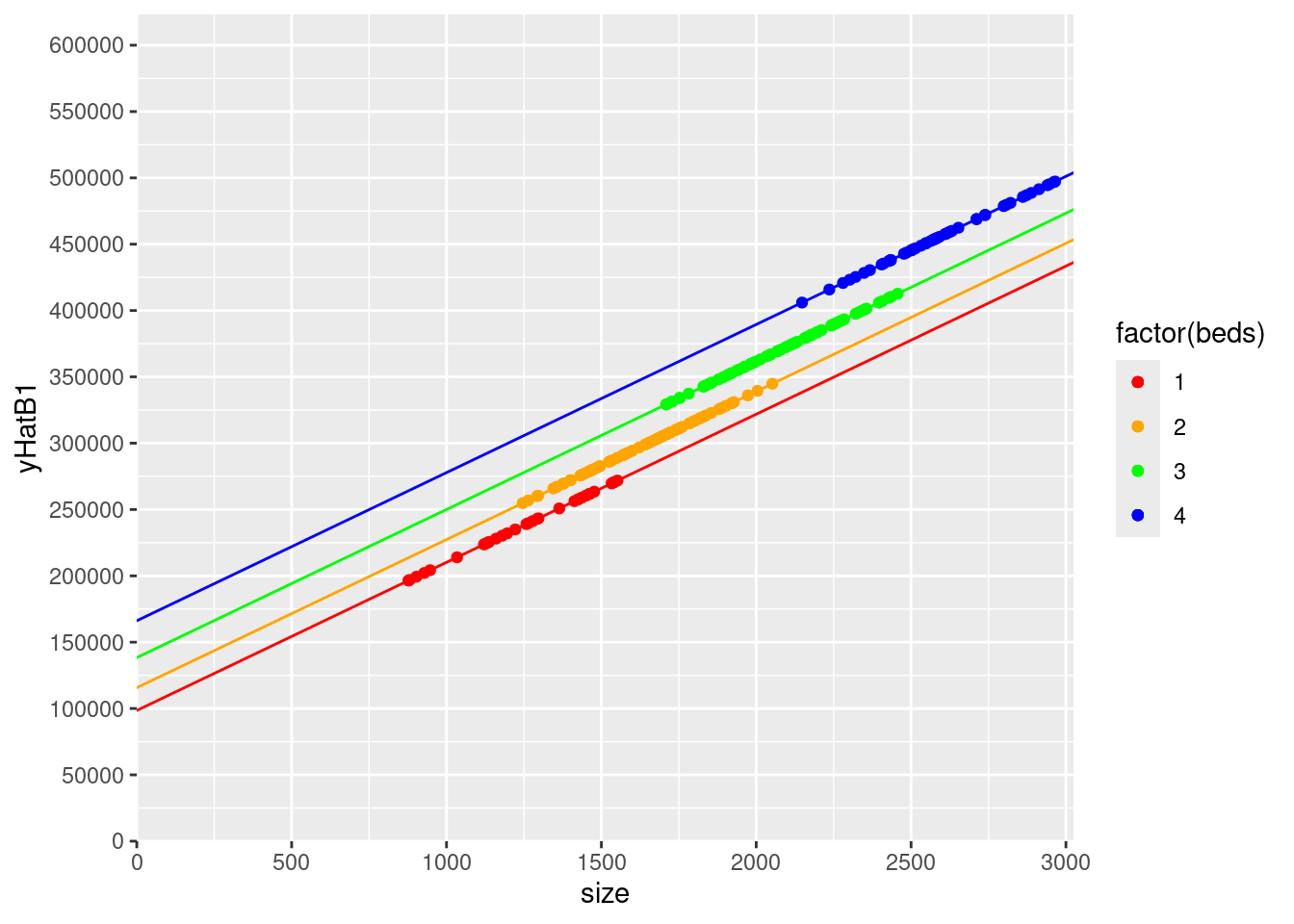
Now the distance between adding 2, 3, and 4, bathrooms are different (17174.45, 22676.43, and 27798.32). Compared to the first model where adding one bedroom had the same effect regardless.
20) Now let’s look at models with the number of bathrooms in addition to size and the number of bedrooms. For this model, include bedrooms as beds. Try to answer the same questions as the first model with bedrooms. Making a plot that includes yHat predicted values. Color the yHat points based on the number of bedrooms (using the same colors as before). Why are the yHat points arranged in rows? How many rows are there? Why? Add geom_abline()s that connect the rows of dots (using the same colors).
Note that this is now 8 separate geom_abline()s, but, as above, this isn’t hard if you copy/paste and just change what needs to be modified.
modelSBedBath <- lm(price~size + baths + beds, data = mydata)

mydata$yHatSBB <- coef(modelSBedBath)["(Intercept)"] + coef(modelSBedBath)["size"] * mydata$size + coef(modelSBedBath)["beds"] * mydata$beds + coef(modelSBedBath)["baths"] * mydata$baths

ggplot(mydata) +
  scale_x_continuous(expand = c(0, 0),limits = c(0, max(mydata$size)*1.02),breaks = seq(0,max(mydata$size)*1.02,500)) +
  scale_y_continuous(expand = c(0, 0),limits = c(0, max(mydata$price)*1.02), breaks = seq(0,max(mydata$price)*1.02,50000)) +
  geom_point(data=mydata,aes(y=yHatSBB,x=size, color = factor(beds))) +
  scale_color_manual(values=c("red", "orange", "green","blue")) +
  geom_abline(intercept = (coef(modelSBedBath)["(Intercept)"] + coef(modelSBedBath)["baths"]*1 + coef(modelSBedBath)["beds"]*1) , slope = coef(modelSBedBath)["size"] , color = "red") +
  geom_abline(intercept = (coef(modelSBedBath)["(Intercept)"] + coef(modelSBedBath)["baths"]*2+ coef(modelSBedBath)["beds"]*1) , slope = coef(modelSBedBath)["size"] , color = "red") +
 geom_abline(intercept = (coef(modelSBedBath)["(Intercept)"] + coef(modelSBedBath)["baths"]*1 + coef(modelSBedBath)["beds"]*2) , slope = coef(modelSBedBath)["size"] , color = "orange") +
  geom_abline(intercept = (coef(modelSBedBath)["(Intercept)"] + coef(modelSBedBath)["baths"]*2+ coef(modelSBedBath)["beds"]*2) , slope = coef(modelSBedBath)["size"] , color = "orange") +
   geom_abline(intercept = (coef(modelSBedBath)["(Intercept)"] + coef(modelSBedBath)["baths"]*1 + coef(modelSBedBath)["beds"]*3) , slope = coef(modelSBedBath)["size"] , color = "green") +
  geom_abline(intercept = (coef(modelSBedBath)["(Intercept)"] + coef(modelSBedBath)["baths"]*2+ coef(modelSBedBath)["beds"]*3) , slope = coef(modelSBedBath)["size"] , color = "green") +
   geom_abline(intercept = (coef(modelSBedBath)["(Intercept)"] + coef(modelSBedBath)["baths"]*1 + coef(modelSBedBath)["beds"]*4) , slope = coef(modelSBedBath)["size"] , color = "blue") +
geom_abline(intercept = (coef(modelSBedBath)["(Intercept)"] + coef(modelSBedBath)["baths"]*2+ coef(modelSBedBath)["beds"]*4) , slope = coef(modelSBedBath)["size"] , color = "blue") 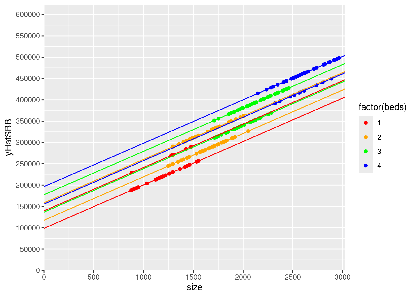
There are 8 rows because there are 8 combination of beds and baths (1 bed - 1 bath, 1 bed - 2 bath, 2 bed - 1 bath, …)
21) Finally, try adding baths to the model with factor(beds) and make a similar graph (with the yHat points colored by the number of bedrooms, and the corresponding geom_abline()s). If you understood the previous two questions, you should have no problem understanding this question too. If you didn’t, make sure you understand those models first before trying to wrap your head around this one. How has the spacing between the lines changed? Explain the spacing between the same colored lines (i.e., the same number of bedrooms but 2 bathrooms instead of 1), and the different colored lines (i.e., the number of bedrooms).
modelSBedBathF <- lm(price~size + baths + factor(beds), data = mydata)


mydata$yHatSBB1 <- ifelse(mydata$beds == 1, coef(modelSBedBathF)["(Intercept)"] + coef(modelSBedBathF)["size"]*mydata$size + coef(modelSBedBathF)["baths"]* mydata$baths, NA)
mydata$yHatSBB2 <- ifelse(mydata$beds == 2, coef(modelSBedBathF)["(Intercept)"] + coef(modelSBedBathF)["size"]*mydata$size + coef(modelSBedBathF)["baths"]* mydata$baths + coef(modelSBedBathF)["factor(beds)2"], NA)
mydata$yHatSBB3 <- ifelse(mydata$beds == 3, coef(modelSBedBathF)["(Intercept)"] + coef(modelSBedBathF)["size"]*mydata$size + coef(modelSBedBathF)["baths"]* mydata$baths + coef(modelSBedBathF)["factor(beds)3"], NA)
mydata$yHatSBB4 <- ifelse(mydata$beds == 4, coef(modelSBedBathF)["(Intercept)"] + coef(modelSBedBathF)["size"]*mydata$size + coef(modelSBedBathF)["baths"]* mydata$baths + coef(modelSBedBathF)["factor(beds)4"], NA)


ggplot(mydata) +
  scale_x_continuous(expand = c(0, 0),limits = c(0, max(mydata$size)*1.02),breaks = seq(0,max(mydata$size)*1.02,500)) +
  scale_y_continuous(expand = c(0, 0),limits = c(0, max(mydata$price)*1.02), breaks = seq(0,max(mydata$price)*1.02,50000)) +
  geom_point(data=mydata,aes(y=yHatSBB1,x=size, color = factor(beds))) +
  geom_point(data=mydata,aes(y=yHatSBB2,x=size, color = factor(beds))) +
   geom_point(data=mydata,aes(y=yHatSBB3,x=size, color = factor(beds))) +
   geom_point(data=mydata,aes(y=yHatSBB4,x=size, color = factor(beds))) +
  scale_color_manual(values=c("red", "orange", "green","blue")) +
  geom_abline(intercept = (coef(modelSBedBathF)["(Intercept)"] + coef(modelSBedBathF)["baths"]*1) , slope = coef(modelSBedBathF)["size"] , color = "red") +
  geom_abline(intercept = (coef(modelSBedBathF)["(Intercept)"] + coef(modelSBedBathF)["baths"]*2) , slope = coef(modelSBedBathF)["size"] , color = "red") +
  geom_abline(intercept = (coef(modelSBedBathF)["(Intercept)"] + coef(modelSBedBathF)["baths"]*1 + coef(modelSBedBathF)["factor(beds)2"]) , slope = coef(modelSBedBathF)["size"] , color = "orange") +
  geom_abline(intercept = (coef(modelSBedBathF)["(Intercept)"] + coef(modelSBedBathF)["baths"]*2+ coef(modelSBedBathF)["factor(beds)2"]) , slope = coef(modelSBedBathF)["size"] , color = "orange") +
    geom_abline(intercept = (coef(modelSBedBathF)["(Intercept)"] + coef(modelSBedBathF)["baths"]*1 + coef(modelSBedBathF)["factor(beds)3"]) , slope = coef(modelSBedBathF)["size"] , color = "green") +
  geom_abline(intercept = (coef(modelSBedBathF)["(Intercept)"] + coef(modelSBedBathF)["baths"]*2+ coef(modelSBedBathF)["factor(beds)3"]) , slope = coef(modelSBedBathF)["size"] , color = "green") +
    geom_abline(intercept = (coef(modelSBedBathF)["(Intercept)"] + coef(modelSBedBathF)["baths"]*1 + coef(modelSBedBathF)["factor(beds)4"]) , slope = coef(modelSBedBathF)["size"] , color = "blue") +
  geom_abline(intercept = (coef(modelSBedBathF)["(Intercept)"] + coef(modelSBedBathF)["baths"]*2+ coef(modelSBedBathF)["factor(beds)4"]) , slope = coef(modelSBedBathF)["size"] , color = "blue")
## Warning: Removed 184 rows containing missing values or values outside the scale range
## (`geom_point()`).## Warning: Removed 150 rows containing missing values or values outside the scale range
## (`geom_point()`).## Warning: Removed 148 rows containing missing values or values outside the scale range
## (`geom_point()`).## Warning: Removed 166 rows containing missing values or values outside the scale range
## (`geom_point()`).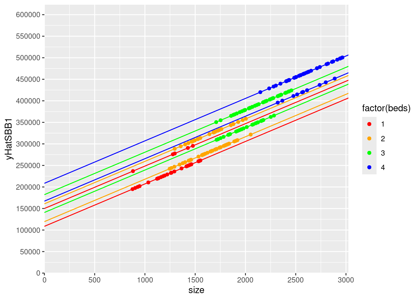
The spacing between the same colored lines is for between one and two bathroom houses with the same number of bedrooms. This distance is represented by baths : 41370.26
But holding number of bathrooms constant, the difference in predicted price when adding another bedroom is:
One to Two Bedrooms: 10914.48
Two to Three Bedrooms: 21243.33
Three to Four Bedrooms: 26378.28
Similar to modelB we see that the difference between bedrooms is different.