3 Intro to the Tidyverse
https://learn.datacamp.com/courses/introduction-to-the-tidyverse
Main functions and concepts covered in this chapter:
- pipes (
%>%) filter()arrange()mutate()ggplot()scale_x_log10()- faceting (
facet_wrap()) summarizegroup_by- Assignment operator (
<-) expand_limits(y=0)geom_point()geom_line()geom_col()geom_histogram()geom_boxplot()labs()
Packages used in this chapter:
## Load all packages used in this chapter
library(tidyverse) #includes dplyr, ggplot2, and other common packages, so we typically just load tidyverse instead of loading them separately (otherwise people tend to load the the same packages multiple times which slows things down)
## ── Attaching core tidyverse packages ──────────────────────── tidyverse 2.0.0 ──
## ✔ dplyr 1.1.4 ✔ readr 2.1.6
## ✔ forcats 1.0.1 ✔ stringr 1.6.0
## ✔ ggplot2 4.0.1 ✔ tibble 3.3.0
## ✔ lubridate 1.9.4 ✔ tidyr 1.3.1
## ✔ purrr 1.2.0
## ── Conflicts ────────────────────────────────────────── tidyverse_conflicts() ──
## ✖ dplyr::filter() masks stats::filter()
## ✖ dplyr::lag() masks stats::lag()
## ℹ Use the conflicted package (<http://conflicted.r-lib.org/>) to force all conflicts to become errorsDatasets used in this chapter:
## Load datasets used in this chapter
# The only dataset used is from the gapminder package
#   so it is loaded automatically when we load the gapminder package
#   (i.e., when we call library(gapminder))
# DataCamp has a link to a .tsv file named gapminder that you can use instead
#   It can be loaded like this:
# gapminder2 <- read_tsv("https://assets.datacamp.com/production/repositories/1323/datasets/578a87c7d1e46b61ec2cfc0aaa1e42acb3d03a11/gapminder.tsv")
# I would use the package, but if for some reason it doesn't seem to match,
#    you can use the DataCamp file instead
3.1 Data wrangling
Before we get started, it’s a good idea to have a general sense of what’s in the dataset we’ll be using:
## tibble [1,704 × 6] (S3: tbl_df/tbl/data.frame)
##  $ country  : Factor w/ 142 levels "Afghanistan",..: 1 1 1 1 1 1 1 1 1 1 ...
##  $ continent: Factor w/ 5 levels "Africa","Americas",..: 3 3 3 3 3 3 3 3 3 3 ...
##  $ year     : int [1:1704] 1952 1957 1962 1967 1972 1977 1982 1987 1992 1997 ...
##  $ lifeExp  : num [1:1704] 28.8 30.3 32 34 36.1 ...
##  $ pop      : int [1:1704] 8425333 9240934 10267083 11537966 13079460 14880372 12881816 13867957 16317921 22227415 ...
## $ gdpPercap: num [1:1704] 779 821 853 836 740 ...## country continent year lifeExp
## Afghanistan: 12 Africa :624 Min. :1952 Min. :23.60
## Albania : 12 Americas:300 1st Qu.:1966 1st Qu.:48.20
## Algeria : 12 Asia :396 Median :1980 Median :60.71
## Angola : 12 Europe :360 Mean :1980 Mean :59.47
## Argentina : 12 Oceania : 24 3rd Qu.:1993 3rd Qu.:70.85
## Australia : 12 Max. :2007 Max. :82.60
## (Other) :1632
## pop gdpPercap
## Min. :6.001e+04 Min. : 241.2
## 1st Qu.:2.794e+06 1st Qu.: 1202.1
## Median :7.024e+06 Median : 3531.8
## Mean :2.960e+07 Mean : 7215.3
## 3rd Qu.:1.959e+07 3rd Qu.: 9325.5
## Max. :1.319e+09 Max. :113523.1
## # To see how many observations per year, we can convert year to a factor and summarize it
summary(as.factor(gapminder$year))## 1952 1957 1962 1967 1972 1977 1982 1987 1992 1997 2002 2007
## 142 142 142 142 142 142 142 142 142 142 142 1423.1.1 Pipe Operator
%>%: the pipe operator: take whatever is before it, and feed it into the next step.
In other words, a %>% sum(b) is the same as `sum(a+b)
## [1] 33.1.2 Filter
In the tidyverse (dplyr is one of the tidyverse packages), functions that do things to or with a dataset are called “verbs”. Our first verb is filter().
The filter() verb extracts particular observations based on a condition
For example, we can get only observations for year 1957
## # A tibble: 142 × 6
##    country     continent  year lifeExp      pop gdpPercap
##    <fct>       <fct>     <int>   <dbl>    <int>     <dbl>
##  1 Afghanistan Asia       1957    30.3  9240934      821.
##  2 Albania     Europe     1957    59.3  1476505     1942.
##  3 Algeria     Africa     1957    45.7 10270856     3014.
##  4 Angola      Africa     1957    32.0  4561361     3828.
##  5 Argentina   Americas   1957    64.4 19610538     6857.
##  6 Australia   Oceania    1957    70.3  9712569    10950.
##  7 Austria     Europe     1957    67.5  6965860     8843.
##  8 Bahrain     Asia       1957    53.8   138655    11636.
##  9 Bangladesh  Asia       1957    39.3 51365468      662.
## 10 Belgium     Europe     1957    69.2  8989111     9715.
## # ℹ 132 more rows
We see 10 rows, and it says there are 132 more rows. We know from the summary above that there are 142 observations per year, so that makes sense.
You can also filter for multiple conditions:
## # A tibble: 1 × 6
##   country continent  year lifeExp        pop gdpPercap
##   <fct>   <fct>     <int>   <dbl>      <int>     <dbl>
## 1 China   Asia       2002    72.0 1280400000     3119.
# Filter for China or Japan in 2002
gapminder %>% filter(year==2002 & (country == "China" | country == "Japan"))## # A tibble: 2 × 6
## country continent year lifeExp pop gdpPercap
## <fct> <fct> <int> <dbl> <int> <dbl>
## 1 China Asia 2002 72.0 1280400000 3119.
## 2 Japan Asia 2002 82 127065841 28605.## # A tibble: 4 × 6
## country continent year lifeExp pop gdpPercap
## <fct> <fct> <int> <dbl> <int> <dbl>
## 1 China Asia 1992 68.7 1164970000 1656.
## 2 China Asia 1997 70.4 1230075000 2289.
## 3 China Asia 2002 72.0 1280400000 3119.
## 4 China Asia 2007 73.0 1318683096 4959.3.1.3 Arrange
You use arrange() to sort observations in ascending or descending order of a particular variable. Use desc() around the variable name to sort in descending order (default is ascending).
## # A tibble: 1,704 × 6
##    country      continent  year lifeExp     pop gdpPercap
##    <fct>        <fct>     <int>   <dbl>   <int>     <dbl>
##  1 Rwanda       Africa     1992    23.6 7290203      737.
##  2 Afghanistan  Asia       1952    28.8 8425333      779.
##  3 Gambia       Africa     1952    30    284320      485.
##  4 Angola       Africa     1952    30.0 4232095     3521.
##  5 Sierra Leone Africa     1952    30.3 2143249      880.
##  6 Afghanistan  Asia       1957    30.3 9240934      821.
##  7 Cambodia     Asia       1977    31.2 6978607      525.
##  8 Mozambique   Africa     1952    31.3 6446316      469.
##  9 Sierra Leone Africa     1957    31.6 2295678     1004.
## 10 Burkina Faso Africa     1952    32.0 4469979      543.
## # ℹ 1,694 more rows## # A tibble: 1,704 × 6
## country continent year lifeExp pop gdpPercap
## <fct> <fct> <int> <dbl> <int> <dbl>
## 1 Japan Asia 2007 82.6 127467972 31656.
## 2 Hong Kong, China Asia 2007 82.2 6980412 39725.
## 3 Japan Asia 2002 82 127065841 28605.
## 4 Iceland Europe 2007 81.8 301931 36181.
## 5 Switzerland Europe 2007 81.7 7554661 37506.
## 6 Hong Kong, China Asia 2002 81.5 6762476 30209.
## 7 Australia Oceania 2007 81.2 20434176 34435.
## 8 Spain Europe 2007 80.9 40448191 28821.
## 9 Sweden Europe 2007 80.9 9031088 33860.
## 10 Israel Asia 2007 80.7 6426679 25523.
## # ℹ 1,694 more rows3.1.4 Mutate
The mutate() verb changes the values in a column or adds a new column.
Change life expectancy from being measured in years to being measured in months
# Use mutate to create a new column called lifeExpMonths
gapminder %>% mutate(lifeExpMonths = lifeExp * 12)
## # A tibble: 1,704 × 7
## country continent year lifeExp pop gdpPercap lifeExpMonths
## <fct> <fct> <int> <dbl> <int> <dbl> <dbl>
## 1 Afghanistan Asia 1952 28.8 8425333 779. 346.
## 2 Afghanistan Asia 1957 30.3 9240934 821. 364.
## 3 Afghanistan Asia 1962 32.0 10267083 853. 384.
## 4 Afghanistan Asia 1967 34.0 11537966 836. 408.
## 5 Afghanistan Asia 1972 36.1 13079460 740. 433.
## 6 Afghanistan Asia 1977 38.4 14880372 786. 461.
## 7 Afghanistan Asia 1982 39.9 12881816 978. 478.
## 8 Afghanistan Asia 1987 40.8 13867957 852. 490.
## 9 Afghanistan Asia 1992 41.7 16317921 649. 500.
## 10 Afghanistan Asia 1997 41.8 22227415 635. 501.
## # ℹ 1,694 more rows3.1.5 Combining verbs
We can also combine multiple verbs. Each verb produces output. Using pipes, we just pipe the output of one step into the next verb.
# Sort countries by population in the year 2007
gapminder %>%
    filter(year==2007) %>%
    arrange(desc(pop))
## # A tibble: 142 × 6
## country continent year lifeExp pop gdpPercap
## <fct> <fct> <int> <dbl> <int> <dbl>
## 1 China Asia 2007 73.0 1318683096 4959.
## 2 India Asia 2007 64.7 1110396331 2452.
## 3 United States Americas 2007 78.2 301139947 42952.
## 4 Indonesia Asia 2007 70.6 223547000 3541.
## 5 Brazil Americas 2007 72.4 190010647 9066.
## 6 Pakistan Asia 2007 65.5 169270617 2606.
## 7 Bangladesh Asia 2007 64.1 150448339 1391.
## 8 Nigeria Africa 2007 46.9 135031164 2014.
## 9 Japan Asia 2007 82.6 127467972 31656.
## 10 Mexico Americas 2007 76.2 108700891 11978.
## # ℹ 132 more rowsNote how the pipe goes at the end of a line when we want to use another verb
We can also use variables created in earlier steps. Here we create the life expectancy in months variable, and then sort by it (after filtering to only have 2007)
# Filter, mutate, and arrange the gapminder dataset
gapminder %>% filter(year == 2007) %>%
    mutate(lifeExpMonths = 12 * lifeExp) %>%
    arrange(desc(lifeExpMonths))
## # A tibble: 142 × 7
## country continent year lifeExp pop gdpPercap lifeExpMonths
## <fct> <fct> <int> <dbl> <int> <dbl> <dbl>
## 1 Japan Asia 2007 82.6 127467972 31656. 991.
## 2 Hong Kong, China Asia 2007 82.2 6980412 39725. 986.
## 3 Iceland Europe 2007 81.8 301931 36181. 981.
## 4 Switzerland Europe 2007 81.7 7554661 37506. 980.
## 5 Australia Oceania 2007 81.2 20434176 34435. 975.
## 6 Spain Europe 2007 80.9 40448191 28821. 971.
## 7 Sweden Europe 2007 80.9 9031088 33860. 971.
## 8 Israel Asia 2007 80.7 6426679 25523. 969.
## 9 France Europe 2007 80.7 61083916 30470. 968.
## 10 Canada Americas 2007 80.7 33390141 36319. 968.
## # ℹ 132 more rows3.2 Data visualization
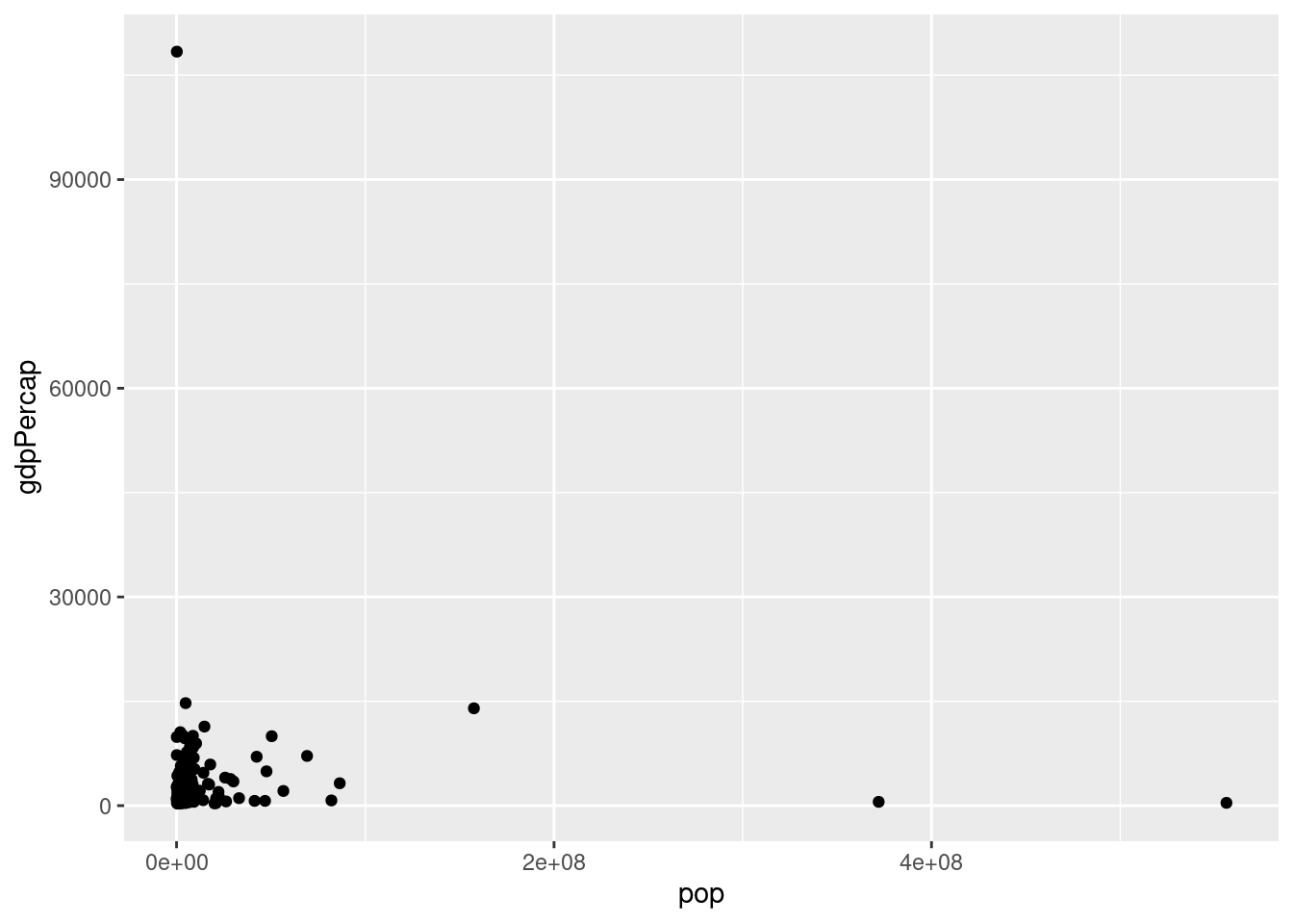
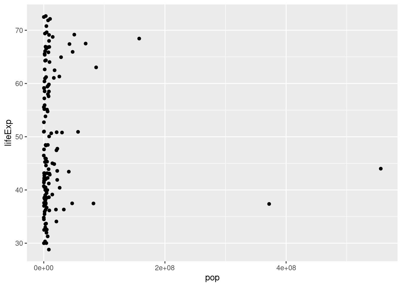
3.2.2 Log transformations
The previous created a scatter plot with population on the x-axis and life expectancy on the y-axis. Since population is spread over several orders of magnitude, with some countries having a much higher population than others, it’s a good idea to put the x-axis on a log scale.
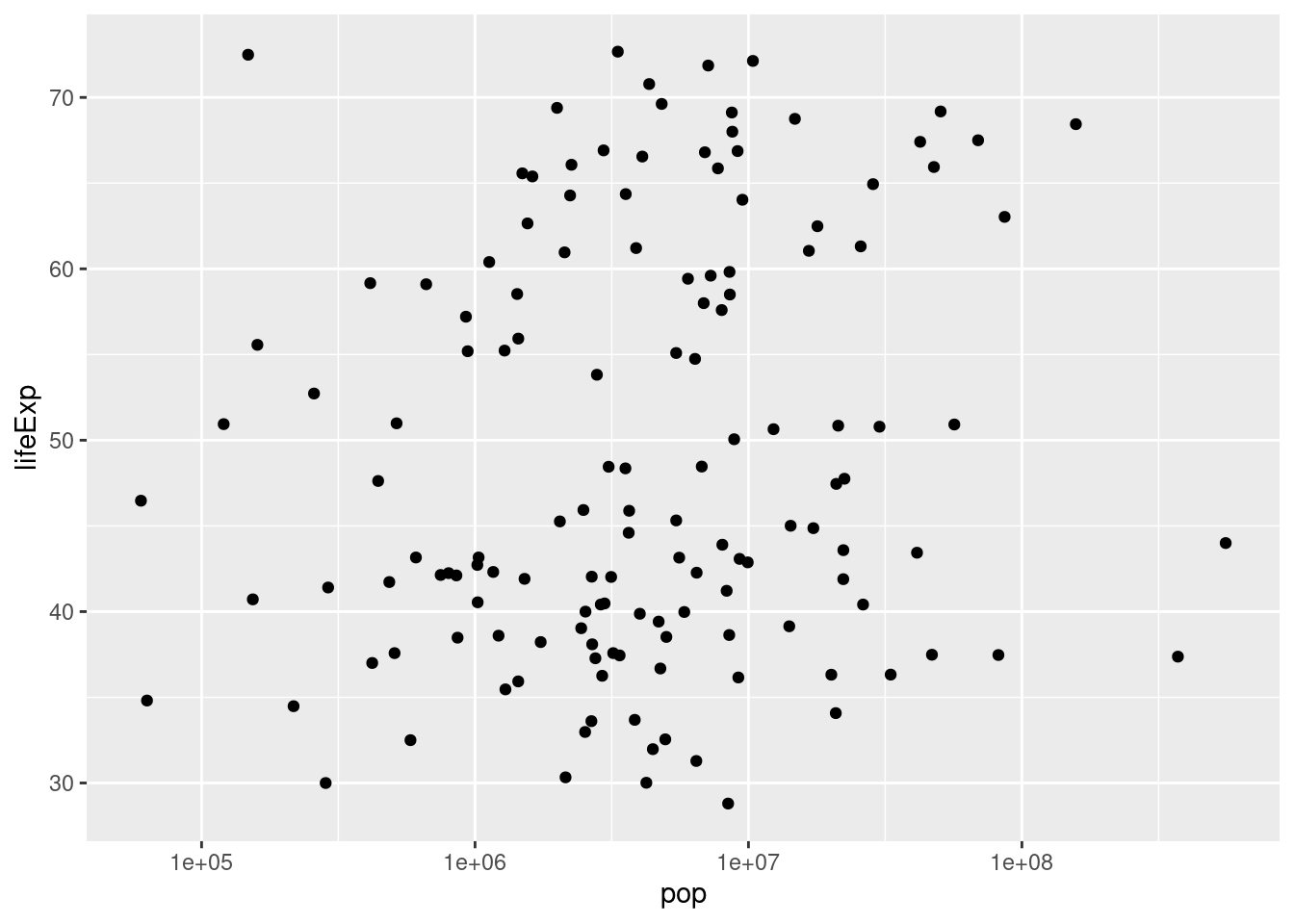
Sometimes it may be appropriate to place both axes on a log scale
ggplot(gapminder_1952, aes(x = pop, y = gdpPercap)) +
geom_point() +
scale_x_log10() +
scale_y_log10()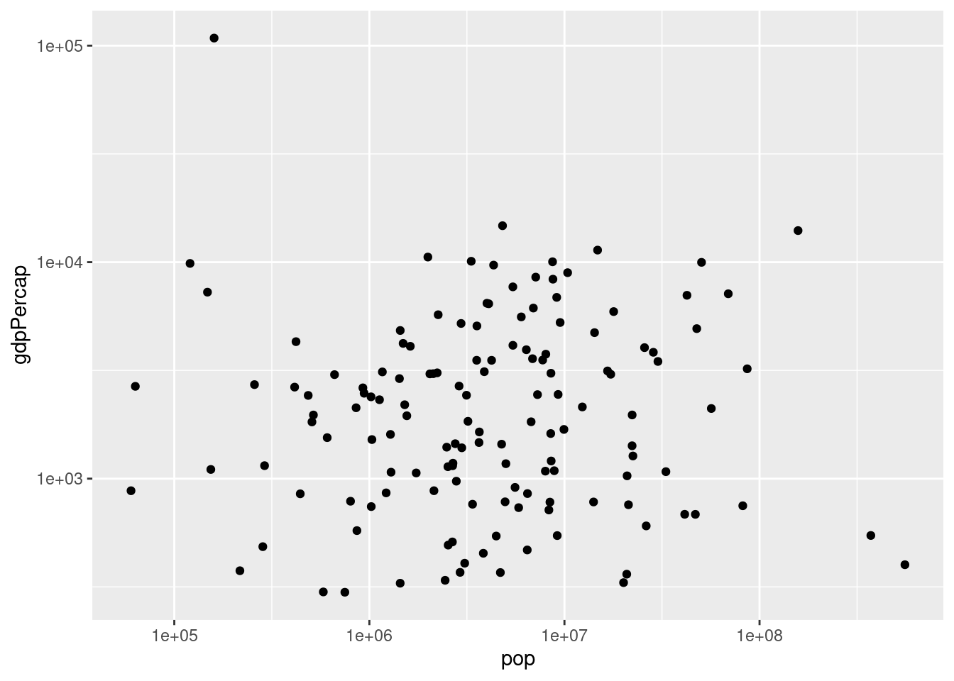
3.2.3 Additional aesthetics
Color can be added as another aesthetic in a scatterplot. This works well for distinguishing between different categorical variables.
ggplot(gapminder_1952, aes(x = pop, y = lifeExp, color = continent)) +
geom_point() + scale_x_log10()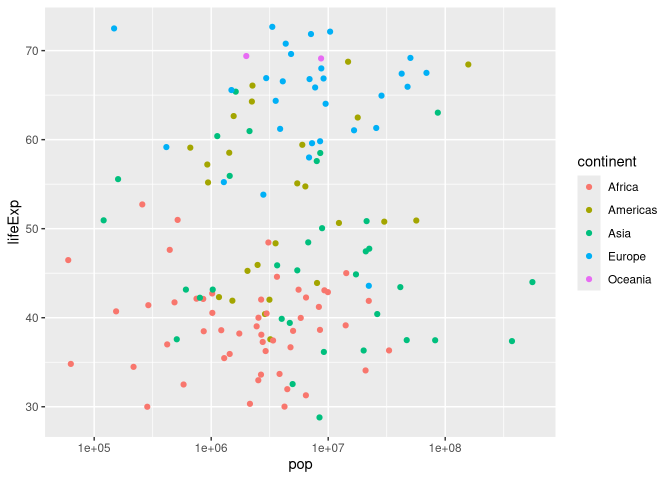
Size is another aesthetic that can be used. This is effective with quantitative variables.
ggplot(gapminder_1952, aes(x = pop, y = lifeExp, color = continent, size = gdpPercap)) +
geom_point() +
scale_x_log10()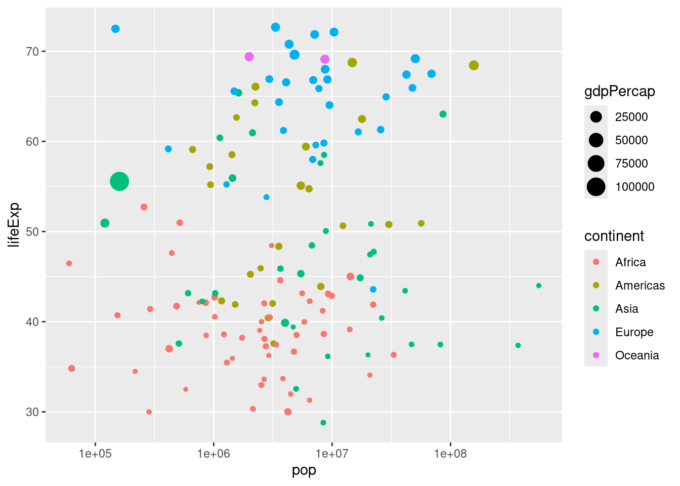
3.2.4 Faceting
Faceting can be used to divide a graph into subplots based on one of its variables, such as the continent.
ggplot(gapminder_1952, aes(x = pop, y = lifeExp))+
geom_point()+
scale_x_log10()+
facet_wrap(~continent)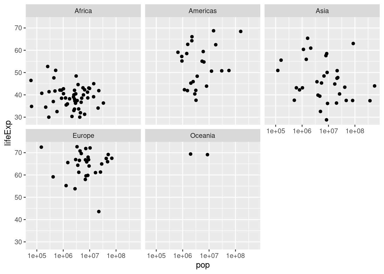
All of these tools can be combined (when appropriate) to help us learn more about our respective data. In this case, we are able to understand how global statistics have changed over time
ggplot(gapminder, aes(x=gdpPercap, y = lifeExp, color = continent, size = pop))+
geom_point()+
scale_x_log10()+
facet_wrap(~year)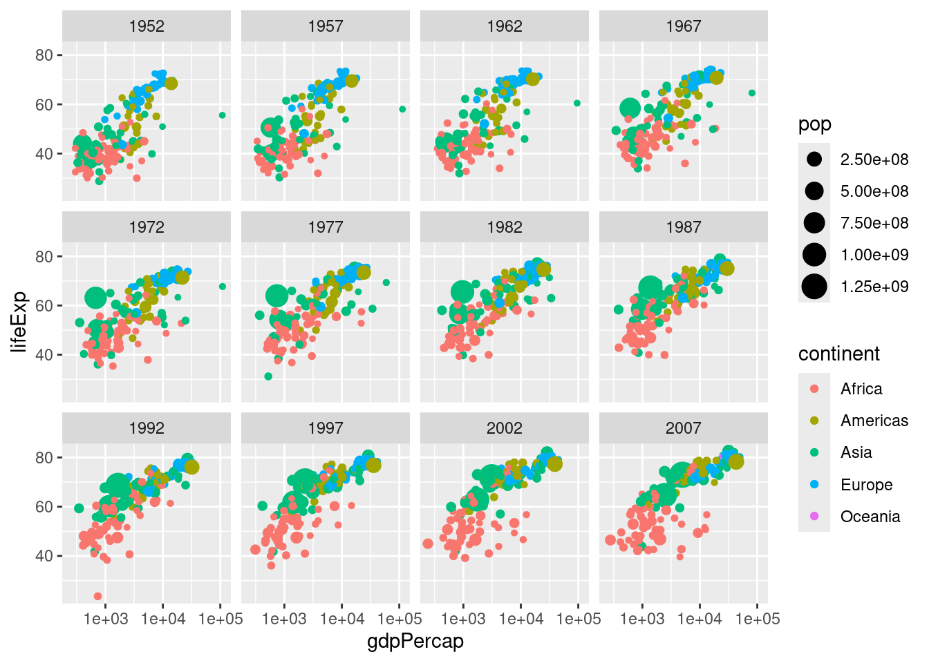
3.3 Grouping and summarizing
3.3.1 Summarize
We can use mean() and sum() with summarize()to draw conclusions across a dataset. We will use these functions to find the mean life expectancy and total population.
## # A tibble: 1 × 2
## meanLifeExp totalpop
## <dbl> <dbl>
## 1 59.5 50440465801You’ve seen how to find the mean life expectancy and the total population across a set of observations, but mean() and sum() are only two of the functions R provides for summarizing a collection of numbers. Here, you’ll learn to use the median() function in combination with summarize().
## # A tibble: 1 × 1
## medianLifeExp
## <dbl>
## 1 60.7These conclusions can be more helpful if we also use filter(). Rather than summarizing the entire dataset, you may want to find the median life expectancy for only one particular year. In this case, you’ll find the median in the year 1957.
## # A tibble: 1 × 1
## medianLifeExp
## <dbl>
## 1 48.4The summarize() verb allows you to summarize multiple variables at once. In this case, you’ll use the median() function to find the median life expectancy and the max() function to find the maximum GDP per capita.
gapminder%>%
filter(year == 1957)%>%
summarize(medianLifeExp = median(lifeExp),
maxGdpPercap = max(gdpPercap))## # A tibble: 1 × 2
## medianLifeExp maxGdpPercap
## <dbl> <dbl>
## 1 48.4 113523.3.3.2 Group_by
Using group_by() we can perform the tasks that could be repetitive if we filtered by each variable (year in this example). In a previous exercise, you found the median life expectancy and the maximum GDP per capita in the year 1957. Now, you’ll perform those two summaries within each year in the dataset.
gapminder %>%
group_by(year) %>%
summarize(medianLifeExp = median(lifeExp),
maxGdpPercap = max(gdpPercap))## # A tibble: 12 × 3
## year medianLifeExp maxGdpPercap
## <int> <dbl> <dbl>
## 1 1952 45.1 108382.
## 2 1957 48.4 113523.
## 3 1962 50.9 95458.
## 4 1967 53.8 80895.
## 5 1972 56.5 109348.
## 6 1977 59.7 59265.
## 7 1982 62.4 33693.
## 8 1987 65.8 31541.
## 9 1992 67.7 34933.
## 10 1997 69.4 41283.
## 11 2002 70.8 44684.
## 12 2007 71.9 49357.You can group by any variable in your dataset to create a summary, not just time.
gapminder %>%
filter(year == 1957) %>%
group_by(continent) %>%
summarize(medianLifeExp = median(lifeExp),
maxGdpPercap = max(gdpPercap)) ## # A tibble: 5 × 3
## continent medianLifeExp maxGdpPercap
## <fct> <dbl> <dbl>
## 1 Africa 40.6 5487.
## 2 Americas 56.1 14847.
## 3 Asia 48.3 113523.
## 4 Europe 67.6 17909.
## 5 Oceania 70.3 12247.You can group by multiple variables as well (this can be very useful). Instead of grouping just by year, or just by continent, you’ll now group by both continent and year to summarize within each.
gapminder %>%
group_by(continent, year) %>%
summarize(medianLifeExp = median(lifeExp),
maxGdpPercap = max(gdpPercap))## `summarise()` has grouped output by 'continent'. You can override using the
## `.groups` argument.## # A tibble: 60 × 4
## # Groups: continent [5]
## continent year medianLifeExp maxGdpPercap
## <fct> <int> <dbl> <dbl>
## 1 Africa 1952 38.8 4725.
## 2 Africa 1957 40.6 5487.
## 3 Africa 1962 42.6 6757.
## 4 Africa 1967 44.7 18773.
## 5 Africa 1972 47.0 21011.
## 6 Africa 1977 49.3 21951.
## 7 Africa 1982 50.8 17364.
## 8 Africa 1987 51.6 11864.
## 9 Africa 1992 52.4 13522.
## 10 Africa 1997 52.8 14723.
## # ℹ 50 more rows3.3.3 Visualizing summarized data
In the last chapter, you summarized the gapminder data to calculate the median life expectancy within each year. This code is provided for you, and is saved (with <-) as the by_year dataset.
Now you can use the ggplot2 package to turn this into a visualization of changing life expectancy over time.
by_year <- gapminder %>%
group_by(year) %>%
summarize(medianLifeExp = median(lifeExp),
maxGdpPercap = max(gdpPercap))
ggplot(by_year, aes(x = year, y = medianLifeExp))+
geom_point()+
expand_limits(y = 0)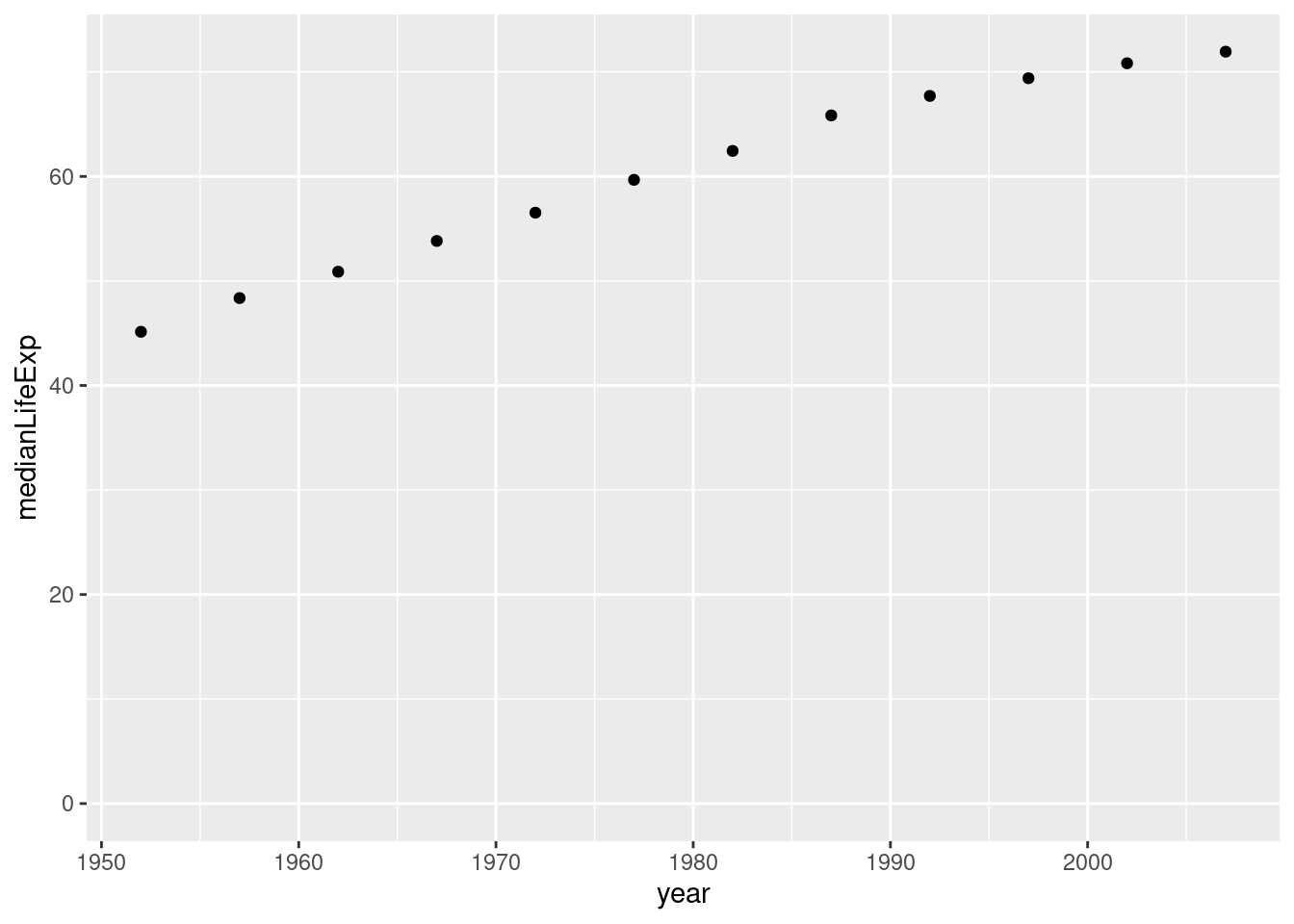
In the last exercise you were able to see how the median life expectancy of countries changed over time. Now you’ll examine the median GDP per capita instead, and see how the trend differs among continents.
by_year_continent <- gapminder %>%
group_by(continent, year) %>%
summarize(medianGdpPercap = median(gdpPercap))## `summarise()` has grouped output by 'continent'. You can override using the
## `.groups` argument.ggplot(by_year_continent, aes(x = year, y = medianGdpPercap, color = continent)) +
geom_point()+
expand_limits(y=0)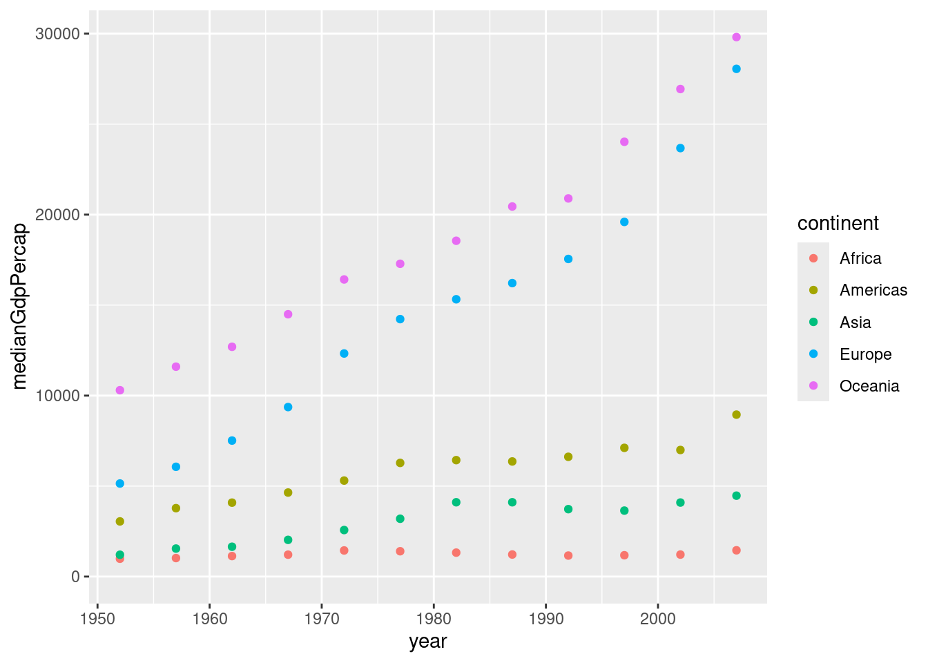
In these exercises you’ve generally created plots that show change over time. But as another way of exploring your data visually, you can also use ggplot2 to plot summarized data to compare continents within a single year.
by_continent_2007 <- gapminder %>%
filter(year == 2007) %>%
group_by(continent) %>%
summarize(medianLifeExp = median(lifeExp),
medianGdpPercap = median(gdpPercap))
ggplot(by_continent_2007, aes(x = medianGdpPercap, y = medianLifeExp, color = continent))+
geom_point()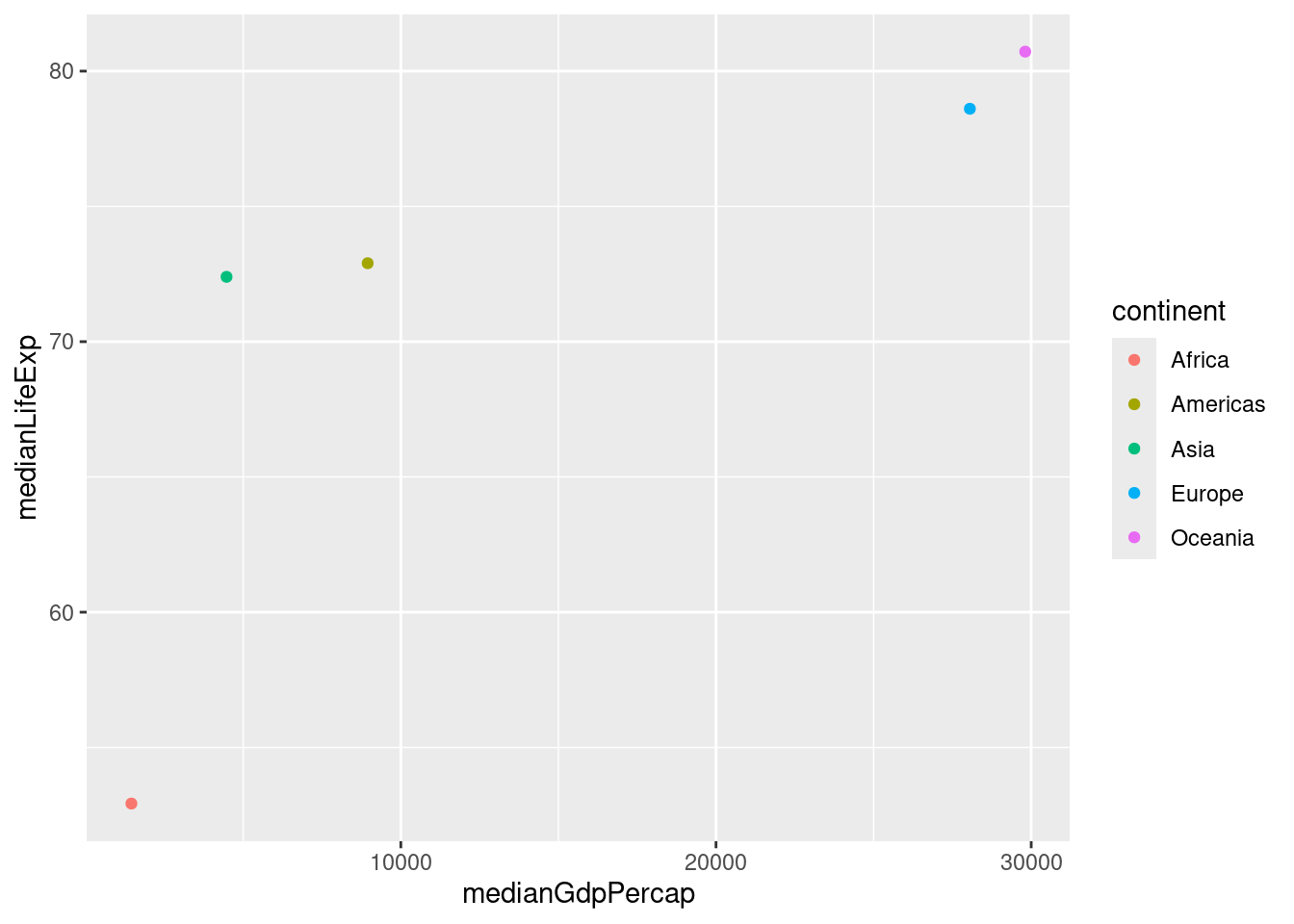
3.4 Types of visualizations
3.4.1 Line plots
A line plot is useful for visualizing trends over time. In this exercise, you’ll examine how the median GDP per capita has changed over time.
by_year <- gapminder %>%
group_by(year) %>%
summarize(medianGdpPercap = median(gdpPercap))
ggplot(by_year, aes(x = year, y = medianGdpPercap)) +
geom_line() +
expand_limits(y = 0)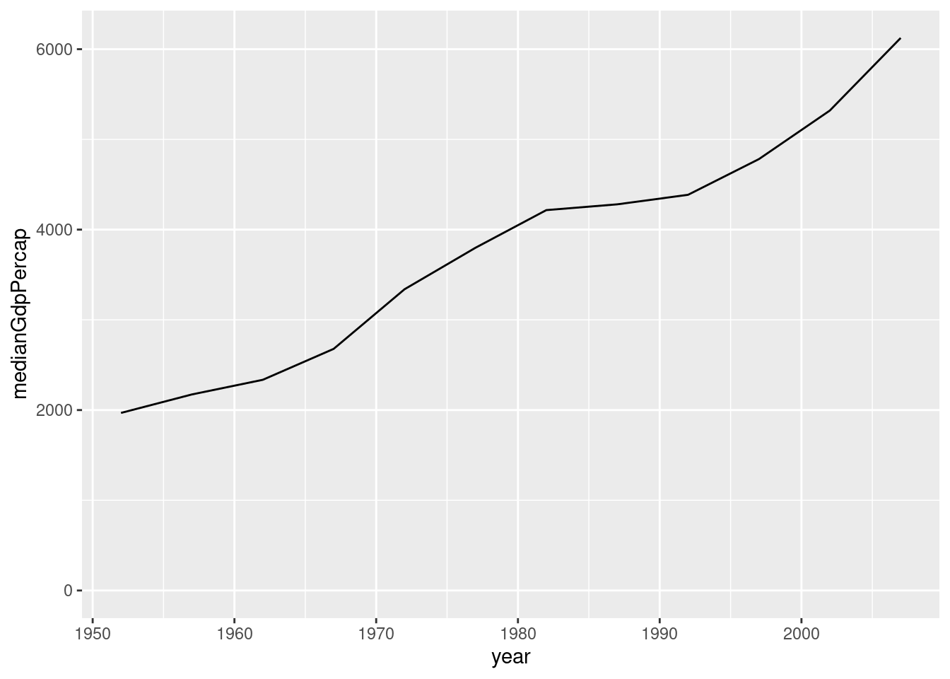
Similar to with geom_point(), we can also use the color aesthetic. In the last exercise you used a line plot to visualize the increase in median GDP per capita over time. Now you’ll examine the change within each continent.
ggplot(by_year_continent, aes(x = year, y = medianGdpPercap, color = continent))+
geom_line()+
expand_limits(y = 0)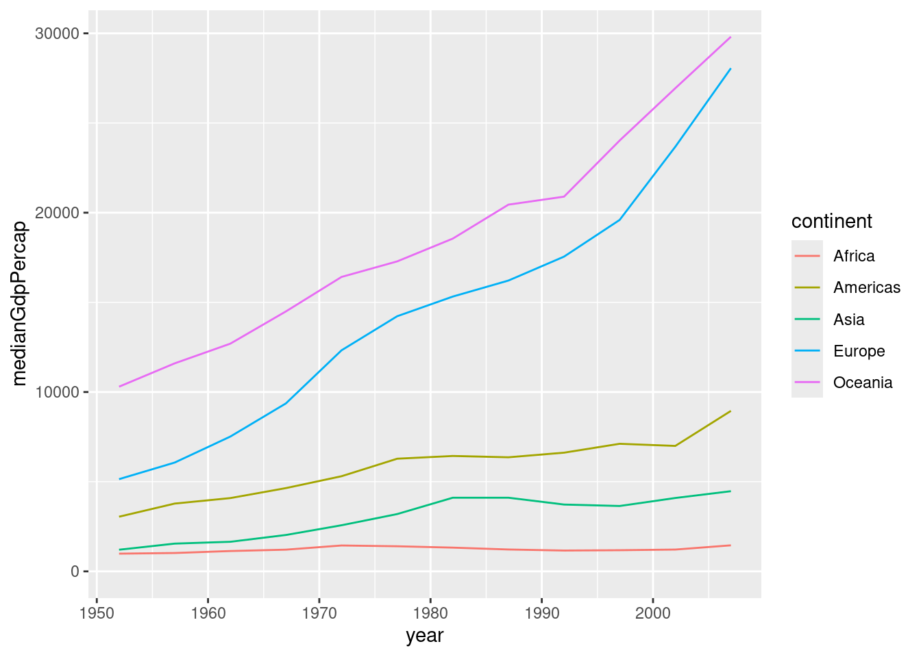
3.4.2 Bar plots
A bar plot is useful for visualizing summary statistics, such as the median GDP in each continent.
by_continent <- gapminder %>%
filter(year== 1952) %>%
group_by(continent) %>%
summarize(medianGdpPercap = median(gdpPercap))
ggplot(by_continent, aes(x = continent, y = medianGdpPercap)) + geom_col()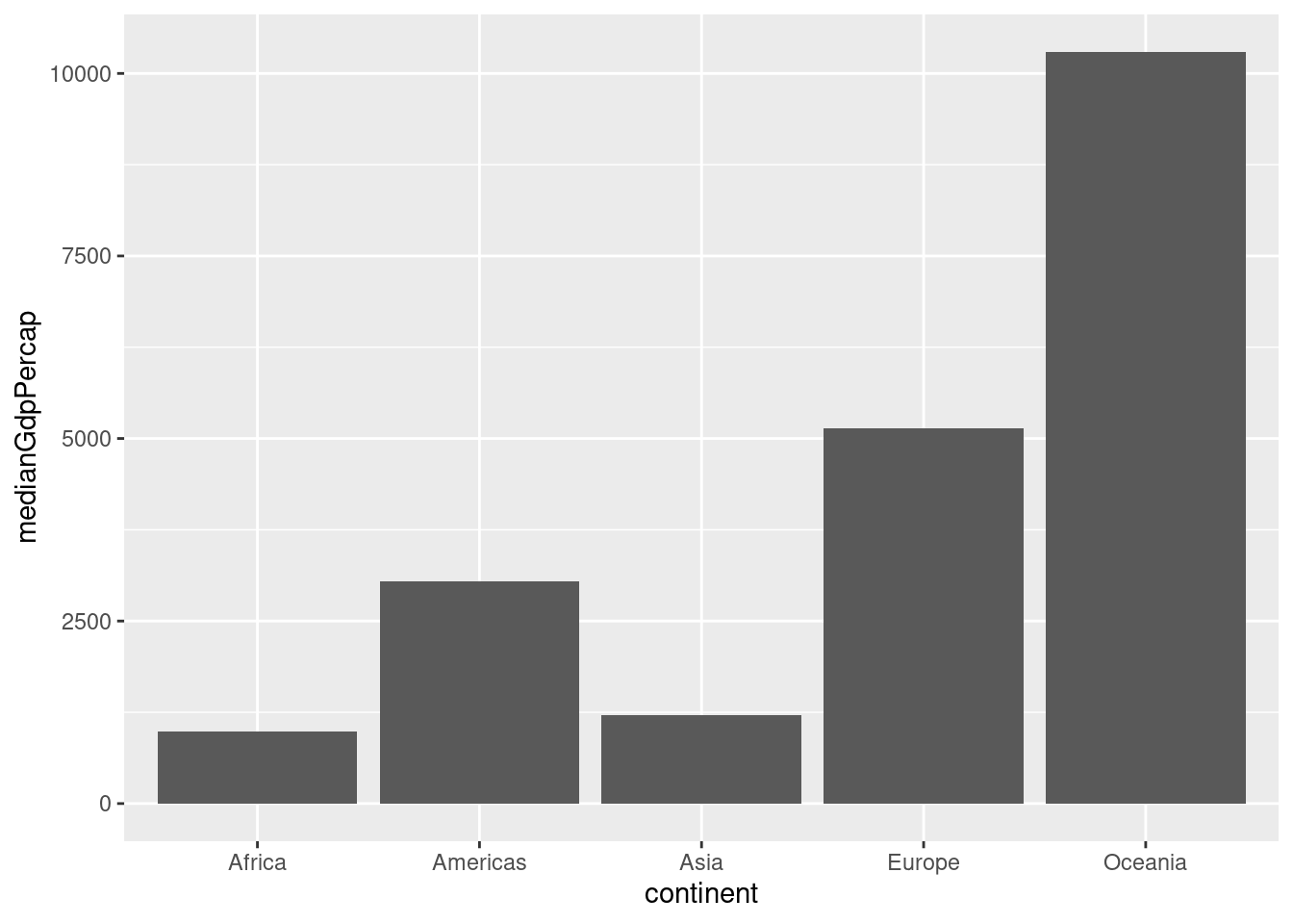
oceania_1952 <- gapminder %>%
filter(year == 1952, continent == "Oceania")
ggplot(oceania_1952, aes(x = country, y = gdpPercap)) +
geom_col()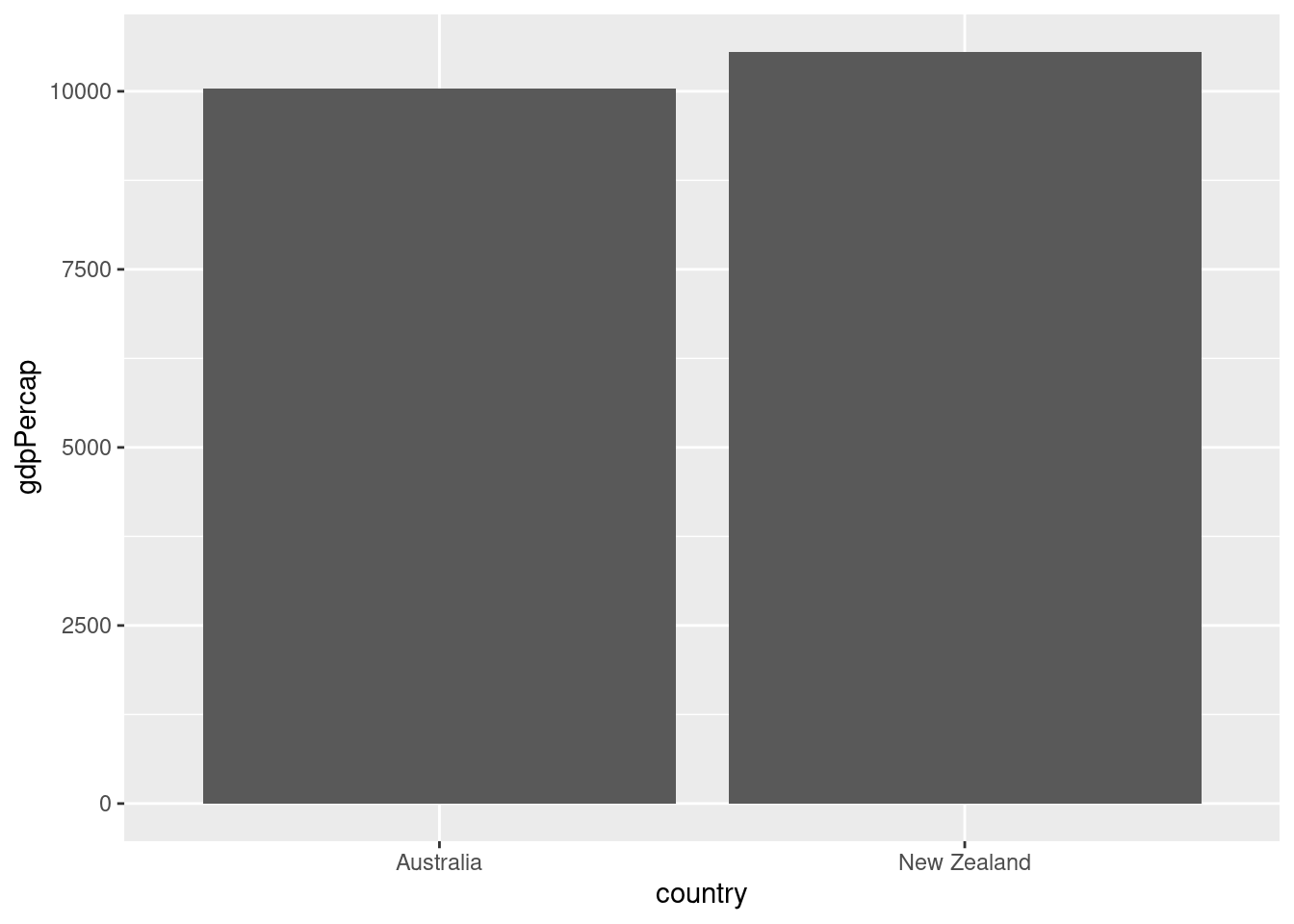
3.4.3 Histograms
A histogram is useful for examining the distribution of a numeric variable. In this exercise, you’ll create a histogram showing the distribution of country populations (by millions) in the year 1952.
gapminder_1952 <- gapminder %>%
filter(year == 1952) %>%
mutate(pop_by_mil = pop / 1000000)
ggplot(gapminder_1952, aes(x = pop_by_mil)) +
geom_histogram(bins = 50)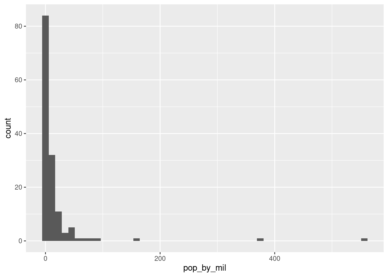
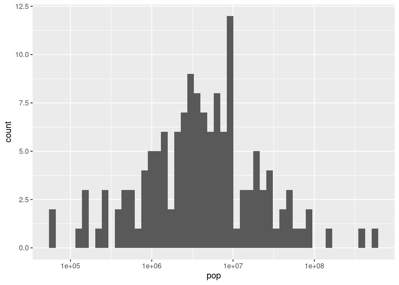
In the last exercise you created a histogram of populations across countries. You might have noticed that there were several countries with a much higher population than others, which causes the distribution to be very skewed, with most of the distribution crammed into a small part of the graph. (Consider that it’s hard to tell the median or the minimum population from that histogram).
To make the histogram more informative, you can try putting the x-axis on a log scale.
3.4.4 Boxplots
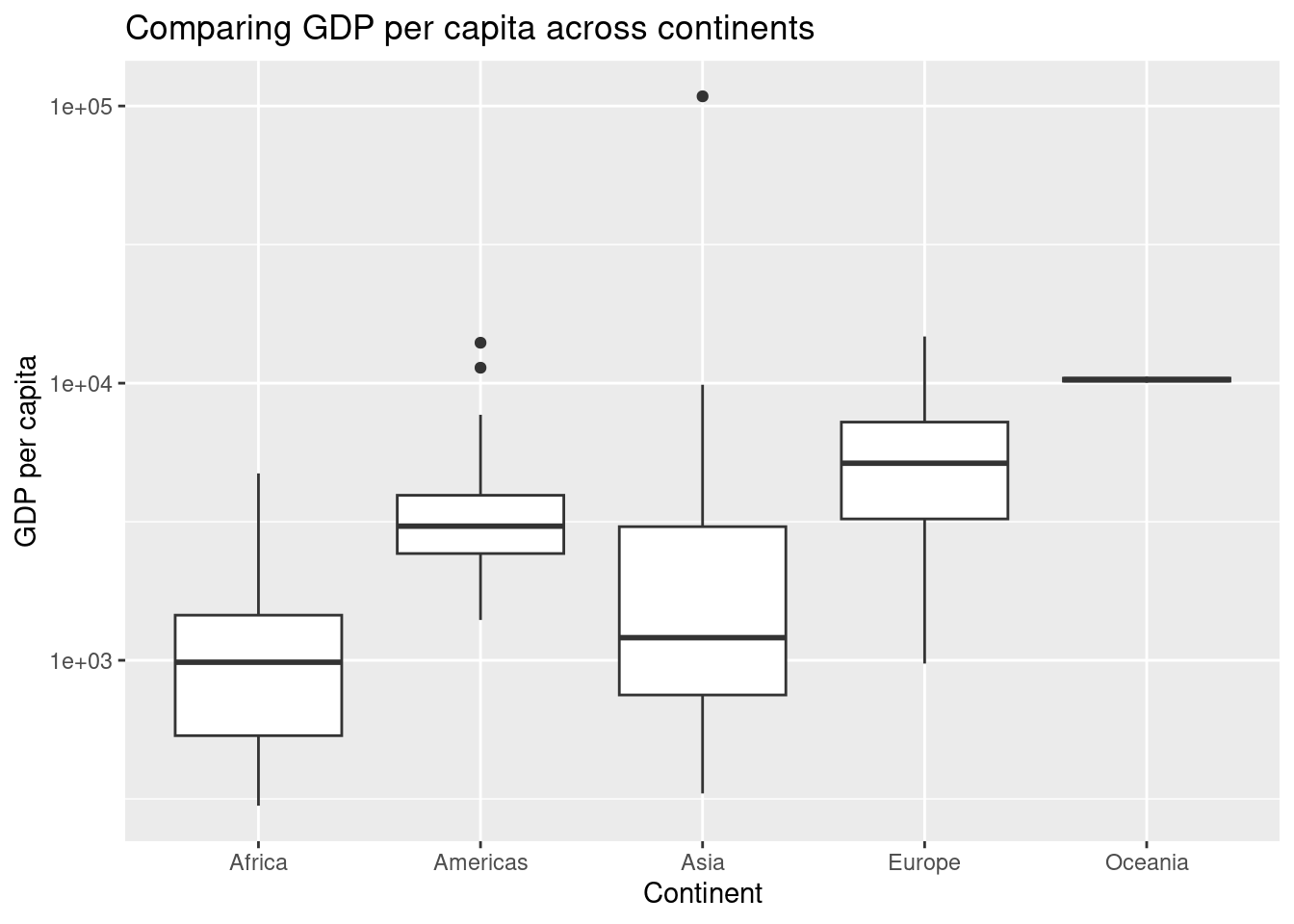
A boxplot is useful for comparing a distribution of values across several groups. In this exercise, you’ll examine the distribution of GDP per capita by continent. Since GDP per capita varies across several orders of magnitude, you’ll need to put the y-axis on a log scale.
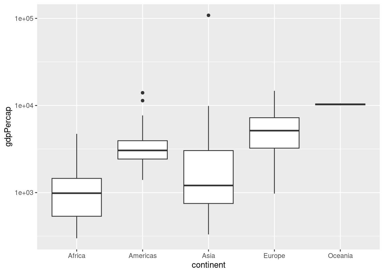
You can also add titles, axis labels, and many other things to our visualizations. Below see a few basic improvements to the professionalism of the above graphic.
ggplot(gapminder_1952, aes(x = continent, y = gdpPercap)) +
  geom_boxplot()+
scale_y_log10() +
labs(title = "Comparing GDP per capita across continents", x = "Continent", y = "GDP per capita")