4 Intro to Data Visualization with ggplot2
https://learn.datacamp.com/courses/introduction-to-data-visualization-with-ggplot2
Main functions and concepts covered in this BP chapter:
geom_point()geom_smooth()scale_*_*()geom_text()- Aesthetics (
color,size,shape,alpha,label) geom_bar()geom_col()geom_histogram()geom_line()position_*()element_line()element_rect()element_text()element_blank()ggthemestheme_set()
Packages used in this chapter:
## Load all packages used in this chapter
library(tidyverse) #includes dplyr, ggplot2, and other common packages
## ── Attaching core tidyverse packages ──────────────────────── tidyverse 2.0.0 ──
## ✔ dplyr 1.1.4 ✔ readr 2.1.6
## ✔ forcats 1.0.1 ✔ stringr 1.6.0
## ✔ ggplot2 4.0.1 ✔ tibble 3.3.0
## ✔ lubridate 1.9.4 ✔ tidyr 1.3.1
## ✔ purrr 1.2.0
## ── Conflicts ────────────────────────────────────────── tidyverse_conflicts() ──
## ✖ dplyr::filter() masks stats::filter()
## ✖ dplyr::lag() masks stats::lag()
## ℹ Use the conflicted package (<http://conflicted.r-lib.org/>) to force all conflicts to become errors# used for vocab dataset
library(carData)
# If you run code to create plt_prop_unemployed_over_time, you need lubridate
library(lubridate)
# For the themes chapter
library(ggthemes)
## For the last plot
library(gapminder)
library(RColorBrewer)Datasets used in this chapter:
## Load datasets used in this chapter
# mtcars, diamonds, economics: part of tidyverse package
# vocab: part of carData package
load("data/fish.RData") # fish.species dataset
Note: A few exercises use the mtcars variable fcyl. They added the fcyl variable to mtcars. It is simply the cyl variable as a factor You know how to do this from learning about mutate in the previous BP chapter (i.e., mtcars <- mtcars %>% mutate(fcyl = factor(cyl))). You also need to do the same thing to create fam, which is the factor version of am.
Note2 : Similarly, for the Vocab dataset, you need to convert education and vocabulary to factor, e.g., Vocab <- Vocab %>% mutate(education = factor(education)) and similarly for vocabulary.
Note 3: this BP chapter is on Introduction to Data Visualization with ggplot2, to further your skills (including some that might be useful later in 380), you are free to also explore Intermediate Data Visualization with ggplot2
4.1 Introduction
To get a first feel for ggplot2, let’s try to run some basic ggplot2 commands. The mtcars dataset contains information on 32 cars from a 1973 issue of Motor Trend magazine. This dataset is small, intuitive, and contains a variety of continuous and categorical variables.
## 'data.frame':    32 obs. of  11 variables:
##  $ mpg : num  21 21 22.8 21.4 18.7 18.1 14.3 24.4 22.8 19.2 ...
##  $ cyl : num  6 6 4 6 8 6 8 4 4 6 ...
##  $ disp: num  160 160 108 258 360 ...
##  $ hp  : num  110 110 93 110 175 105 245 62 95 123 ...
##  $ drat: num  3.9 3.9 3.85 3.08 3.15 2.76 3.21 3.69 3.92 3.92 ...
##  $ wt  : num  2.62 2.88 2.32 3.21 3.44 ...
##  $ qsec: num  16.5 17 18.6 19.4 17 ...
##  $ vs  : num  0 0 1 1 0 1 0 1 1 1 ...
##  $ am  : num  1 1 1 0 0 0 0 0 0 0 ...
##  $ gear: num  4 4 4 3 3 3 3 4 4 4 ...
##  $ carb: num  4 4 1 1 2 1 4 2 2 4 ...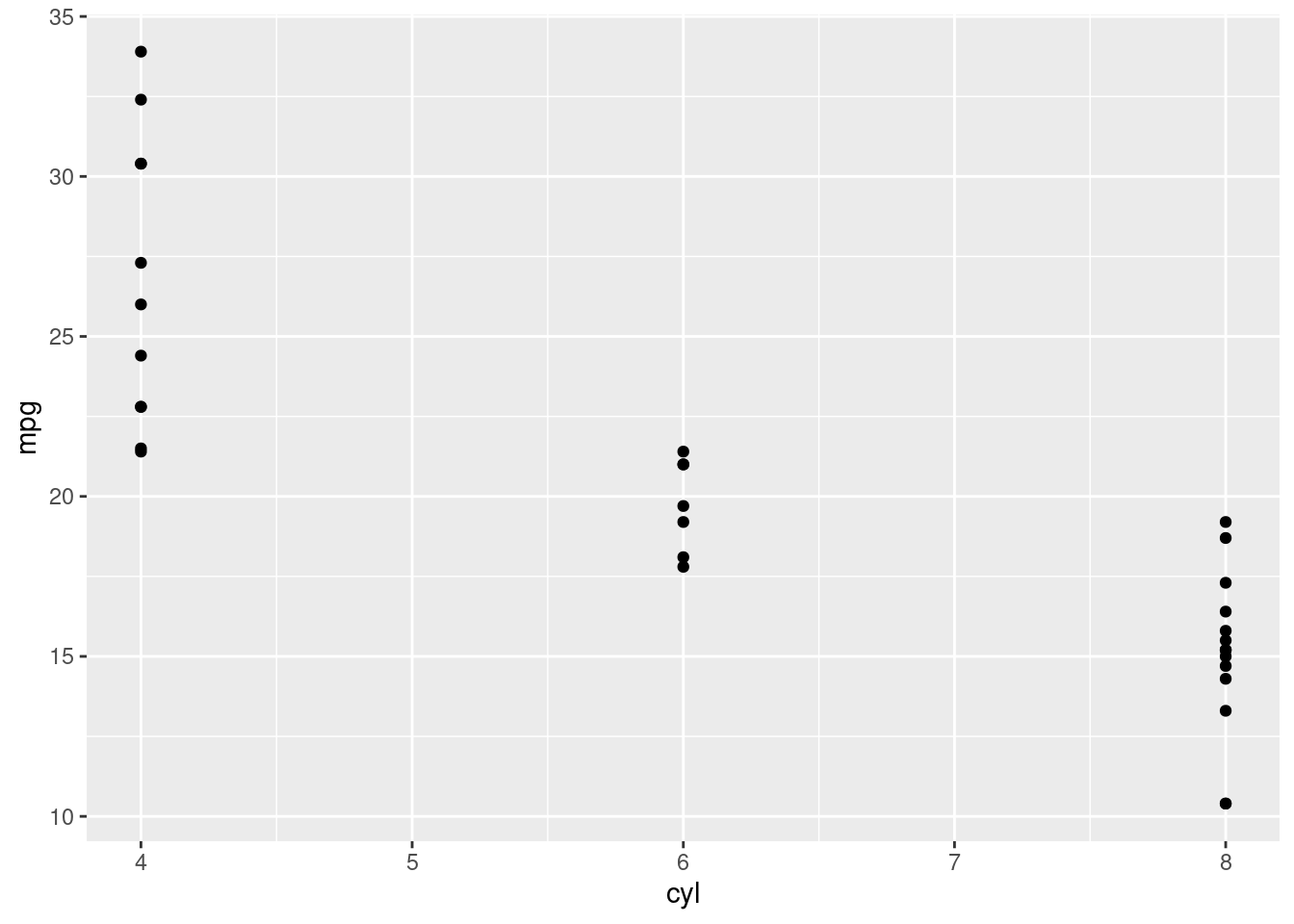
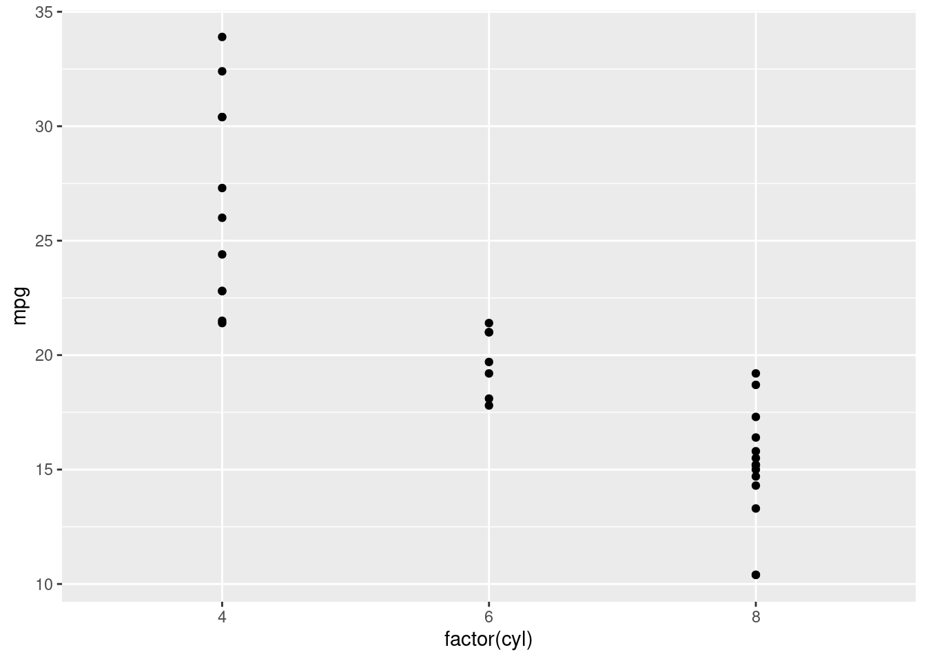
The plot from the previous exercise wasn’t really satisfying. Although cyl (the number of cylinders) is categorical, you probably noticed that it is classified as numeric in mtcars. This is really misleading because the representation in the plot doesn’t match the actual data type. You’ll have to explicitly tell ggplot2 that cyl is a categorical variable.
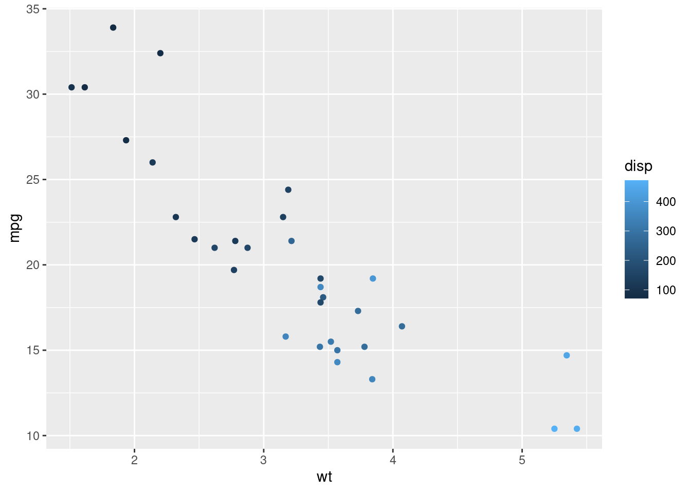
Let’s dive a little deeper into the three main topics in this course: The data, aesthetics, and geom layers. We’ll get to making pretty plots in the last chapter with the themes layer. Now we’ll add color, you could also use the size aesthetic instead.
The diamonds dataset contains details of 1,000 diamonds. Among the variables included are carat (a measurement of the diamond’s size) and price.
You’ll use two common geom layer functions:
geom_point() adds points (as in a scatter plot).
geom_smooth() adds a smooth trend curve.
## tibble [53,940 × 10] (S3: tbl_df/tbl/data.frame)
##  $ carat  : num [1:53940] 0.23 0.21 0.23 0.29 0.31 0.24 0.24 0.26 0.22 0.23 ...
##  $ cut    : Ord.factor w/ 5 levels "Fair"<"Good"<..: 5 4 2 4 2 3 3 3 1 3 ...
##  $ color  : Ord.factor w/ 7 levels "D"<"E"<"F"<"G"<..: 2 2 2 6 7 7 6 5 2 5 ...
##  $ clarity: Ord.factor w/ 8 levels "I1"<"SI2"<"SI1"<..: 2 3 5 4 2 6 7 3 4 5 ...
##  $ depth  : num [1:53940] 61.5 59.8 56.9 62.4 63.3 62.8 62.3 61.9 65.1 59.4 ...
##  $ table  : num [1:53940] 55 61 65 58 58 57 57 55 61 61 ...
##  $ price  : int [1:53940] 326 326 327 334 335 336 336 337 337 338 ...
##  $ x      : num [1:53940] 3.95 3.89 4.05 4.2 4.34 3.94 3.95 4.07 3.87 4 ...
##  $ y      : num [1:53940] 3.98 3.84 4.07 4.23 4.35 3.96 3.98 4.11 3.78 4.05 ...
## $ z : num [1:53940] 2.43 2.31 2.31 2.63 2.75 2.48 2.47 2.53 2.49 2.39 ...## `geom_smooth()` using method = 'gam' and formula = 'y ~ s(x, bs = "cs")'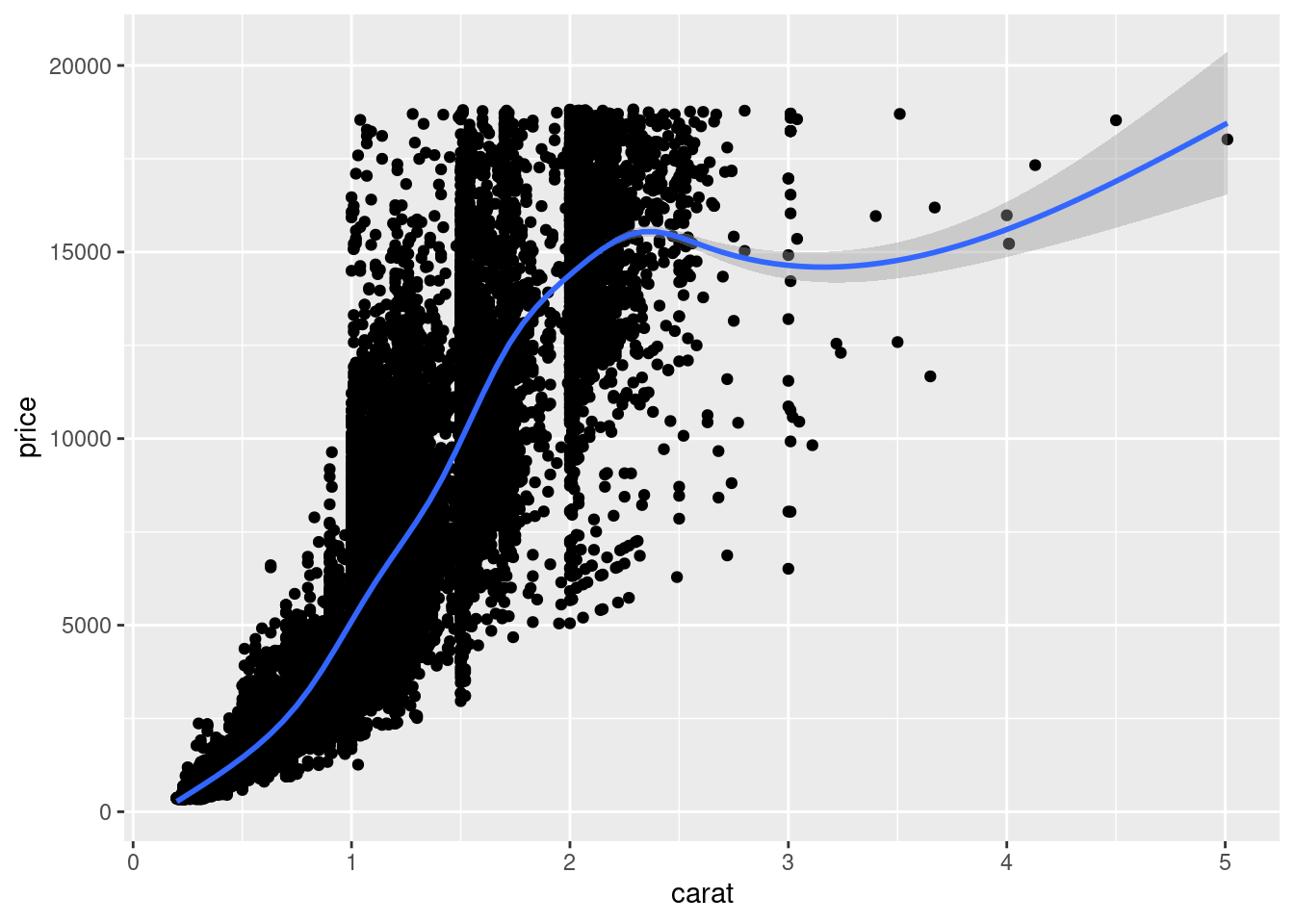
If you have multiple geoms, then mapping an aesthetic to data variable inside the call to ggplot() will change all the geoms. It is also possible to make changes to individual geoms by passing arguments to the geom_*() functions.
geom_point() has an alpha argument that controls the opacity of the points. A value of 1 (the default) means that the points are totally opaque; a value of 0 means the points are totally transparent (and therefore invisible). Values in between specify transparency.
## `geom_smooth()` using method = 'gam' and formula = 'y ~ s(x, bs = "cs")'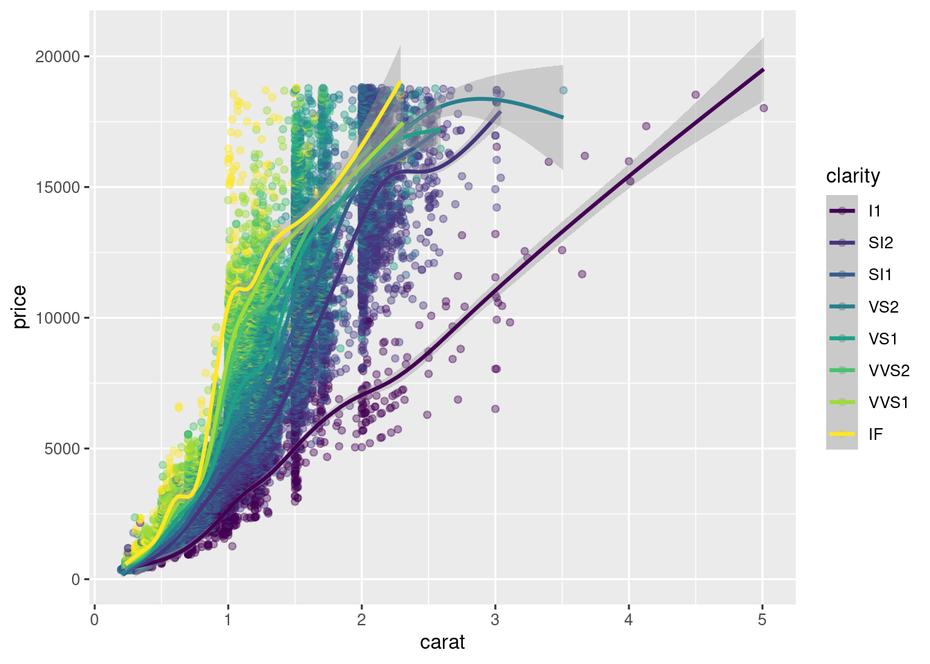
Plots can be saved as variables, which can be added to later on using the + operator. This is really useful if you want to make multiple related plots from a common base.
plt_price_vs_carat <- ggplot(diamonds, aes(carat, price))

plt_price_vs_carat_transparent <- plt_price_vs_carat + geom_point(alpha = 0.2)

plt_price_vs_carat_transparent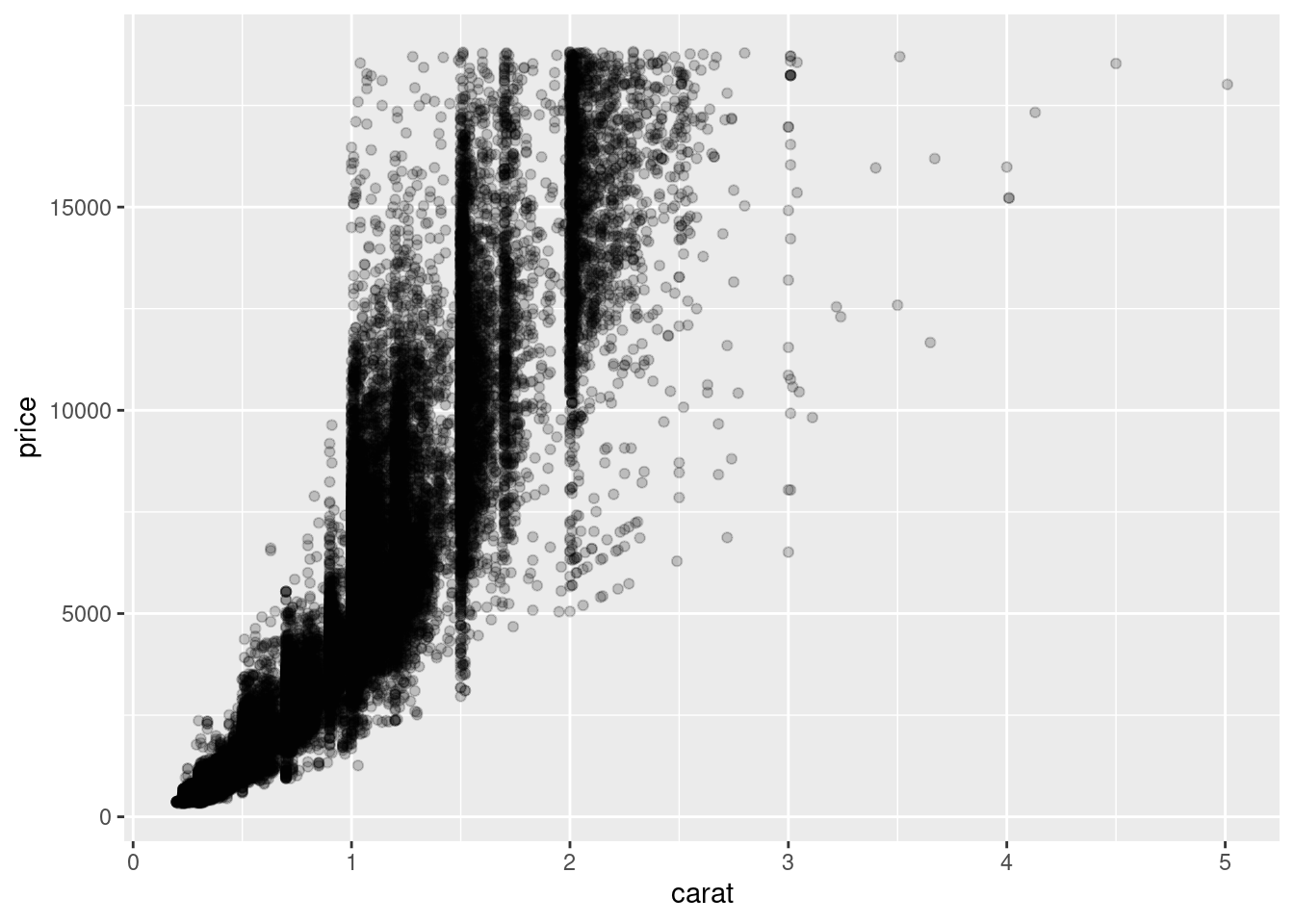
4.2 Aesthetics
In the video you saw 9 visible aesthetics. Let’s apply them to a categorical variable — the cylinders in mtcars, cyl.
These are the aesthetics you can consider within aes() in this chapter: x, y, color, fill, size, alpha, labels and shape.
One common convention is that you don’t name the x and y arguments to aes(), since they almost always come first, but you do name other arguments.
mtcars <- mtcars %>% mutate(fcyl = factor(cyl)) %>%
  mutate(fam = factor(am))

ggplot(mtcars, aes(wt, mpg, color = fcyl)) +
  geom_point(shape = 1, size = 4)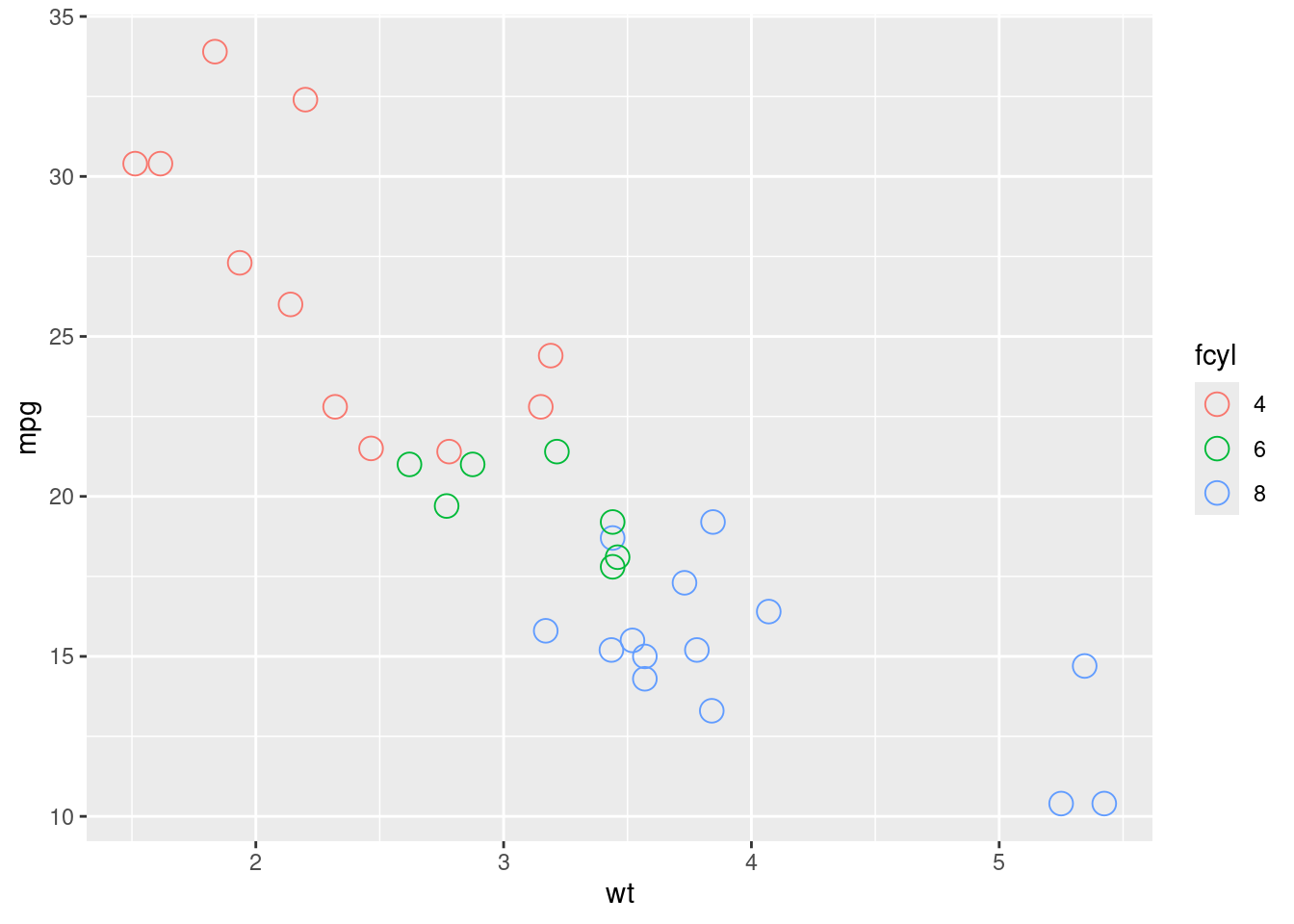
Typically, the color aesthetic changes the outline of a geom and the fill aesthetic changes the inside. geom_point() is an exception: you use color (not fill) for the point color. However, some shapes have special behavior.
The default geom_point() uses shape = 19: a solid circle. An alternative is shape = 21: a circle that allow you to use both fill for the inside and color for the outline. This is lets you to map two aesthetics to each point.
All shape values are described on the points() (docs) help page.
fcyl and fam are the cyl and am columns converted to factors, respectively.
ggplot(mtcars, aes(wt, mpg, fill = fcyl, color = fam)) +
  geom_point(shape = 21, size = 4, alpha = 0.6)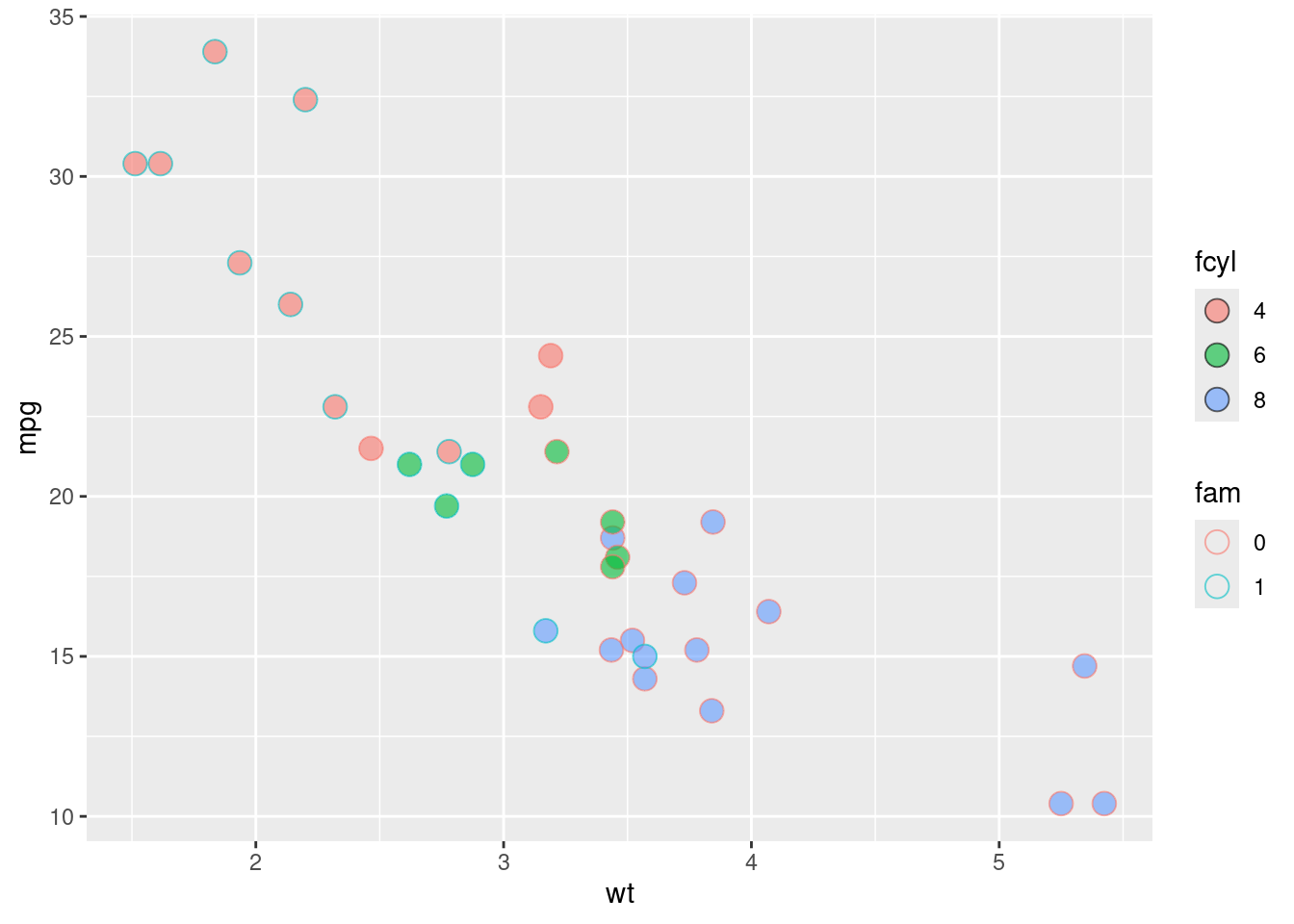
Now that you’ve got some practice with using attributes, be careful of a major pitfall: these attributes can overwrite the aesthetics of your plot!
## Warning: Using size for a discrete variable is not advised.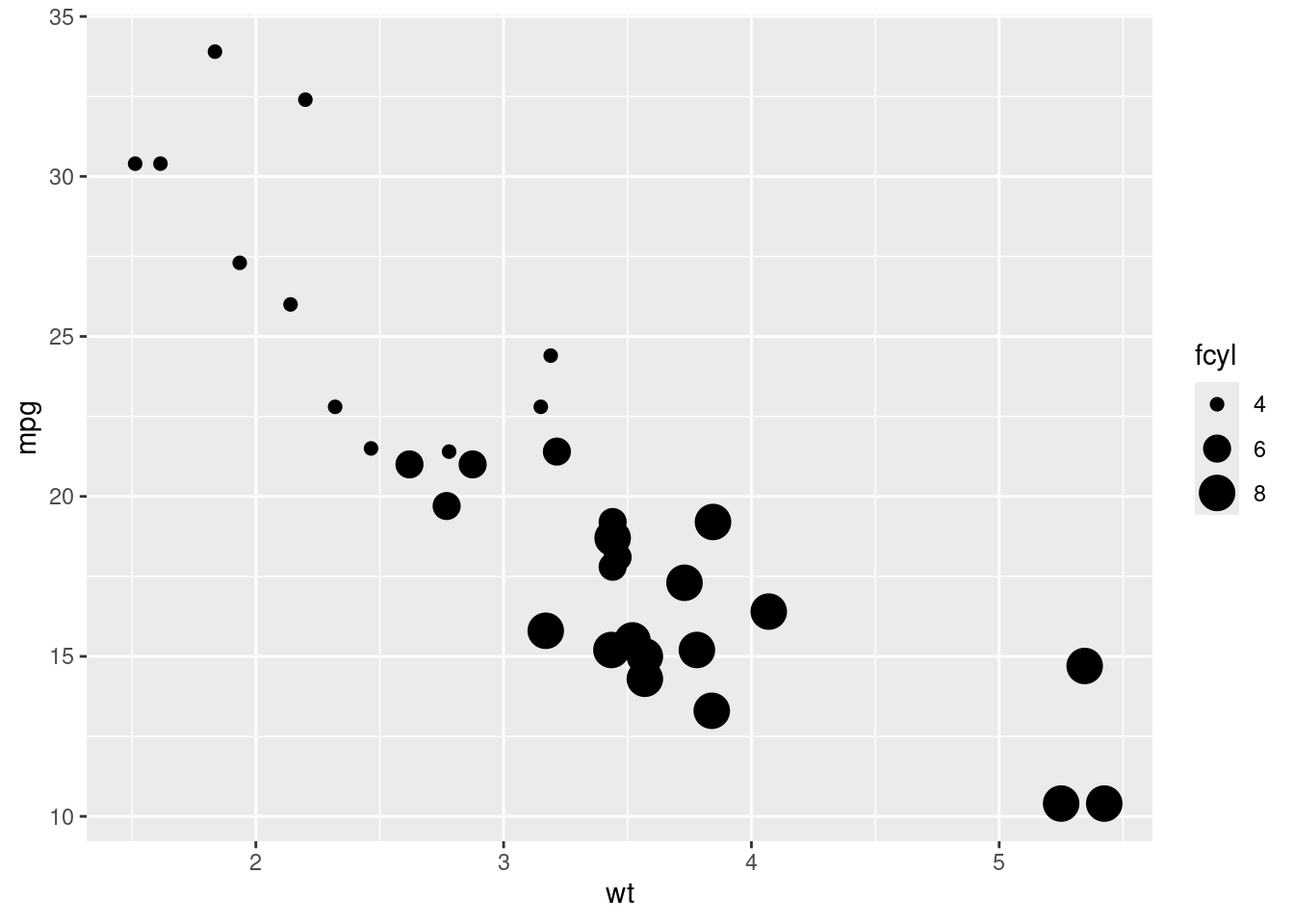
4.2.1 All about attributes: color, shape, size and alpha
This time you’ll use these arguments to set attributes of the plot, not map variables onto aesthetics.
You can specify colors in R using hex codes: a hash followed by two hexadecimal numbers each for red, green, and blue ("#RRGGBB"). Hexadecimal is base-16 counting. You have 0 to 9, and A representing 10 up to F representing 15. Pairs of hexadecimal numbers give you a range from 0 to 255. "#000000" is “black” (no color), "#FFFFFF" means “white”, and "#00FFFF" is cyan (mixed green and blue).
A hexadecimal color variable, my_blue has been defined for you.
my_blue <- "#4ABEFF"

ggplot(mtcars, aes(wt, mpg, fill = fcyl)) +
  geom_point(color = my_blue, size = 10, shape = 1)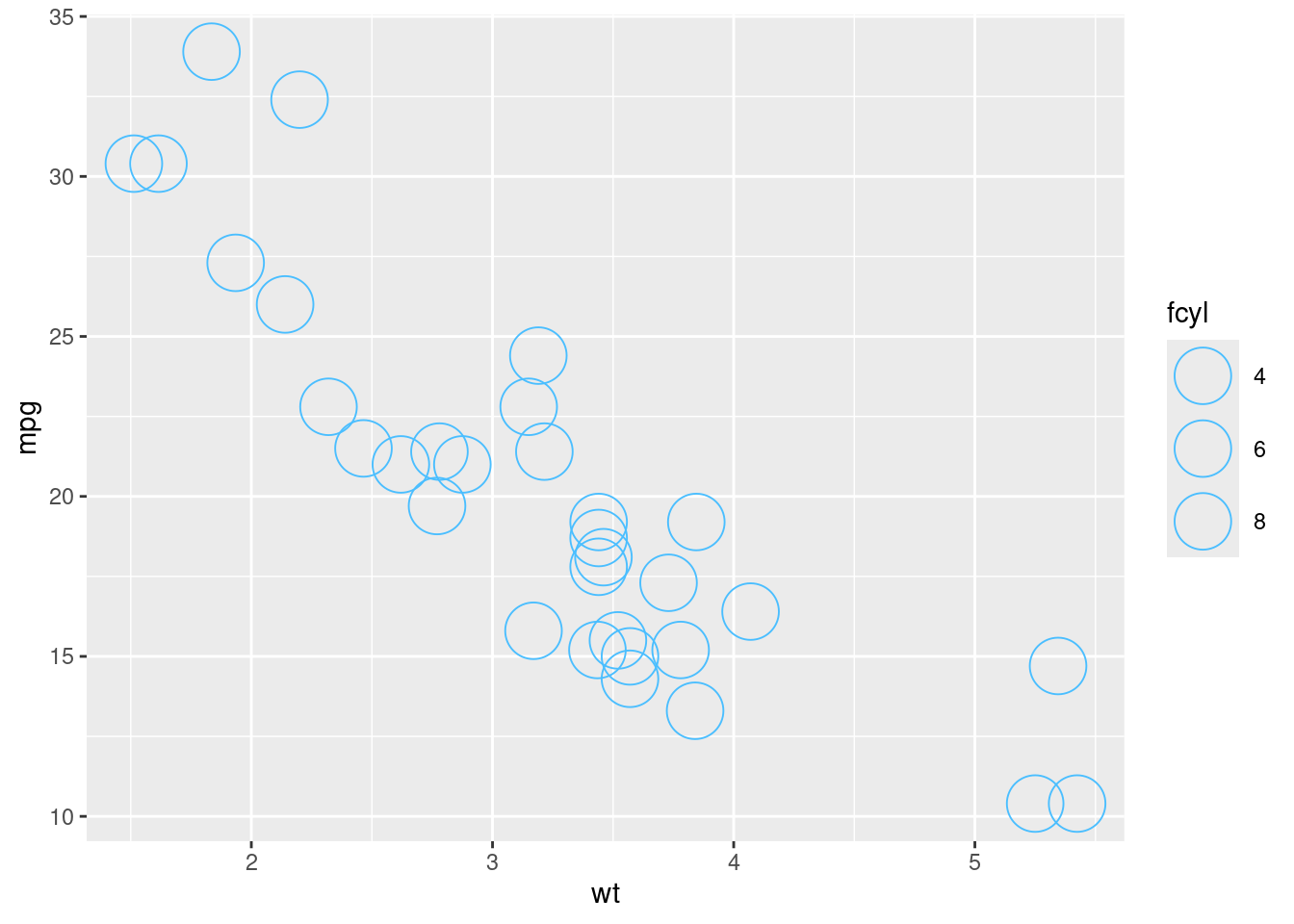
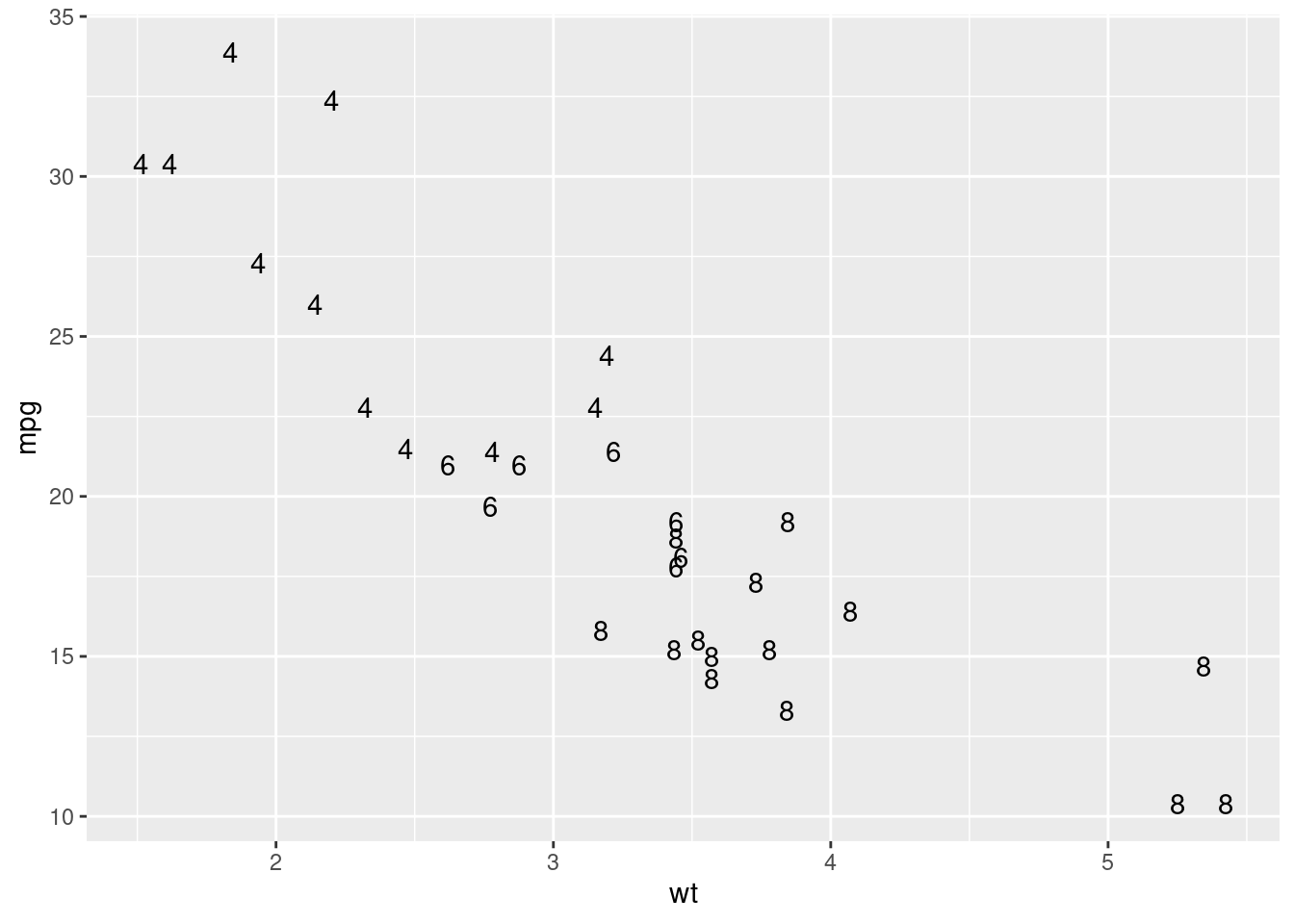
ggplot(mtcars, aes(wt, mpg, color = fcyl)) +
  # Add text layer with label rownames(mtcars) and color red
  geom_text(label = rownames(mtcars), color = "red")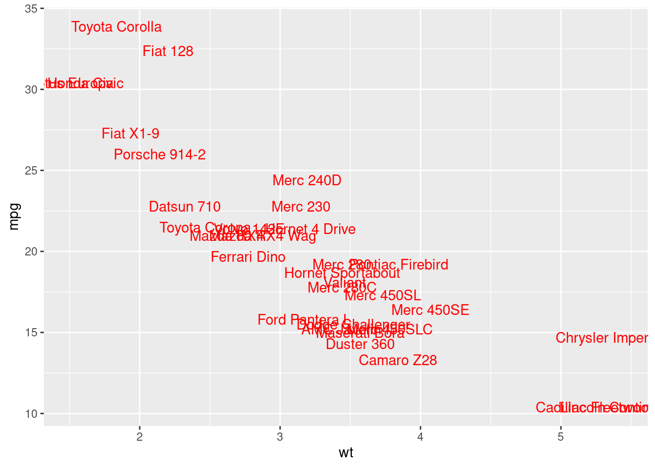
Notice that adding more aesthetic mappings to your plot is not always a good idea! You may just increase complexity and decrease readability.
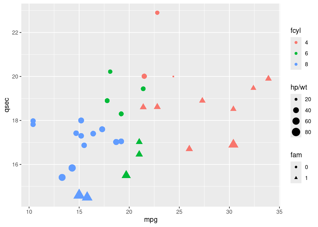
In this exercise, you’ll modify some aesthetics to make a bar plot of the number of cylinders for cars with different types of transmission.
You’ll also make use of some functions for improving the appearance of the plot.
labs() to set the x- and y-axis labels. It takes strings for each argument.
scale_fill_manual() defines properties of the color scale (i.e. axis). The first argument sets the legend title. values is a named vector of colors to use.
palette <- c(automatic = "#377EB8", manual = "#E41A1C")

ggplot(mtcars, aes(fcyl, fill = fam)) +
  geom_bar(position = "dodge") +
  labs(x = "Number of Cylinders", y = "Count")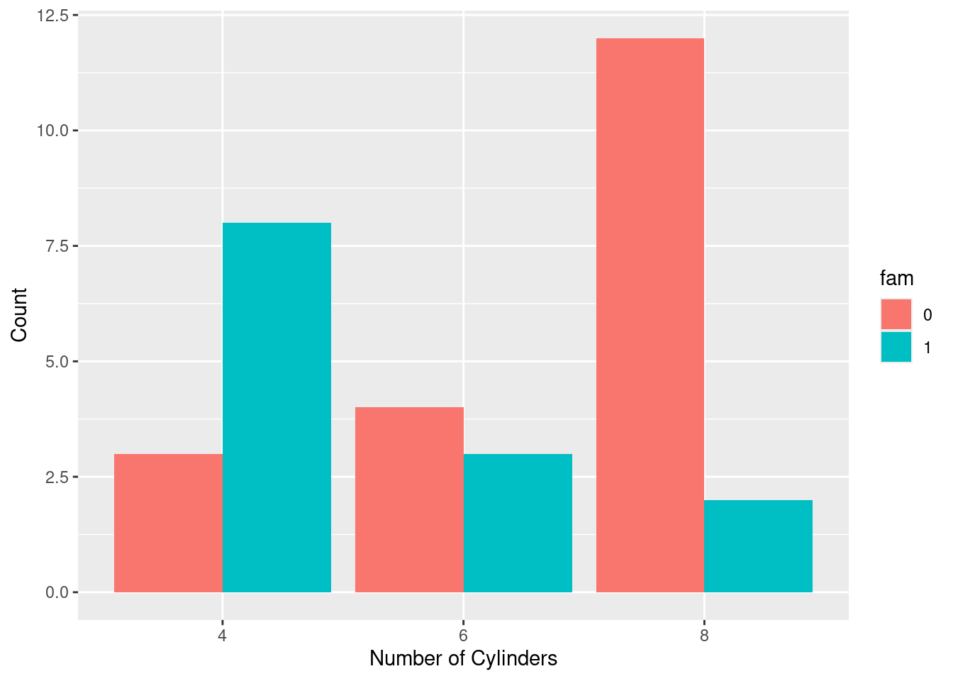
## <ggproto object: Class ScaleDiscrete, Scale, gg>
##     aesthetics: fill
##     axis_order: function
##     break_info: function
##     break_positions: function
##     breaks: waiver
##     call: call
##     clone: function
##     dimension: function
##     drop: TRUE
##     expand: waiver
##     fallback_palette: function
##     get_breaks: function
##     get_breaks_minor: function
##     get_labels: function
##     get_limits: function
##     get_transformation: function
##     guide: legend
##     is_discrete: function
##     is_empty: function
##     labels: waiver
##     limits: function
##     make_sec_title: function
##     make_title: function
##     map: function
##     map_df: function
##     minor_breaks: waiver
##     n.breaks.cache: NULL
##     na.translate: TRUE
##     na.value: grey50
##     name: Transmission
##     palette: function
##     palette.cache: NULL
##     position: left
##     range: environment
##     rescale: function
##     reset: function
##     train: function
##     train_df: function
##     transform: function
##     transform_df: function
##     super:  <ggproto object: Class ScaleDiscrete, Scale, gg>
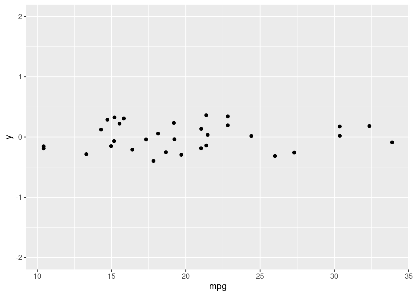
Setting a dummy aesthetic In the last chapter you saw that all the visible aesthetics can serve as attributes and aesthetics, but I very conveniently left out x and y. That’s because although you can make univariate plots (such as histograms, which you’ll get to in the next chapter), a y-axis will always be provided, even if you didn’t ask for it.
You can make univariate plots in ggplot2, but you will need to add a fake y axis by mapping y to zero.
When using setting y-axis limits, you can specify the limits as separate arguments, or as a single numeric vector. That is, ylim(lo, hi) or ylim(c(lo, hi)).
4.3 Geometries
4.3.1 Scatter plots
Scatter plots (using geom_point()) are intuitive, easily understood, and very common, but we must always consider overplotting, particularly in the following four situations:
- Large datasets
- Aligned values on a single axis
- Low-precision data
- Integer data
Typically, alpha blending (i.e. adding transparency) is recommended when using solid shapes. Alternatively, you can use opaque, hollow shapes.
4.3.1.1 Large datasets
plt_price_vs_carat_by_clarity <- ggplot(diamonds, aes(carat, price, color = clarity))

plt_price_vs_carat_by_clarity + geom_point(alpha = 0.5, shape = 16)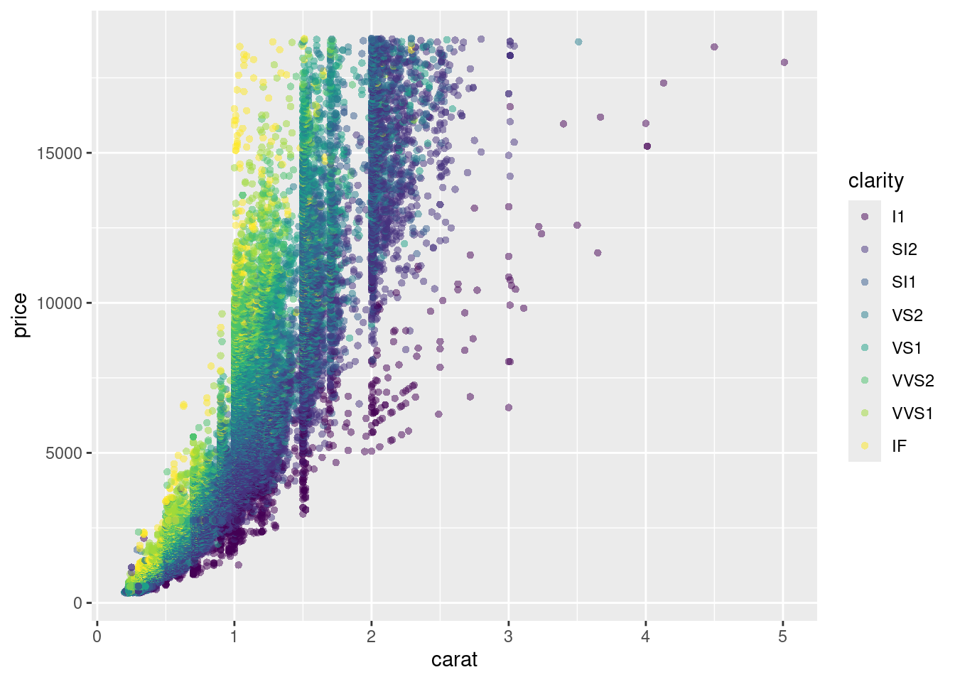
4.3.1.2 Aligned values on a single axis
Let’s take a look at another case where we should be aware of overplotting: Aligning values on a single axis.
This occurs when one axis is continuous and the other is categorical, which can be overcome with some form of jittering.
plt_mpg_vs_fcyl_by_fam <- ggplot(mtcars, aes(fcyl, mpg, color = fam))

plt_mpg_vs_fcyl_by_fam + geom_point()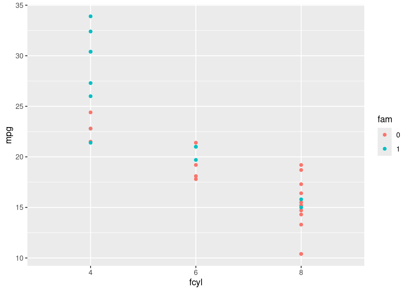
plt_mpg_vs_fcyl_by_fam + geom_point(position = position_jitterdodge(jitter.width = 0.3, dodge.width = 0.3))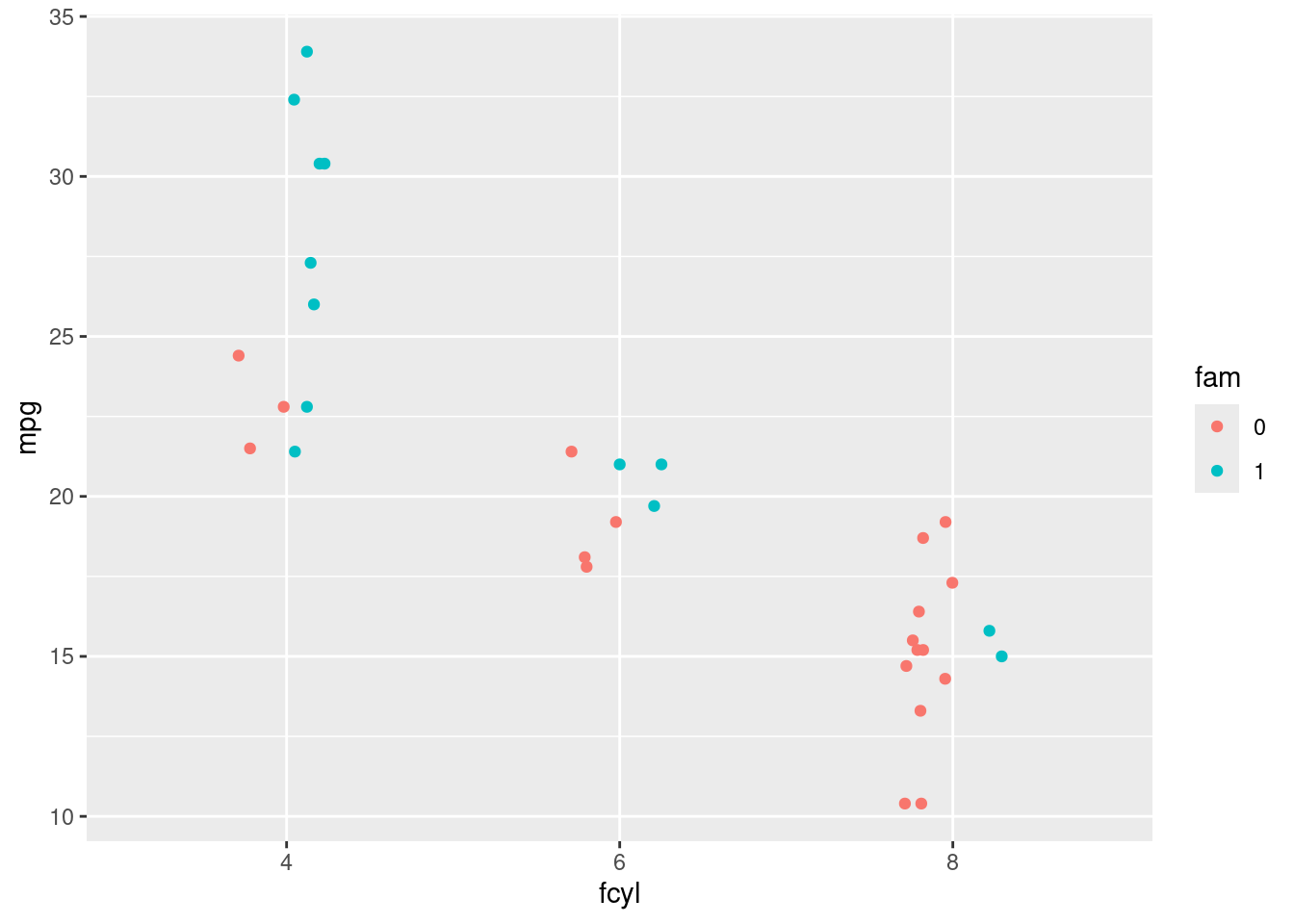
4.3.1.3 Low-precision data
This results from low-resolution measurements like in the iris dataset, which is measured to 1mm precision (see viewer). It’s similar to case 2, but in this case we can jitter on both the x and y axis.
ggplot(iris, aes(Sepal.Length, Sepal.Width, color = Species)) +
  geom_point(alpha = 0.5, position = position_jitter(width = 0.1))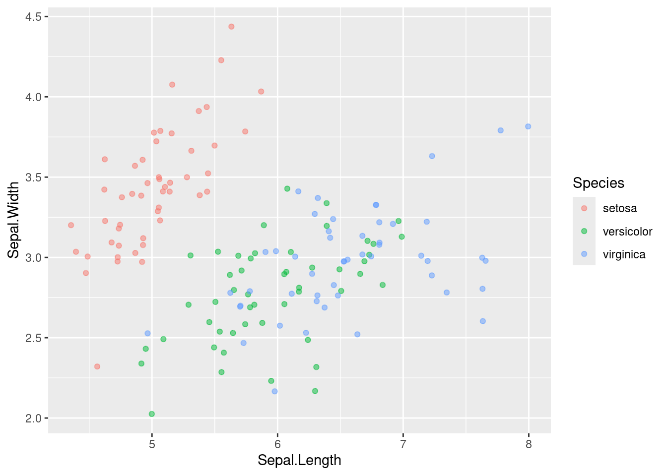
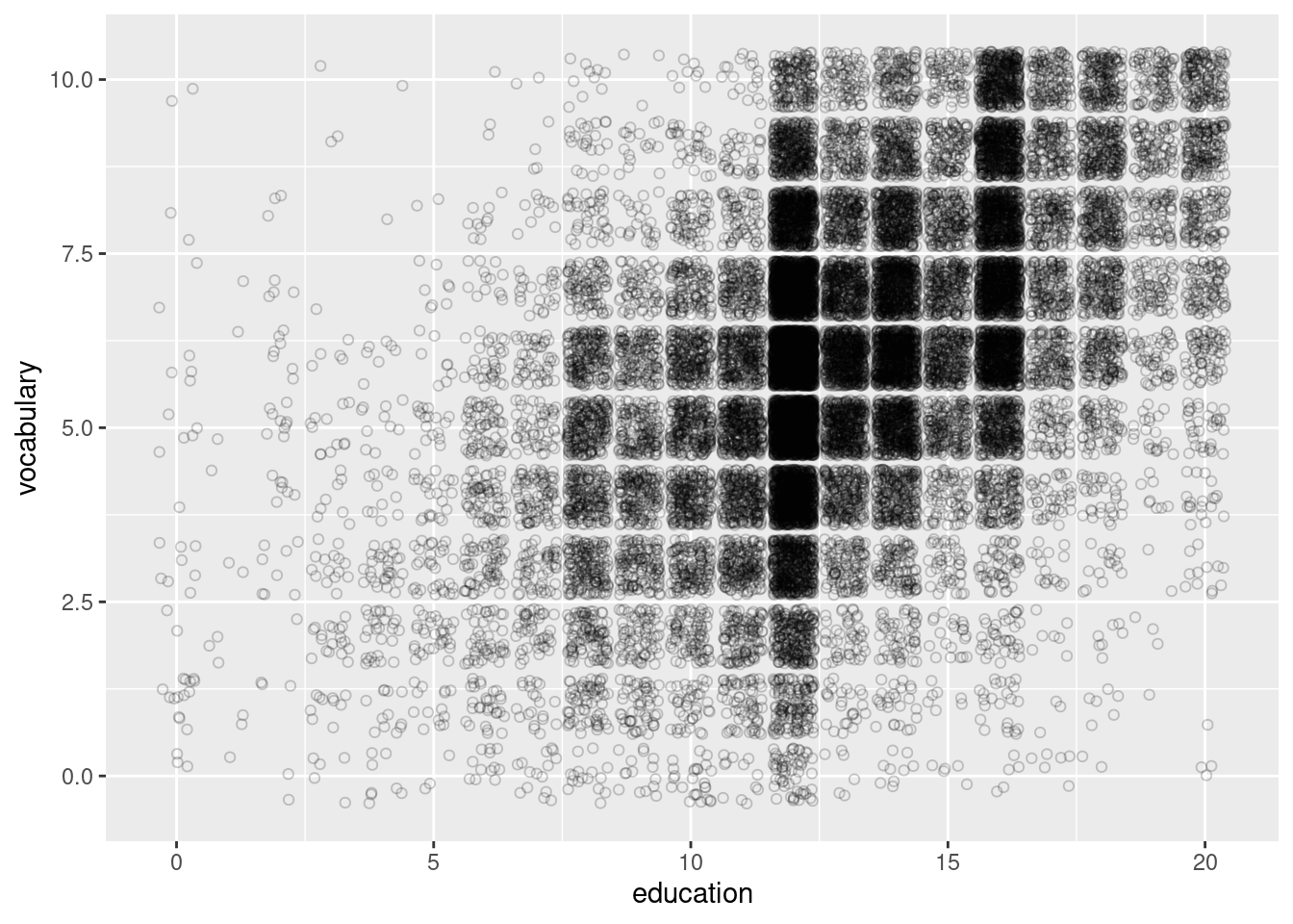
4.3.1.4 Integer data
This can be type integer (i.e. 1 ,2, 3…) or categorical (i.e. class factor) variables. factor is just a special class of type integer.
You’ll typically have a small, defined number of intersections between two variables, which is similar to case 3, but you may miss it if you don’t realize that integer and factor data are the same as low precision data.
4.3.2 Histograms
Recall that histograms cut up a continuous variable into discrete bins and, by default, maps the internally calculated count variable (the number of observations in each bin) onto the y aesthetic. An internal variable called density can be accessed by using the .. notation, i.e. ..density... Plotting this variable will show the relative frequency, which is the height times the width of each bin.
datacamp_light_blue <- "#51A8C9"
# Warning: The dot-dot notation (`..density..`) was deprecated in ggplot2 3.4.0.
# ℹ Please use `after_stat(density)` instead.

ggplot(mtcars, aes(mpg, after_stat(density))) +
  # Set the fill color to datacamp_light_blue
  geom_histogram(binwidth = 1, fill = datacamp_light_blue)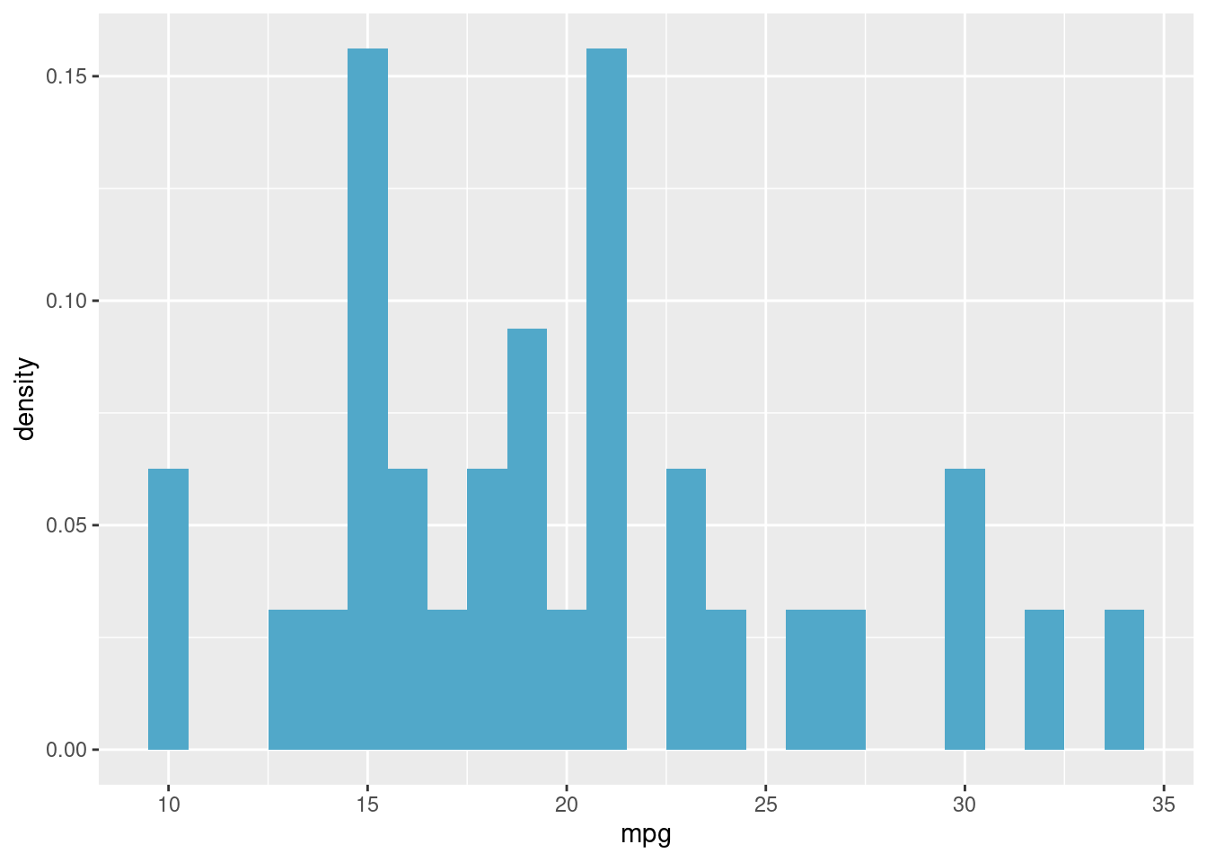
Here, we’ll examine the various ways of applying positions to histograms. geom_histogram(), a special case of geom_bar(), has a position argument that can take on the following values:
stack (the default): Bars for different groups are stacked on top of each other.
dodge: Bars for different groups are placed side by side.
fill: Bars for different groups are shown as proportions.
identity: Plot the values as they appear in the dataset.
ggplot(mtcars, aes(mpg, fill = fam)) +
  # Change the position to identity, with transparency 0.4
  geom_histogram(binwidth = 1, position = "identity", alpha = 0.4)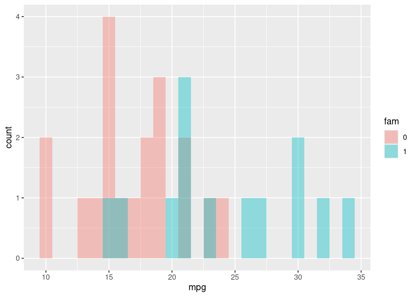
4.3.3 Bar plots
Let’s see how the position argument changes geom_bar().
We have three position options:
stack: The default
dodge: Preferred
fill: To show proportions
While we will be using geom_bar() here, note that the function geom_col() is just geom_bar() where both the position and stat arguments are set to "identity". It is used when we want the heights of the bars to represent the exact values in the data.
ggplot(mtcars, aes(fcyl, fill = fam)) +
  # Change the position to "dodge"
  geom_bar(position = "dodge")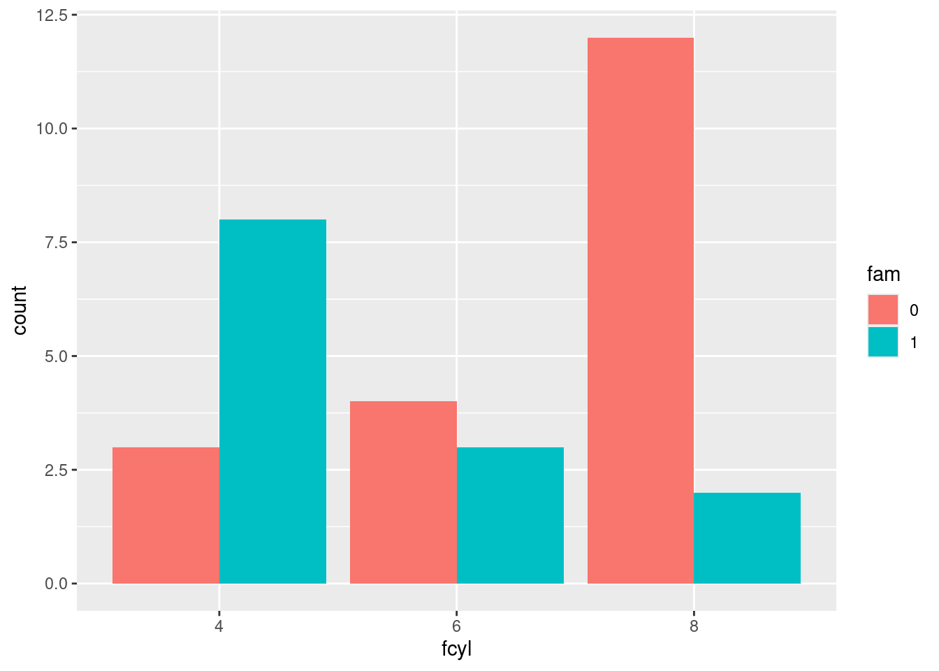
You can customize bar plots further by adjusting the dodging so that your bars partially overlap each other. Instead of using position = "dodge", you’re going to use position_dodge(), like you did with position_jitter() in the the previous exercises.
Remember, the reason you want to use position_dodge() (and position_jitter()) is to specify how much dodging (or jittering) you want.
ggplot(mtcars, aes(cyl, fill = fam)) +
    geom_bar(position = position_dodge(width = 0.2), alpha = 0.6)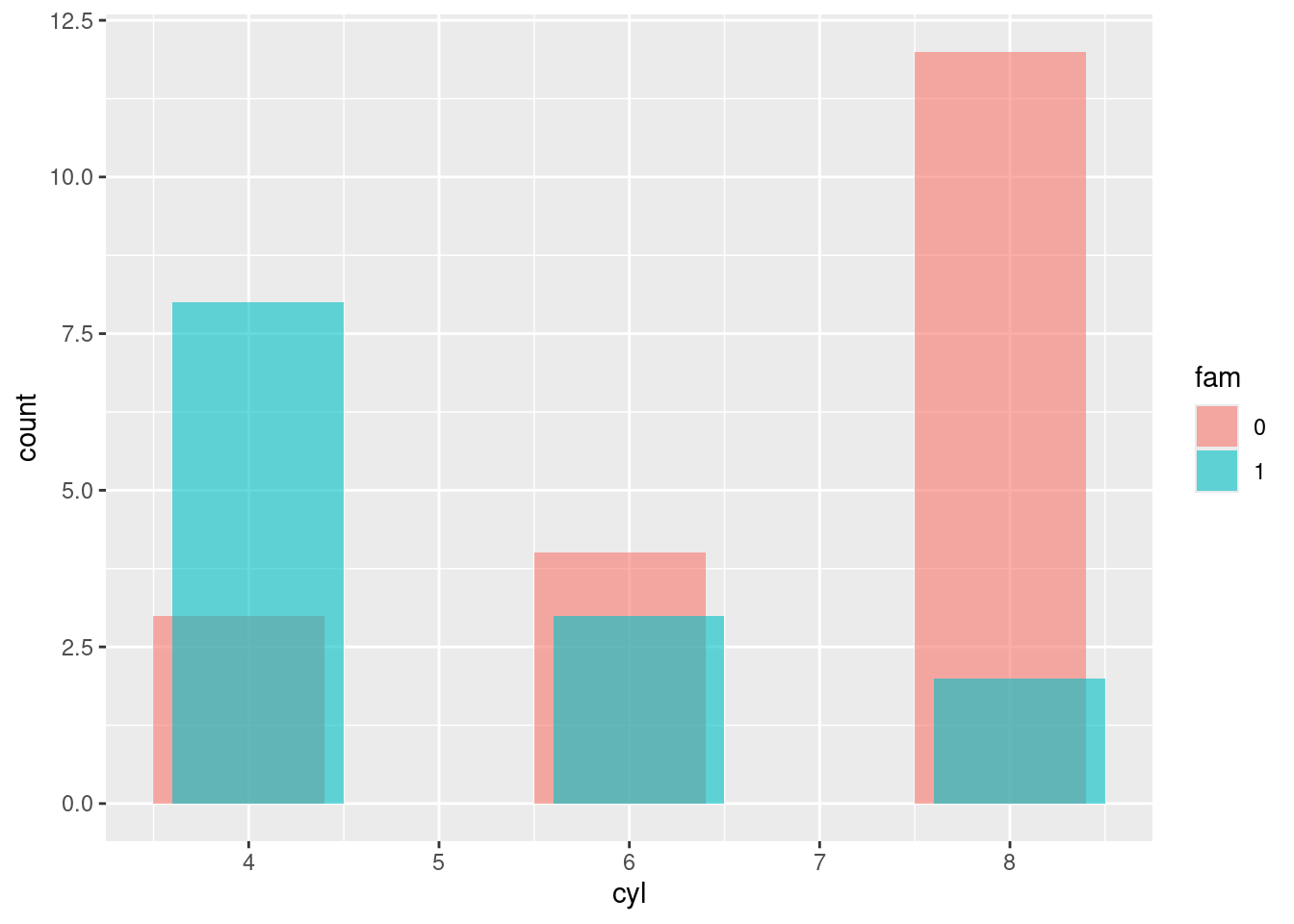
In this bar plot, we’ll fill each segment according to an ordinal variable. The best way to do that is with a sequential color palette. Add a brewer fill scale, using the default palette (don’t pass any arguments). This generated a warning message and an incomplete plot before changing vocabulary into a factor.
ggplot(Vocab, aes(education, fill = factor(vocabulary))) +
  geom_bar(position = "fill") +
  scale_fill_brewer()
## Warning in RColorBrewer::brewer.pal(n, pal): n too large, allowed maximum for palette Blues is 9
## Returning the palette you asked for with that many colors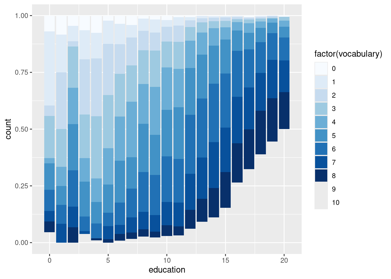
START LHOST ADDED: These are a few that worked in other people’s. If they work, keep them. If not, what’s going wrong?
# Plot education, filled by vocabulary
ggplot(Vocab, aes(x = education, fill = vocabulary)) +
  geom_bar()
## Warning: The following aesthetics were dropped during statistical transformation: fill.
## ℹ This can happen when ggplot fails to infer the correct grouping structure in
## the data.
## ℹ Did you forget to specify a `group` aesthetic or to convert a numerical
## variable into a factor?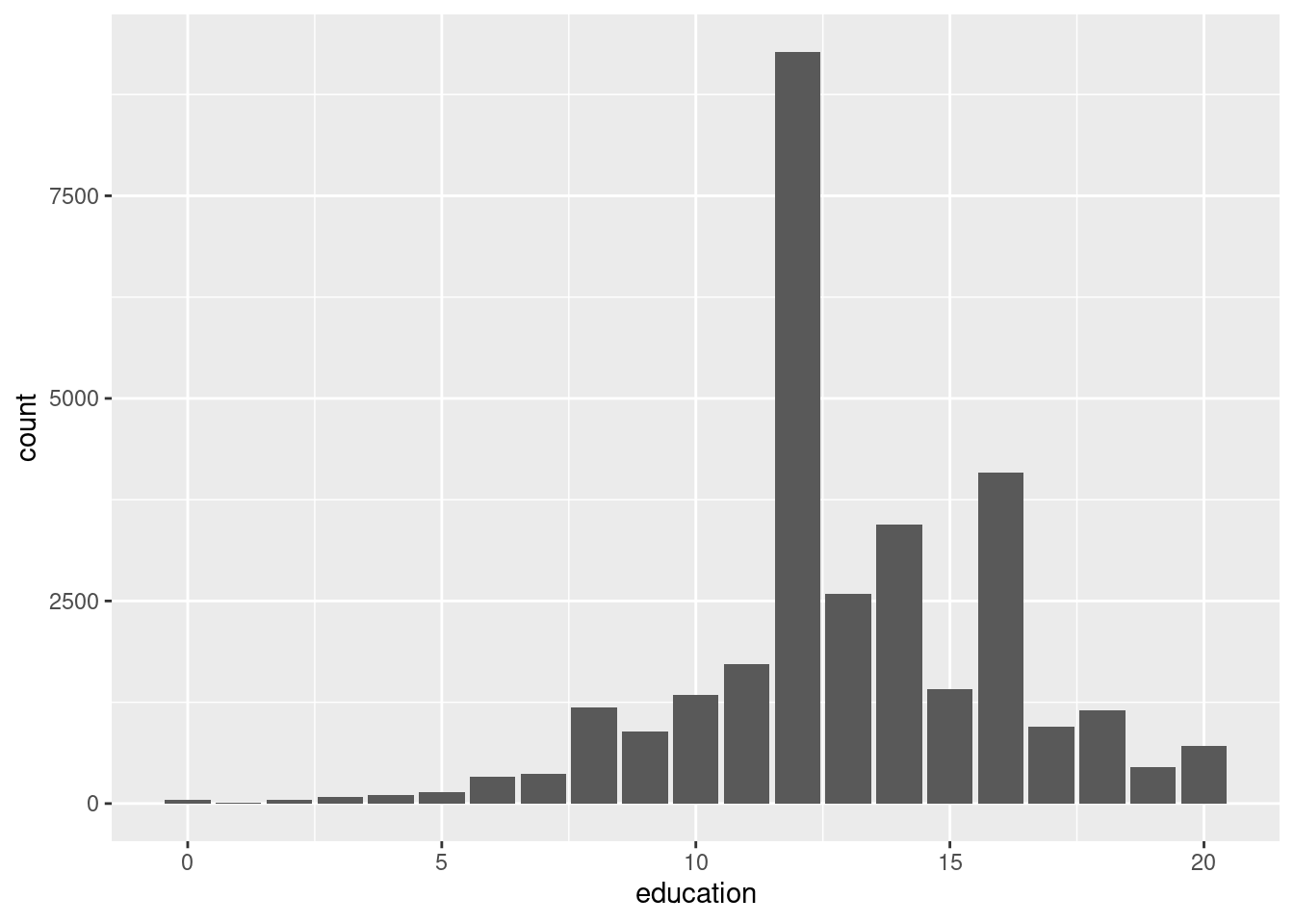
# Plot education, filled by vocabulary
ggplot(Vocab, aes(education, fill = vocabulary)) +
  # Add a bar layer with position "fill"
geom_bar(position = "fill")
## Warning: The following aesthetics were dropped during statistical transformation: fill.
## ℹ This can happen when ggplot fails to infer the correct grouping structure in
## the data.
## ℹ Did you forget to specify a `group` aesthetic or to convert a numerical
## variable into a factor?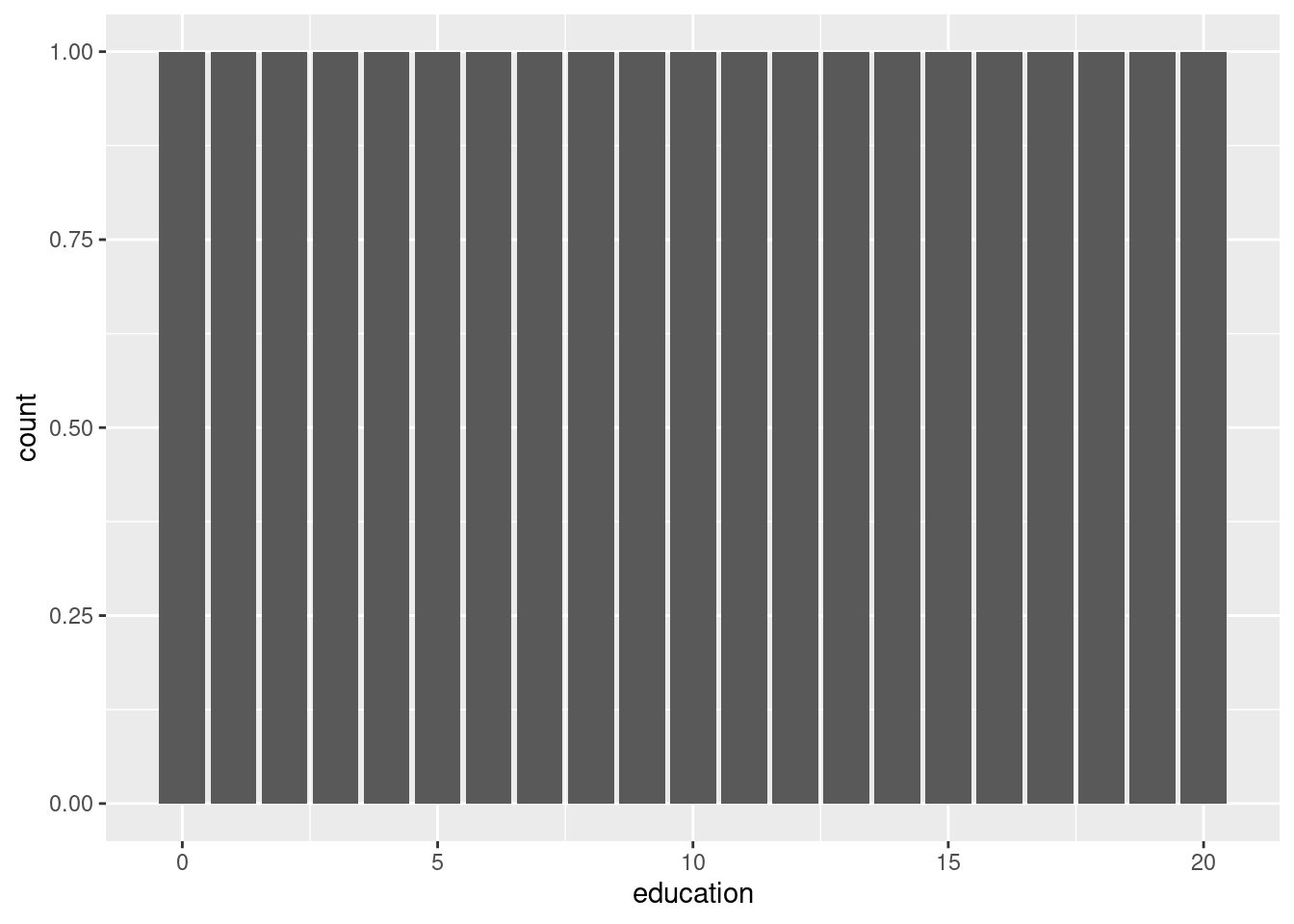
# Plot education, filled by vocabulary
ggplot(Vocab, aes(education, fill = vocabulary)) +
  # Add a bar layer with position "fill"
  geom_bar(position = "fill") +
  # Add a brewer fill scale with default palette
scale_fill_brewer()
## Warning: The following aesthetics were dropped during statistical transformation: fill.
## ℹ This can happen when ggplot fails to infer the correct grouping structure in
## the data.
## ℹ Did you forget to specify a `group` aesthetic or to convert a numerical
## variable into a factor?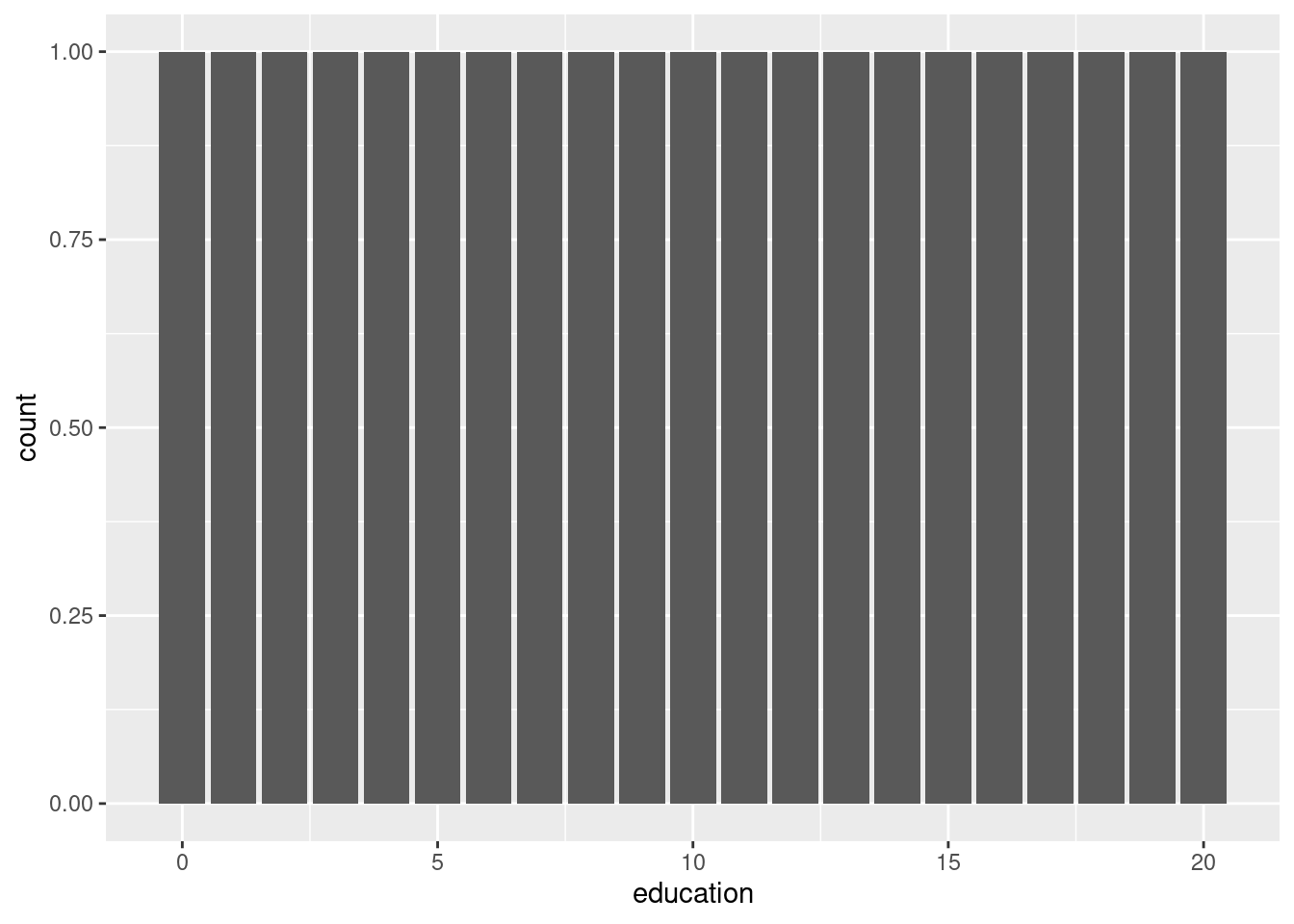
END LHOST ADDED
4.3.4 Line plots
Here, we’ll use the economics dataset to make some line plots. The dataset contains a time series for unemployment and population statistics from the Federal Reserve Bank of St. Louis in the United States. The data is contained in the ggplot2 package.
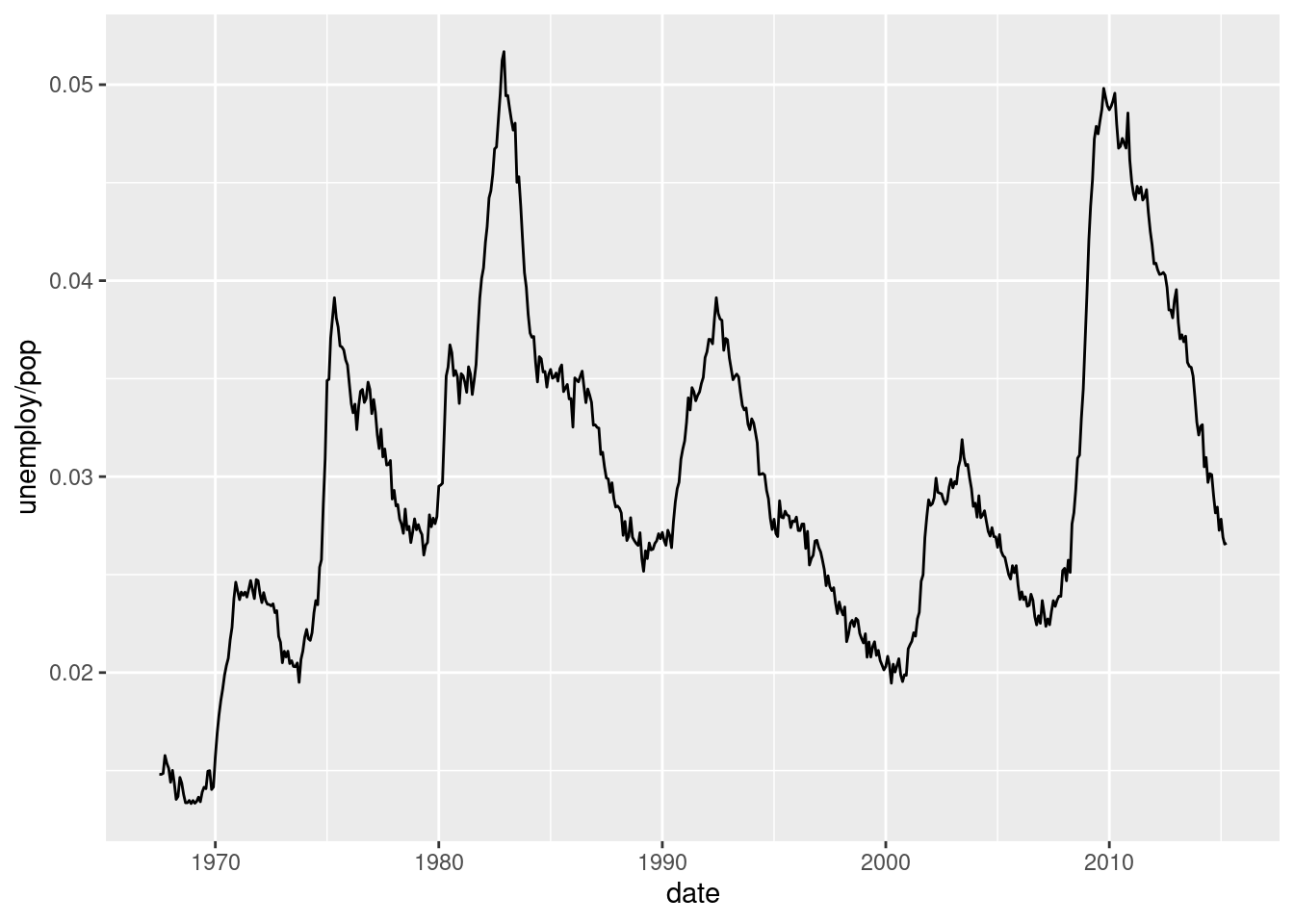
We already saw how the form of your data affects how you can plot it. Let’s explore that further with multiple time series. Here, it’s important that all lines are on the same scale, and if possible, on the same plot.
# Plot the Rainbow Salmon time series
ggplot(fish.species, aes(x = Year, y = Rainbow)) +
  geom_line()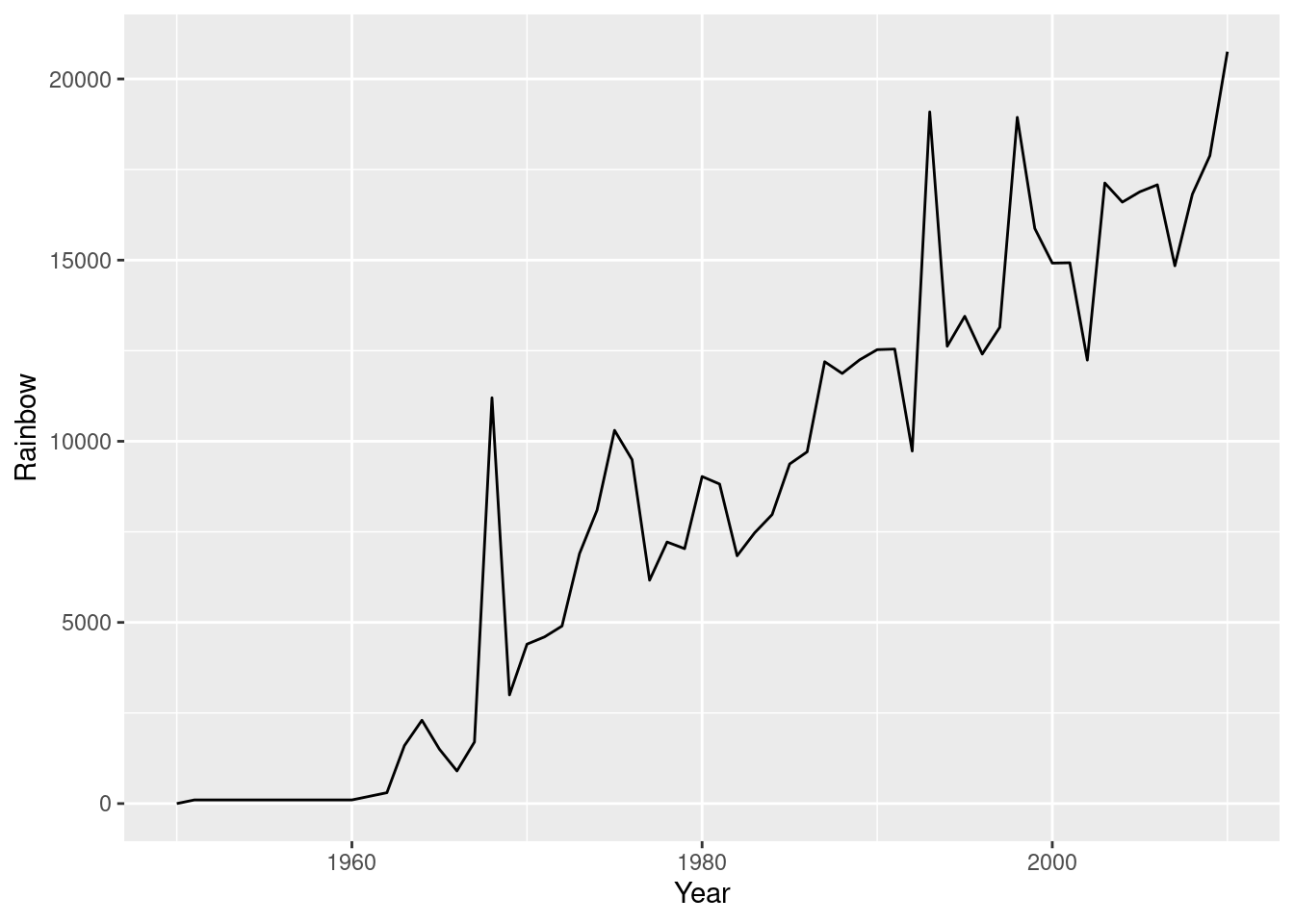
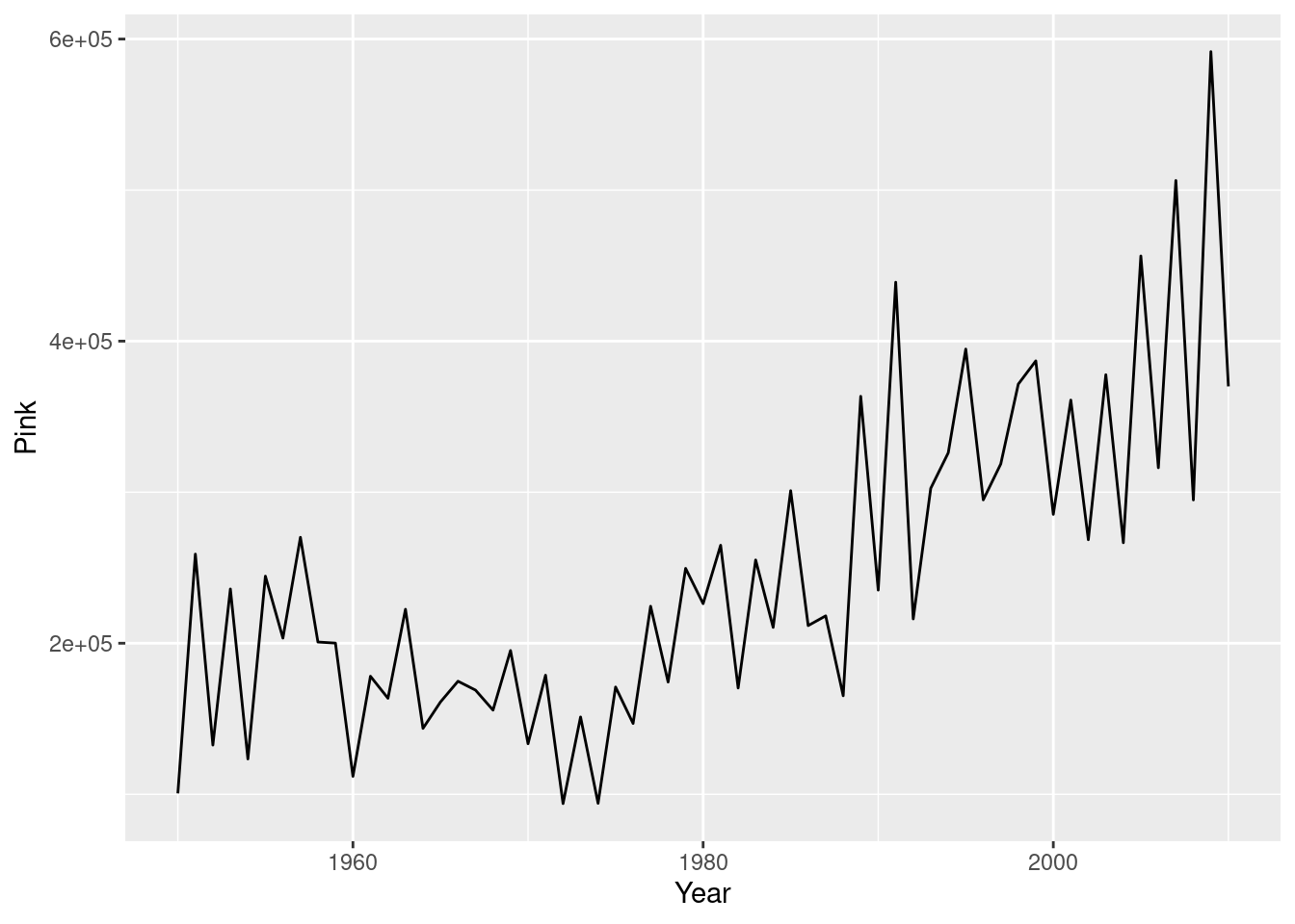
# Plot multiple time-series by grouping by species
ggplot(fish.tidy, aes(Year, Capture)) +
  geom_line(aes(group = Species))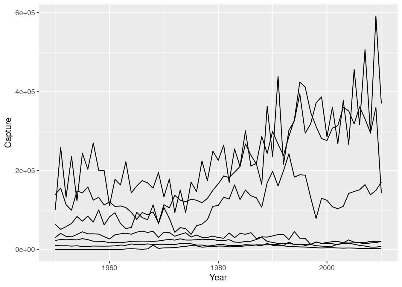
# Plot multiple time-series by coloring by species
ggplot(fish.tidy, aes(x = Year, y = Capture, color = Species)) +
  geom_line()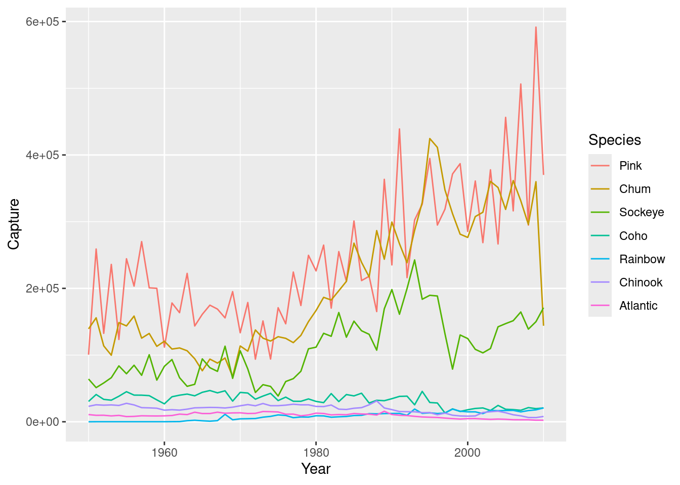
4.4 Themes
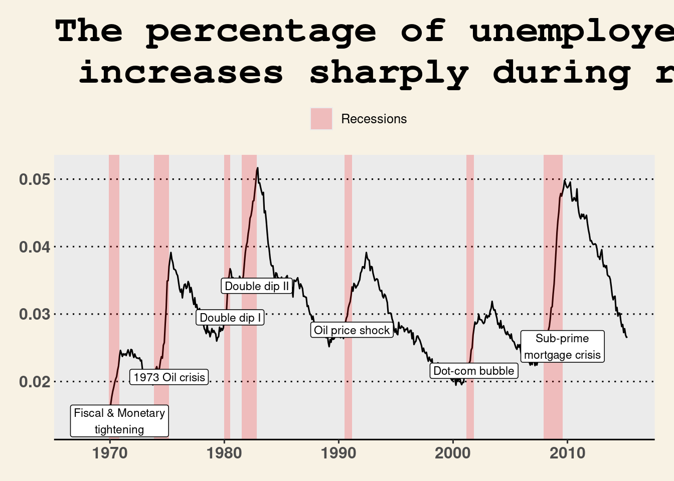
In this chapter DC gives you a few graphs as base plots that we need to recreate here to include those parts later. This is the code to replicate them (pretty close at least). We also need to create a dataset from gapminder for the final graph
## Graph we need to create to use in DC exercises
recess <- data.frame(
  begin = c("1969-12-01","1973-11-01","1980-01-01","1981-07-01","1990-07-01","2001-03-01", "2007-12-01"),
  end = c("1970-11-01","1975-03-01","1980-07-01","1982-11-01","1991-03-01","2001-11-01", "2009-07-30"),
  event = c("Fiscal & Monetary\ntightening", "1973 Oil crisis", "Double dip I","Double dip II", "Oil price shock", "Dot-com bubble", "Sub-prime\nmortgage crisis"),
  y =  c(.01415981, 0.02067402, 0.02951190,  0.03419201,  0.02767339, 0.02159662,0.02520715),
  stringsAsFactors = F
  )

recess$begin <- ymd (recess$begin)
recess$end <- ymd (recess$end)

plt_prop_unemployed_over_time <- ggplot(economics, aes(x = date, y = unemploy/pop)) +
  ggtitle(c("The percentage of unemployed Americans \n increases sharply during recessions")) +
  geom_line() +
  geom_rect(data = recess,
            aes(xmin = begin, xmax = end, ymin = -Inf, ymax = +Inf, fill = "Recession"),
            inherit.aes = FALSE, alpha = 0.2) +
  geom_label(data = recess, aes(x = end, y = y, label=event), size = 3) +
    scale_fill_manual(name = "", values="red", label="Recessions")


### Another plot they give us, but we need to re-create to include
plt_mpg_vs_wt_by_cyl <- ggplot(mtcars, aes(wt, mpg, color = fcyl)) +
  ylab("Miels per gallon") +
  xlab("weight (1000/lbs)") +
  geom_point()


### Data needed for last graph of last chapter:
gm2007_full <- gapminder %>%
                  filter(year == 2007) %>%
                  arrange(lifeExp)


gm2007_top10 <- gm2007_full %>%
                  top_n(10,lifeExp)

gm2007_bottom10 <- gm2007_full %>%
                  top_n(-10,lifeExp)

gm2007 <-  rbind(gm2007_bottom10,gm2007_top10)


# These two lines sort the data in a way that the graphs will look more like the video (by life expectancy) rather than the exercises (which are sorted alphabetically)
gm2007$country <- as.character(gm2007$country)
gm2007$country <- factor(gm2007$country, levels=gm2007$country)
4.4.1 Themes from scratch
Moving the legend Let’s wrap up this course by making a publication-ready plot communicating a clear message.
To change stylistic elements of a plot, call theme() and set plot properties to a new value. For example, the following changes the legend position.
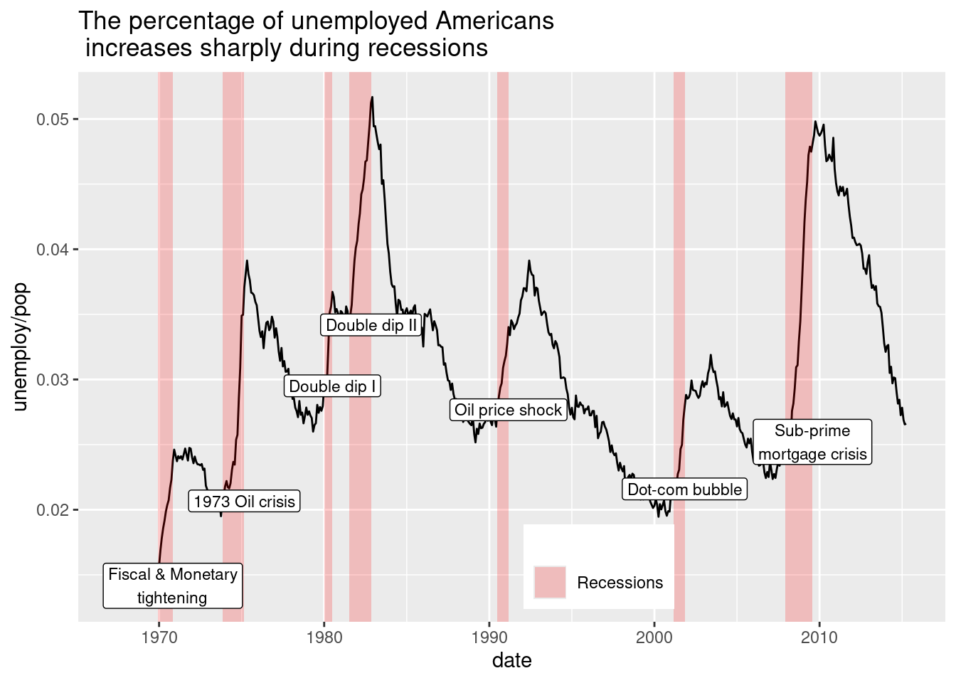
Many plot elements have multiple properties that can be set. For example, line elements in the plot such as axes and gridlines have a color, a thickness (size), and a line type (solid line, dashed, or dotted). To set the style of a line, you use element_line(). For example, to make the axis lines into red, dashed lines, you would use the following.
Similarly, element_rect() changes rectangles and element_text() changes text. You can remove a plot element using element_blank().
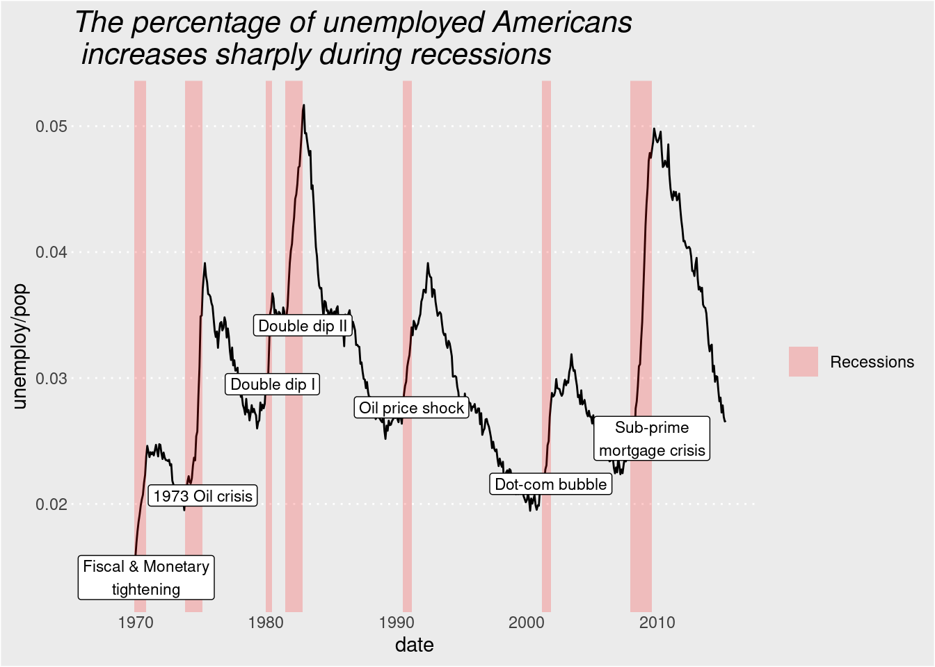
plt_prop_unemployed_over_time +
  theme(
    rect = element_rect(fill = "grey92"),
    legend.key = element_rect(color = NA),
    axis.ticks = element_blank(),
    panel.grid = element_blank(),
    panel.grid.major.y = element_line(
      color = "white",
      linewidth = 0.5,
      linetype = "dotted"
    ),
    # Set the axis text color to grey25
    axis.text = element_text(color = "grey25"),
    # Set the plot title font face to italic and font size to 16
   plot.title = element_text(size = 16, face = "italic")
  )
Whitespace means all the non-visible margins and spacing in the plot.
To set a single whitespace value, use unit(x, unit), where x is the amount and unit is the unit of measure.
Borders require you to set 4 positions, so use margin(top, right, bottom, left, unit). To remember the margin order, think TRouBLe.
The default unit is "pt" (points), which scales well with text. Other options include “cm”, “in” (inches) and “lines” (of text).
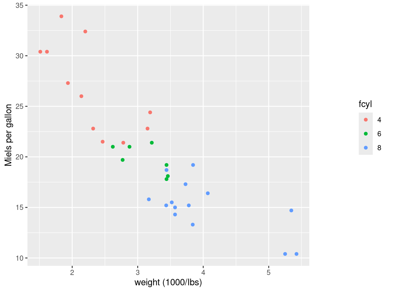
plt_mpg_vs_wt_by_cyl +
  theme(
    # Set the legend margin to (20, 30, 40, 50) points
    legend.margin = margin(20,30,40,50,"pt")
  )
4.4.2 Theme flexibility
In addition to making your own themes, there are several out-of-the-box solutions that may save you lots of time.
theme_gray() is the default.
theme_bw() is useful when you use transparency.
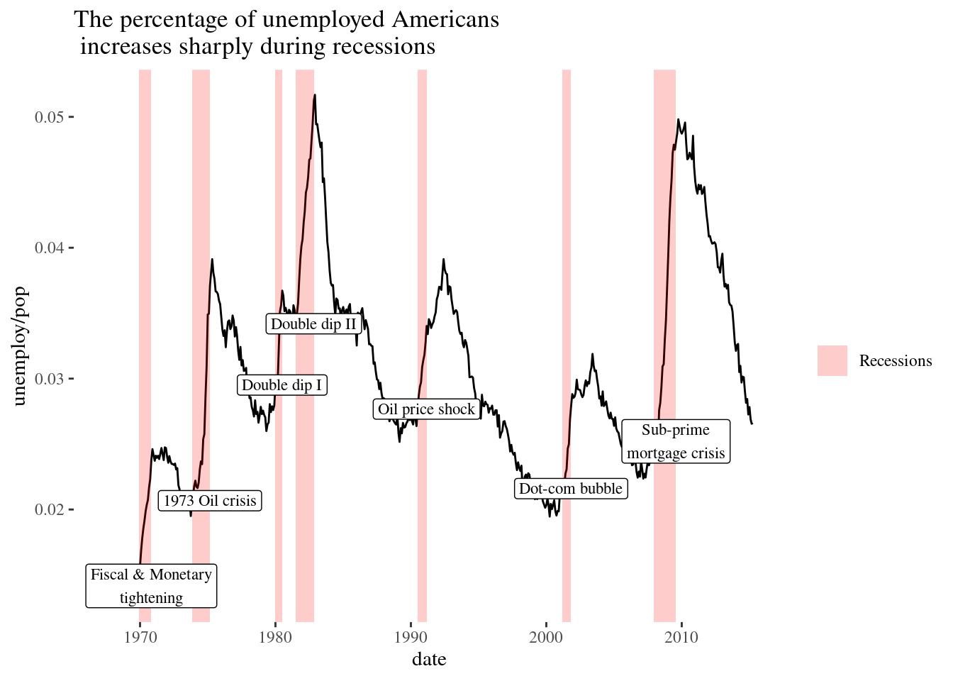
theme_classic() is more traditional.
theme_void() removes everything but the data.
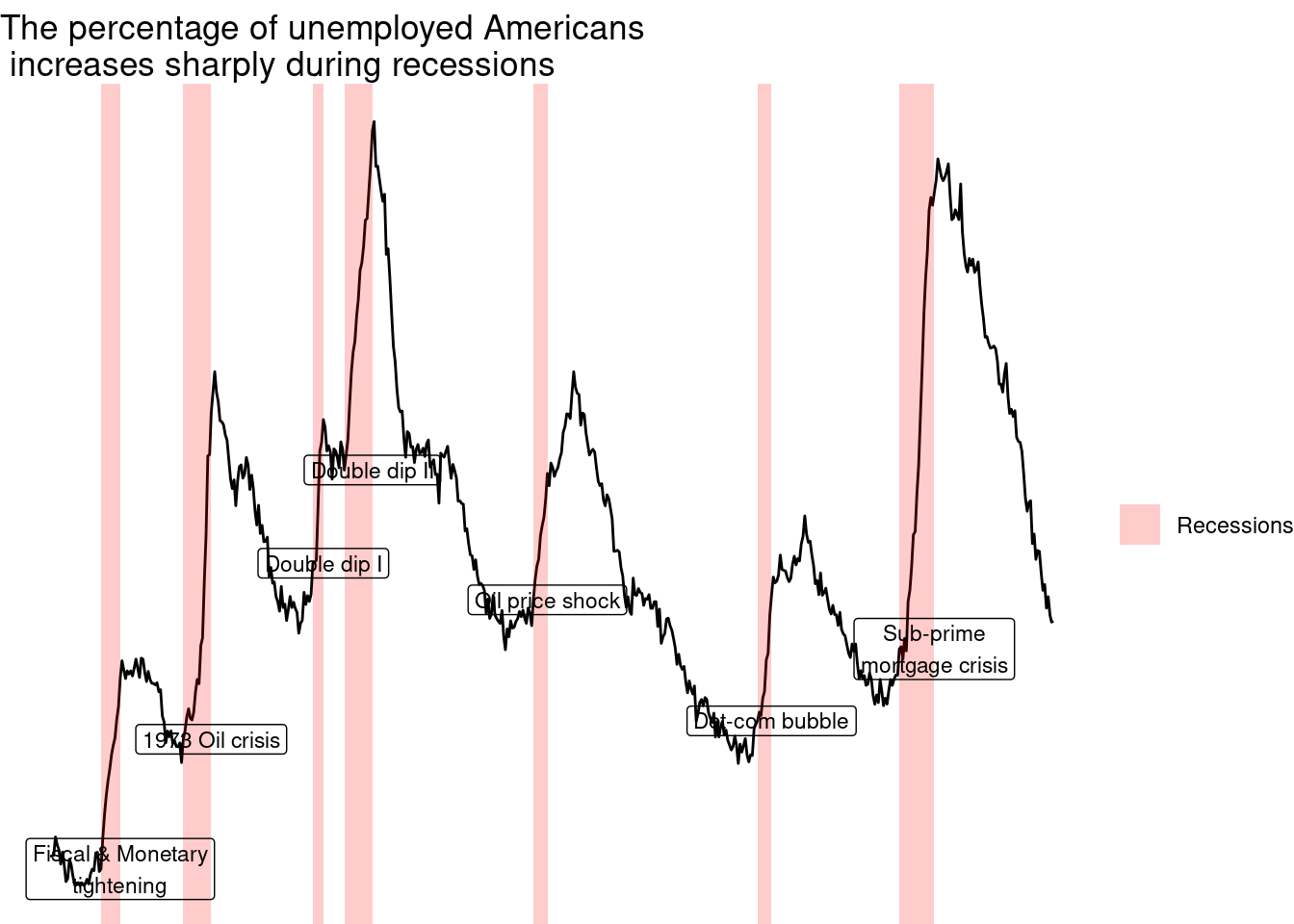
Outside of ggplot2, another source of built-in themes is the ggthemes package.
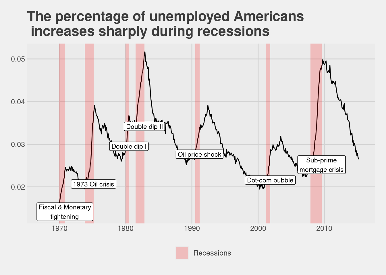
Reusing a theme across many plots helps to provide a consistent style. You have several options for this.
Assign the theme to a variable, and add it to each plot.
Set your theme as the default using theme_set().
A good strategy that you’ll use here is to begin with a built-in theme then modify it
theme_recession <- theme(
rect = element_rect(fill = "grey92"),
legend.key = element_rect(color = NA),
axis.ticks = element_blank(),
panel.grid = element_blank(),
panel.grid.major.y = element_line(color = "white", size = 0.5, linetype = "dotted"),
axis.text = element_text(color = "grey25"),
plot.title = element_text(face = "italic", size = 16),
legend.position = c(0.6, 0.1)
)## Warning: The `size` argument of `element_line()` is deprecated as of ggplot2 3.4.0.
## ℹ Please use the `linewidth` argument instead.
## This warning is displayed once every 8 hours.
## Call `lifecycle::last_lifecycle_warnings()` to see where this warning was
## generated.theme_tufte_recession <- theme_tufte() + theme_recession
# Set theme_tufte_recession as the default theme
theme_set(theme_tufte_recession)
# Draw the plot (without explicitly adding a theme)
plt_prop_unemployed_over_time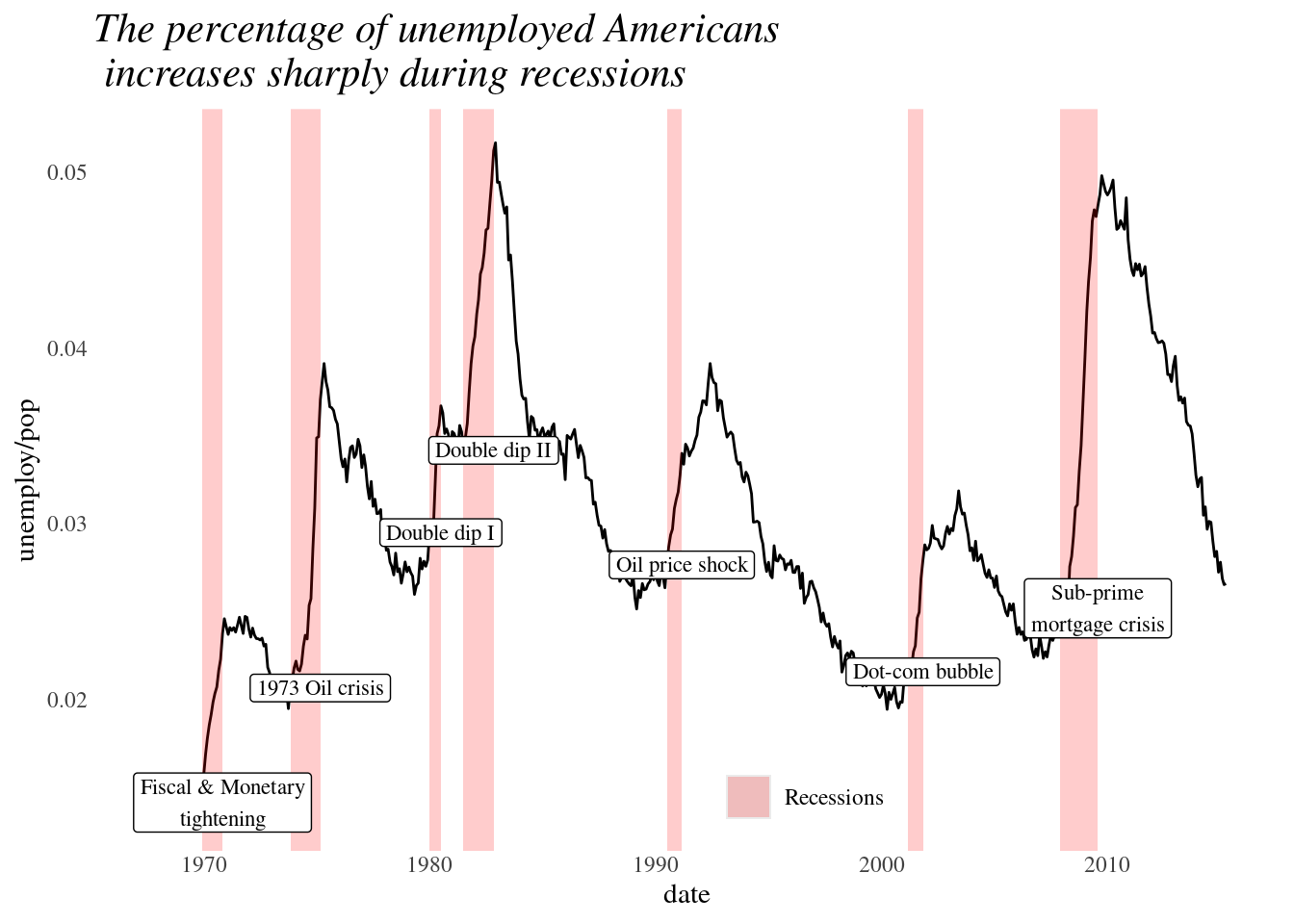
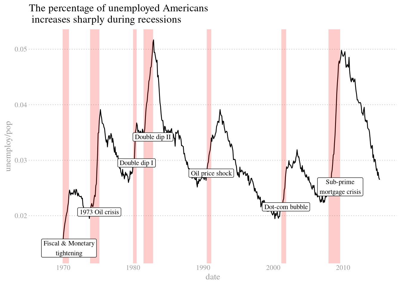
plt_prop_unemployed_over_time +
theme_tufte() +
theme(
legend.position = "none",
axis.ticks = element_blank(),
axis.title = element_text(color = "grey60"),
axis.text = element_text(color = "grey60"),
# Set the panel gridlines major y values
panel.grid.major.y = element_line(
# Set the color to grey60
color = "grey60",
# Set the size to 0.25
size = 0.25,
# Set the linetype to dotted
linetype = "dotted"
)
)
4.4.3 Explanatory plots
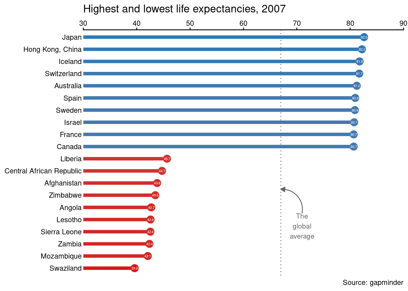
Let’s focus on producing beautiful and effective explanatory plots. In the next couple of exercises, you’ll create a plot that is similar to the one shown in the video using gm2007, a filtered subset of the gapminder dataset.
This type of plot will be in an info-viz style, meaning that it would be similar to something you’d see in a magazine or website for a mostly lay audience.
# Set the color scale
palette <- brewer.pal(5, "RdYlBu")[-(2:4)]
# Using `size` aesthetic for lines was deprecated in ggplot2 3.4.0.
# ℹ Please use `linewidth` instead.

plt_country_vs_lifeExp <- ggplot(gm2007, aes(x = lifeExp, y = country, color = lifeExp)) +
  geom_point(size = 4) +
  geom_segment(aes(xend = 30, yend = country), linewidth = 2) +
  geom_text(aes(label = round(lifeExp,1)), color = "white", size = 1.5) +
  scale_x_continuous("", expand = c(0,0), limits = c(30,90), position = "top") +
  scale_color_gradientn(colors = palette) +
  labs(title = "Highest and lowest life expectancies, 2007", caption = "Source: gapminder")
plt_country_vs_lifeExp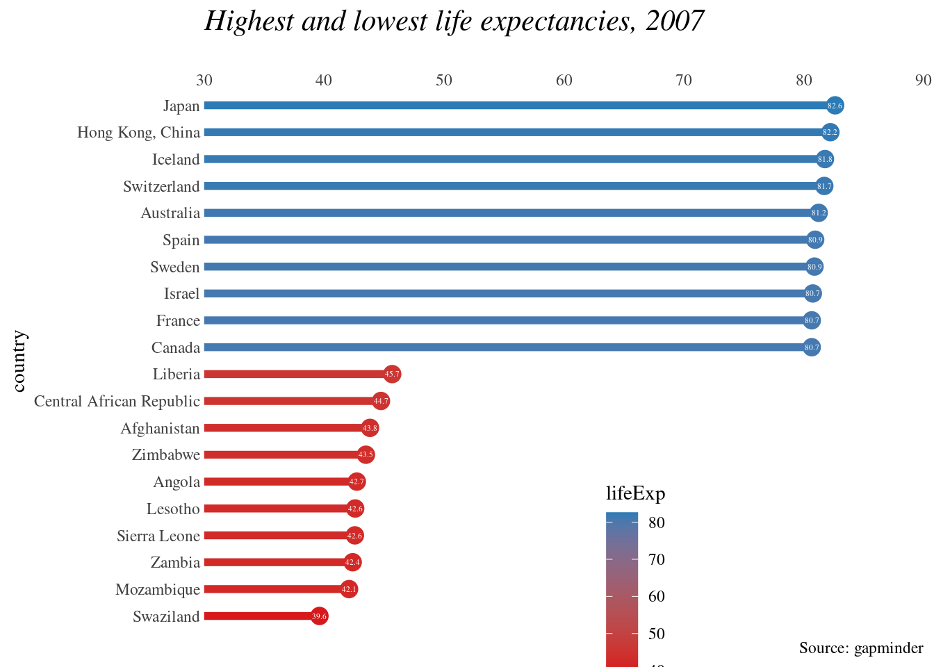
In the previous exercise, we completed our basic plot. Now let’s polish it by playing with the theme and adding annotations. In this exercise, you’ll use annotate() to add text and a curve to the plot.
global_mean <- mean(gm2007_full$lifeExp)
x_start <- global_mean + 4
y_start <- 5.5
x_end <- global_mean
y_end <- 7.5


plt_country_vs_lifeExp +
  theme_classic() +
  theme(axis.line.y = element_blank(),
        axis.ticks.y = element_blank(),
        axis.text = element_text(color = "black"),
        axis.title = element_blank(),
        legend.position = "none") +
  geom_vline(xintercept = global_mean, color = "grey40", linetype = 3) +
 annotate(
    "text",
    x = x_start, y = y_start,
    label = "The\nglobal\naverage",
    vjust = 1, size = 3, color = "grey40"
  ) +
  annotate(
    "curve",
    x = x_start, y = y_start,
    xend = x_end, yend = y_end,
    arrow = arrow(length = unit(0.2, "cm"), type = "closed"),
    color = "grey40"
  )